Category: Editorials

  • Turner Prize No. 27 … 28 … 29 …

    Turner Prize No. 27 … 28 … 29 …

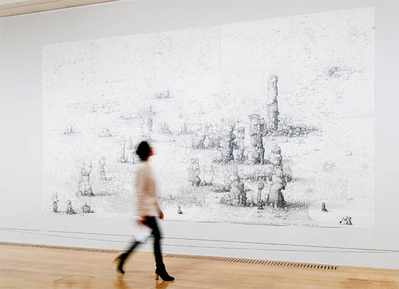
    Some bird in daft boots striding with the confident air born of State Art insight; in the background, Villa Joe by Paul Noble, 2005

    Having slipped into its tedious annual routine, the Turner Prize is upon us again, at Tate Britain, until January 6th; the winner – £25,000 better off – is announced to a live television audience of well into double figures on December 3rd. Those responsible for organising this banquet of self-congratulation continue to fanfare its importance, but it is in truth many years since the Turner Prize introduced an artist of any lasting significance whose work lives in the mind’s eye: it is a safe bet that in a hundred years no one will be looking at any of this work.

    We have now had 27 years of the same ‘cutting edge’, for which lasting importance is routinely claimed; 27 years of ‘challenges’ forgotten almost immediately; 27 years of assorted ‘subversions’, ‘dissolvings’, ‘explorings’, ‘exploitings’ and ‘juxtaposings’ which have altered nothing; and at least a decade of winners whose names only half a dozen addicts of State Art can (or want to) remember. Cubism only took five years and even Impressionism was done for after ten.

    We have reached the end of the avant garde. Without any locomotive power left, the gravy train is slowing down at the terminus, petering out with the buffers in sight, driven along at snail’s pace only by its own momentum and the willing shoulders of Serota’s lackeys. The Turner Prize is fucked, and only those involved with it can’t see the truth.

    In the 18th century art was the preserve of aristocrats; in the 19th it was in thrall to industrialists; in the 20th it was all done for the benefit of the better educated; and in the 21st it was the exclusive domain of art students and others in a new art industry sustained by a tidal wave of taxpayer subsidy. So much for outreach.

    And so to 2012 and the Buggin’s Turner Prize. As you would guess from her name, the person called Spartacus Chetwind is an ass. If she applied both brain cells to the task, and bought a very large cardboard comb, she might just qualify as an entertainer at children’s parties. “Her carnivalesque live events,” claims the Tate’s Chief  Snake Oil Saleswoman, “dissolve the boundary between spectator and participant.” That’s so old hat: Quatermass did that sixty years ago.

    As the work of a precocious undergraduate at a regional ‘university’ no one well educated has heard of, Luke Fowler’s photographs, in which any two pictures are spliced together in the hope of achieving a critical mass, might attract bollocksy exegesis from the resident theorist and intellectual. To the rest of us they add up first to bewilderment, and then nothing at all. But he’s not just a photographer isn’t our Luke. Oh no. He up for a spot of film-making too.

    At a pinch it is painful but still possible to sit through a bad film by a Hollywood film director. However ponderous and leavened with noisy special effects, there will be at least some narrative drive to stop eyes drooping. On the other hand there is a bad film made by a Turner Prize nominee. This will be so inept it is unwatchable after three minutes, unless … unless you are lobbying for a salaried position in State Art – then, you must watch with exaggerated attention, take notes, nod knowingly at intervals and sit through it twice just in case the President-For-Life is spying on you for signs of apostasy. This is the case with Fowler’s 90-minute throatslitter about an interminable therapy session in the States. Any of the Prize’s judges who claims to have sat through this tripe, awake, from beginning to end is lying. It is many miles beyond a human being’s tolerance.

    For those of a more conventional mindset Paul Noble makes large, detailed drawings of an imaginary place called Nobson Newtown, which has been exclusively absorbing his attention for 16 years. Like the work of Bosch and Dali, superficially the scenes look realistic but are fantastic panoramas containing no figures but, instead, are populated by totems not dissimilar to Henry Moore’s Glenkiln Cross. Scattered around the empty squares and expanses in between the ‘sculptures’ are a plague of what look like dog turds. Close up the graphite drawing is more laboured than expected, first impressions from a distance having suggested greater fluency. These pictures are dystopian, surreal curiosities and will take you longer to look at than the works by the other three contestants put together. This must constitute a sort of praise – it’s certainly a relief. His sculptures, carved presumably by someone else in black and white marble, are feeble, though doubtless easily saleable by Noble’s dealer Gagosian.

    And that leaves Elizabeth Price who is represented by a 20-minute film called Woolworth’s Choir of 1979. Claimed by the aforementioned Chief Oiler to be “exploring the elastic potential of digital video”, it comes in three parts: views of an empty choir in a medieval church; clips of women disco dancers flinging their arms about; and footage of a fire in a furniture warehouse above Woolworth’s in Manchester’s Piccadilly. No obvious connection occurs between the three overlapping sections. As an experience, it is slow to unfold and ‘artistically’ repetitive; as in … “I’m repeating myself a lot, therefore I must be an artist”. Sadly, Woolworth’s is not incoherent with poetic possibilities, it is incoherent with incoherence.

    David Lee

    The Jackdaw, October 2012
     

  • A modern masterpiece

    A modern masterpiece

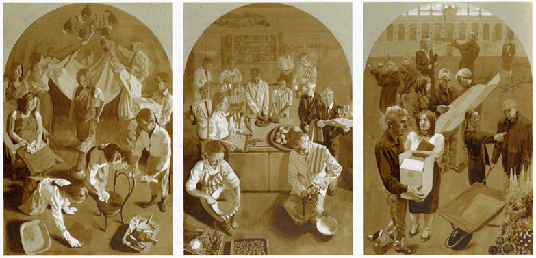
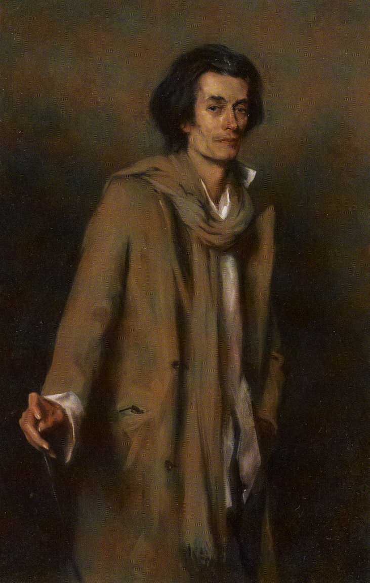
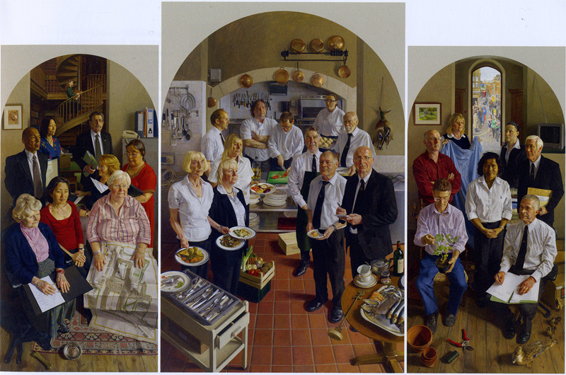
    This large triptych of almost medieval ambition by Ben Sullivan, depicting the 27 non-academic staff of All Souls College in Oxford each of whom sat for the artist, was exhibited briefly during the autumn in the Ashmolean. It is now in its intended permanent home in the southernmost of Hawksmoor’s twin towers at the college. It has been four years in the making and gone through many revisions of approach and scale. In 2003, Sullivan was, at 26, the youngest ever artist elected to the Royal Society of Portrait Painters.

    The All Souls triptych is oil on canvas, and its dimensions 155 x 75 cms for the side panels and a central  panel of 175 x 115 cms. The left panel shows the professional and administrative staff, the central panel concerns those involved with food, and the right-hand panel introduces porters and those staff responsible for accommodation, repairs and gardening.

    This is an important painting which should be shown in the National Portrait Gallery along with its preparatory sketches.

    Of the commission Sullivan has written:

    “The draft proposal was influenced by stylistic and compositional elements from Stanley Spencer’s paintings at Sandham Memorial Chapel at Burghclere. This was a natural point of reference as, like Spencer, I wanted to give an account of people’s day to day activities: to celebrate them as individuals and to elevate and dignify their work. Given the almost religious reverence to be shown to both persons and their tasks, a triptych seemed to be the perfect format.”

    David Lee

    The Jackdaw, October 2012
  • The end of Henry Moore in public?

    The end of Henry Moore in public?

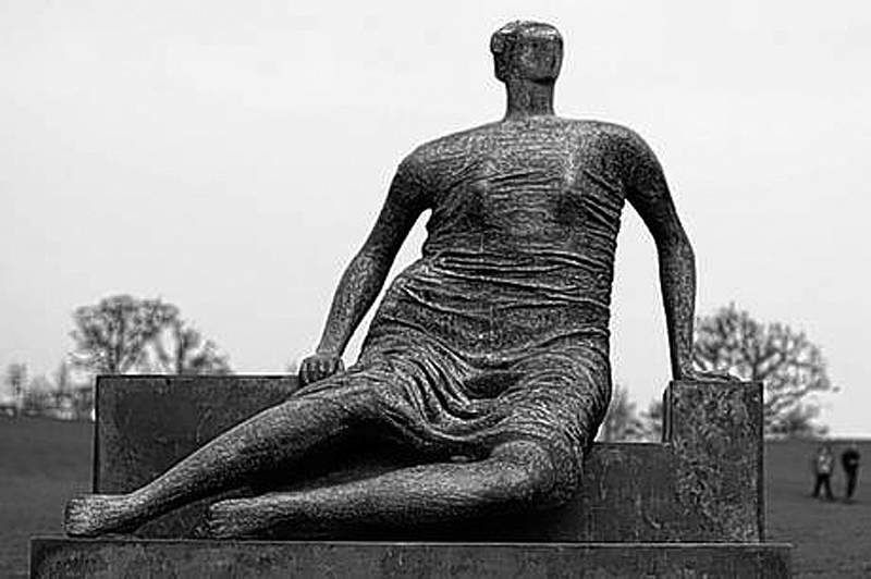
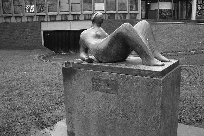
    Henry Moore’s Reclining Figure (1952/3) has been removed from outside the civic centre in Castleford in order, it is claimed, to protect it from theft by scrap metal merchants. Erected in 1980 (in the sculptor’s home town no less), it is not known when or where the work will be returned to view – presumably when all the, er, charming, alternative scrap metal merchants have been packed off home to Limerick and Romania. Castleford’s does seem an over-reaction to the spate of sculpture pinching. All the other recent high profile thefts have taken place at secluded sites, graveyards, parks and country houses, not from the central square of a town whose inhabitants are milling about all night drinking and smoking their benefits away. Presumably the local councillors could instigate inexpensive measures to prevent its illegal removal. If Castleford is right on this there will soon be no Moores in any town.

    This figure, Draped Seated Woman of 1957/58, one of Henry Moore’s most eye-catching bronzes, is to be sold by Tower Hamlets council. (As readers of Private Eye will know, Tower Hamlets seems to be run as a sort of private fief by an Asian mafia.) The sculpture used to be sited on the green in the middle of a Stepney council estate, which was demolished. It has been on display at Yorkshire Sculpture Park since 1997 having been removed from the East End because it was attracting graffiti and other vandalism. The council, which is inevitably claiming chronic poverty, is hoping it will fetch £20 million. It couldn’t now be returned to so rundown a location for fear that it might be vandalized by culture-loving locals or stolen and melted down by our colourful friends in the itinerant community. Public art is a worthily altruistic idea but there are limits, and placing large sculptures made of bronze on council estates might be one of them.

    Make no mistake the dangers to sculpture are real. One of Moore’s important large bronzes has already been stolen and melted down. And in the case of the Harlow Family Group, a stone carving, this was decapitated and, following repair, had to be moved for its own safety from the site chosen for it by Moore to an indoor location where it can’t be seen properly.

    Any sale of Draped Seated Woman would be expressly against the spirit of Moore’s wishes. He was prepared to sell it to the council for £6,000 only if it was displayed in an underprivileged area – he was a working class lad himself. Opponents of the sale have alleged that the mayor only wishes to sell it in order to feed contracts to his business cronies. Doubtless their interest in culture rose to fevered excitement in February of this year when an equivalent piece by Moore was sold for £17 million. It has been proposed that the sculpture could be re-sited in Canary Wharf.  Given Moore’s conditions, removal of the figure from a council estate to the home of global finance would surely too cynical a betrayal.

    The Jackdaw’s preference would be to see this impressive figure in the secure grounds close to the entrance of the British Museum. Visitors might then see it and within a few yards recognize its sculptural antecedents, the draped figures on the Parthenon frieze, which were such an inspiration to Moore.

    There are well over fifty works by Moore around the country on public sites, some of which are housing estates. In these straitened times, which can only get worse, local authorities may be tempted to see the wisdom of selling an asset which might realize sufficient cash to build a new school.

    “Drapery played a very important part in the shelter drawings I made in 1940 and 1941 and what I began to learn then about its function as form gave me the intention, sometime or other, to use drapery in sculpture in a more realistic way than I had ever tried to use it in my carved sculpture. And my first visit to Greece in 1951 perhaps helped to strengthen this intention . . . Drapery can emphasise the tension in a figure, for where the form pushes outwards, such as on the shoulders, the thighs, the breasts, etc., it can be pulled tight across the form (almost like a bandage), and by contrast with the crumpled slackness of the drapery which lies between the salient points, the pressure from inside is intensified . . . Drapery can also, by its direction over the form, make more obvious the section, that is, show shape. It need not be just a decorative addition, but can serve to stress the sculptural idea of the figure.” Henry Moore, 1955

    “Sculpture is an art of the open air. Daylight, sunlight, is necessary to it and for me its best setting and complement is nature. I would rather have a piece of my sculpture put in a landscape, almost any landscape, than in, or on, the most beautiful building I know.” Henry Moore, 1951

     David Lee

    The Jackdaw, October 2012
  • Is this the masterpiece of British land art?

    Is this the masterpiece of British land art?

    The Jackdaw was given exclusive advance access to a grand project which seems certain to become a place of pilgrimage for intrepid devotees of Land Art. Dixon Smith reports.

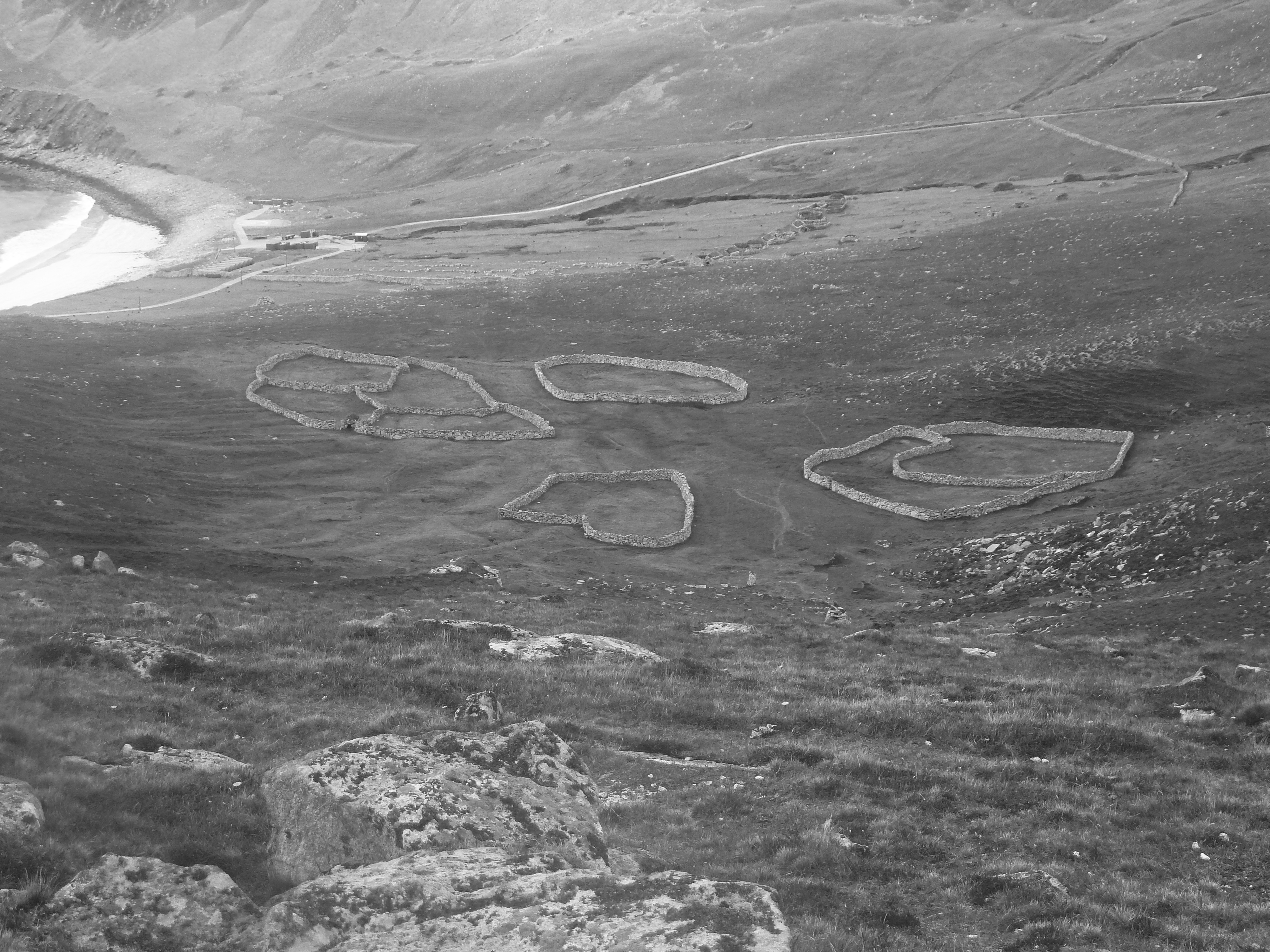
    Already being hailed by the few allowed to see it as the masterpiece of Land Art in the British Isles, In Transit  has been one of public art’s best kept secrets. The Jackdaw was given an advanced sighting before the official unveiling later in the autumn – the work’s location and the identity of the artist are strict secrets until the piece is unveiled to the press. We can reveal however that it is in an extremity of Scotland so remote only the most energetic and intrepid of art anoraks will find it: and it is not a disappointment. The name of the artist should not defeat most art aficionados: he is well-known for the solitary remoteness of his previous exploits.

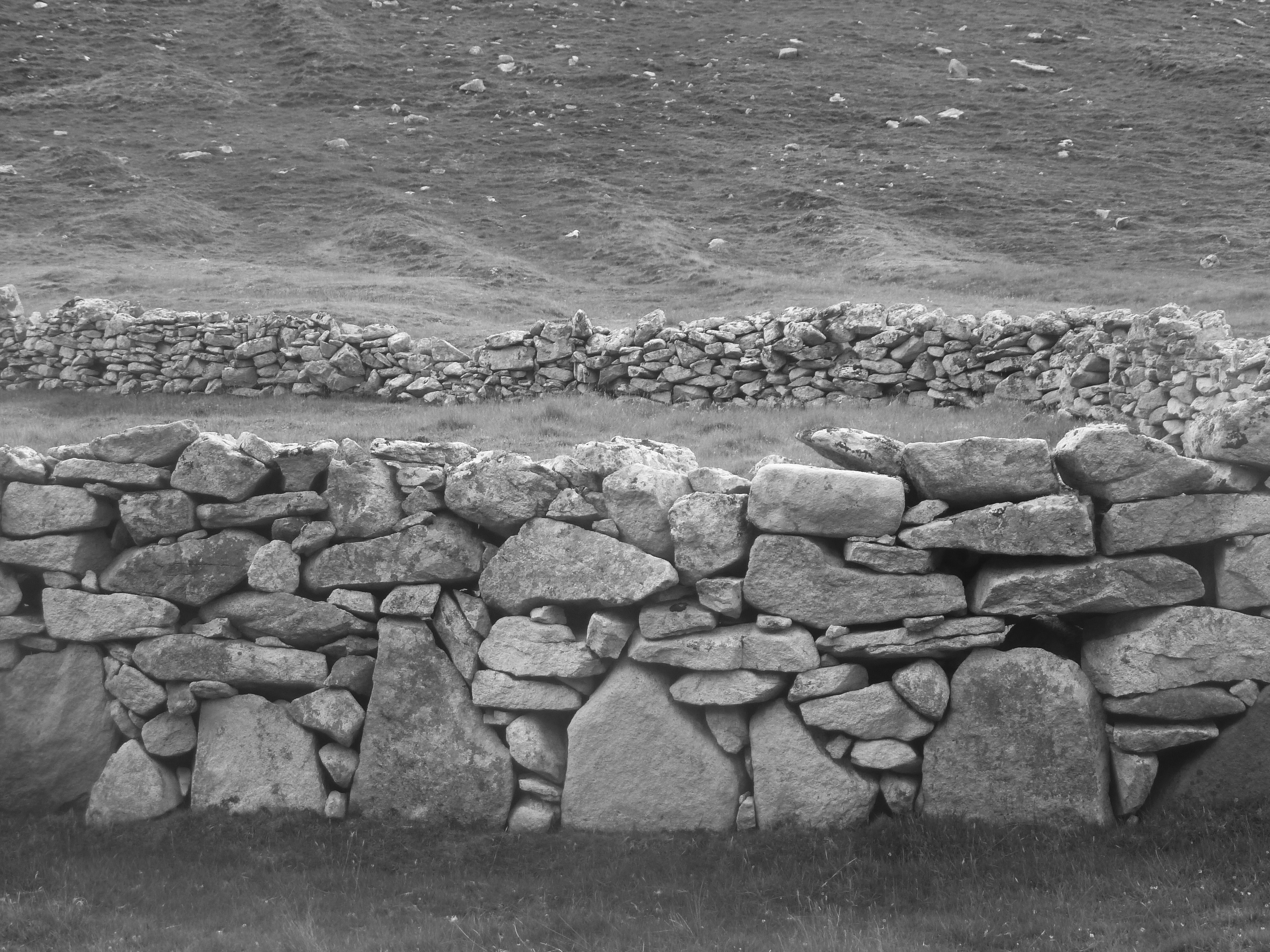
    The site was offered as private land, and therefore not subject to complicated and delaying planning permission. When first approached four years ago, the artist responded enthusiastically to the genius loci, its natural deserted beauty and exposure to the unpredictable Atlantic climate. For the construction he was assisted by a team of artisans, and adopted a looser, more rustic style of dry stone wall-building than the sterile precision more typical of his oeuvre: he used available hillside material as quarry and for authenticity. The work’s title refers to the transient occupation of land and the maker’s insistence that the work should weather and settle, even collapse, naturally in the future, eventually to disappear. It was important to him that the finished piece should echo the work of farmers to cause ambivalence in the mind of those encountering it. The precise shape and spacing of the rough rectangles, their subdividing into writhing shapes, evolved gradually. Decisive planning informed the apparent randomness. Crucial in the calculations is that the eventual accidental discoverers of the work might be ambiguous to the significance of what they see; for example, is it art or nature, decorative or functional? Is it the work of a peasant or of an artist?

    No other land artist has worked before on such an epic scale, nor with such freedom and so grand a simplicity of effect. This is seen to best impact from flanking mountainsides which viewers must negotiate gingerly to approach closer. The underlying concept was to echo the original use of the land as a place for farming hill sheep but to add the artist’s twist of making the result less geometric and therefore less obviously functional to the eye.

    “The asymmetry is its most inventive aspect,” remarked project curator Phil Muir. “It challenges the viewer to work out the artist’s performative purpose and practice. The shapes of the folds are taken straight from the biology microscope and are demonstrative of the microcosm becoming macro. These gateless enclosures threaten to divide like cells and then spread.” There is no doubt that first seeing the piece as you approach along a precipitous ridge, they seem more to do with abstract art than the graft of shepherding and winter shelter for the flock.

    “This is a historic place,” says Muir, “with evidence of occupation since at least the Bronze Age. Life here was tough, the hardship unimaginable today, and the eventual clearances cruel. It has been completely abandoned for a century, and the artist was attracted to this opportunity precisely because he was able to reflect the former function of this place while introducing art to a location in which it is unfamiliar. We are hoping people will encounter it by accident and be inspired to ponder its enigmas. We want it to form a lyrical, uplifting contrast to what is barren, unforgiving land.”

    The Jackdaw, August 2012

  • Olympic posters: our native genius

    Olympic posters: our native genius

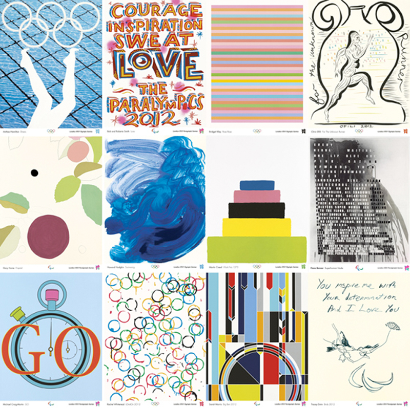
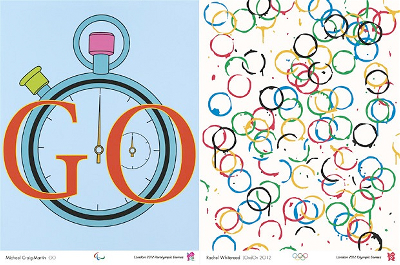
    The Turner Prize nominees and winners came up with a predictable set of embarrassing posters for the Olympics. Apart from the perpetrators themselves, no one could be found to say a good word about their efforts. Someone needs to get a grip. First we were presented with an inept logo which had cost £400,000 for what looked like two minutes work; then there was an artless rollercoaster sculpture selected by the President-For-Life; and now this lot of fashionable scribblers who couldn’t design a wheel from blueprints have done their worst, also, very conveniently, courtesy of the President-For-Life. Inevitably, as with Gibbereesh’s rollercoaster the PFL chose his reliable lackeys from the Turner Prize not to mention a serving Tate Trustee, Bob and Roberta Smith, i.e. one of those currently responsible for employing him.

    Rachel Whiteread and Gary Hume excelled themselves with lovely colouring in – if their efforts had arrived crumpled from the nursery you might have fixed them proudly to the fridge. Bridget Riley knocked off her usual stripes. Each small poster – and these are nothing like the grand sheets of Lautrec – will be available to buy for £7 when an exhibition of the works opens at the Tate next summer.

    Now for the good news, that is if you are one of the participating artists. The posters are being released as signed prints courtesy of Counter Editions, thus enabling the artists to reward themselves in the manner to which they have become accustomed. Bridget Riley’s stripes, for example, is in an edition of 250 and started at £3,000 an impression – yes, that’s a gross of £750,000 for one signed screenprint, and it has already sold out. The Margate Express has hers in an edition of 300 at a throwaway £1,800 apiece – a mere £540,000… It is also sold out. The gross will, of course, have been far greater than the sums cited here as the cost of each print increased as the edition sold out. Still available however are ‘Professor’ Gary Hume’s blots (near right), a snip at £540 in an edition of 250 (£135,000 minimum gross) and Howard Hodgkin’s blue wave (£1,300, ed 300, minimum gross £394,000 – far right). No wonder the artists stood in a line laughing when their works were unveiled.

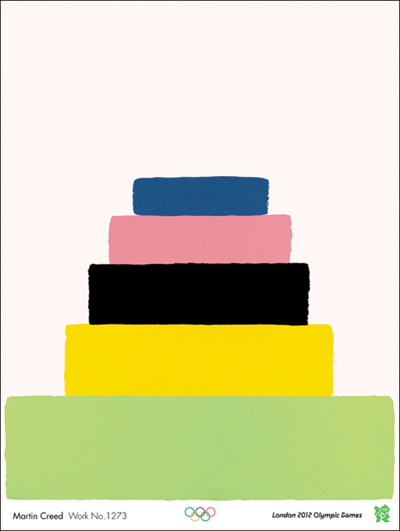
    Martin Creed, at last now widely regarded as educationally subnormal, said of his inspired marvel (£490, lithograph edition 250, minimum gross £122,500): “The colours are based on the Olympic colours but they are changed to make them nicer.” Here is the Mental Paralympian of State Art talking.

    What we got in this project was the usual bunch of over-rated contemporary artists promoting themselves and their art and not the Olympics. We can’t discover from anywhere what the deal was with the artists; were they actually paid to come up with their contributions or was their remuneration to be the loud ker-ching of limited editions? If you come across any information please let us know.

    … And then there was the dear old Margate Express. No are event is nowadays complete without her embonpoint rippling over the proceedings. On the same page of the papers when these Olympic efforts were announced you could look across from the Express’s maudlin scribble to Leonardo da Vinci’s drawing of hands on show in the National Gallery. An unfair comparison, yes, but it is surely impossible to look from one to the other and not think what a catastrophic deterioration has occurred not only in the technical ability of artists but in the willingness of those responsible for protecting standards in art to promote such conspicuous rubbish.

    By the way, if you wish to purchase all 12 of the posters you can buy the set in a nice box for £11,805. A commemorative heirloom for all the family to enjoy, and what a bargain.

     David Lee

    The Jackdaw, Jan-Feb 2012

    Latest News

    These posters are beginning to reappear on the market.

    Three editions sold out within days: they were Tracey Emin, Rachel Whiteread and Bridget Riley.  Now , one of the Rileys is being sold  at auction with an estimate of  £2,000-£3,000. This poster racket was not only a scam to line the pockets of already well-to-do artists but also to allow a quick turnover to collectors eager to cash in on the fever generated by the actual events.

    The complete set of posters are no on view/on sale at Tate Britain until September  23rd. So buy now. They’re crap, but what an investment.

  • Hitting the bottle

    Hitting the bottle

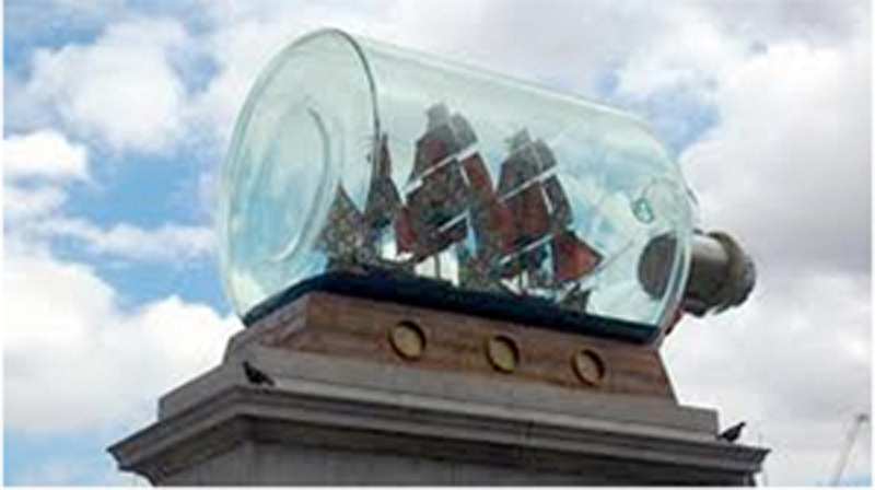
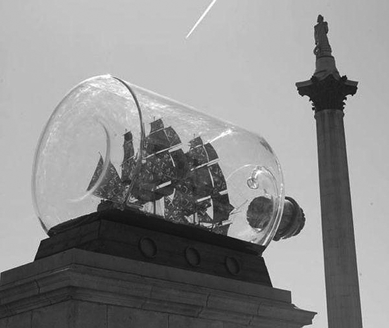
    The National Maritime Museum in Greenwich has bought for £362,500 the ship in a bottle by Yinka Shonibare which had sat ornamentally becalmed on the fourth plinth in Trafalgar Square for the previous 18 months. It is the Greenwich museum’s job to collect ships and related tackle and, lately, any sea-related nonsense deemed  ‘challenging’ by State Art’s omniscient spivs. It is significant, if you hadn’t realised, that the ship’s sails are made from patterned ethnic material of the sort usually swathed around gigantic arses in Dalston market. This encourages what one of the Tate’s finest drivellers grandly declares as “a transformation of perception”. Elsewhere, the same stuff is said to make an incisive comment on Britain’s nasty maritime heritage, “an exploration of colonialism and post-colonialism” no less. Needless to say we are not informed into what our “perception” is “transformed”, nor how “colonialism” is “explored” by deploying some patterned swatches purchased from a Brixton stall. I suppose we must now accept this species of commentary as the naturally occurring guff which will in perpetuity follow conceptual art wherever it goes.

    The sculpture, dubbed Nelson’s Ship in a Bottle, has recently been unveiled on a plain ziggurat base bang outside the National Maritime Museum’s main entrance. Here its presence will doubtless be interpreted as a Blair-like mea culpa for the historical misdeeds of our racist, slave-driving antecedents. Others may interpret its prominence and worship as illustrative of an abject and risible political correctness. Whatever, the bottle is a pretty enough toy untroubled by art. I wish to investigate briefly this apparently straightforward purchase because it reveals the questionable ways in which contemporary art is conducted by a small number of people for the benefit of an equally small number of other people who pop up ubiquitously pulling strings in proceedings such as these. It is curious indeed how the names are always the same ones. These ‘questionable ways’ may be baldly summarised as follows:

    1. We are never told the whole truth, even by public relations’ companies paid to deal with inquiries, and especially concerning the actual cost of anything. State Art is terrified of you knowing the truth, which is the reason why so frequently it is caught out lying.

    2. Obtaining accurate and complete information from arts bodies requires Kafkaesque determination and, when finally a morsel is vouchsafed, it is always uncooperatively partial and might easily contradict what has been released before.

    3. State Art has to be secretive in order to make the public believe that the visual arts are kept cruelly on the breadline and are not, as is the truth, awash with quite staggering amounts of cash which miraculously come available for the right people. If you are a Yinka Shonibare, with access to the engines of State Art, whose institutions you have dutifully served, this system is a licence to print money.

    4. The number of bodies dealing with contemporary art is far too numerous and wastefully duplicating of effort and resources, and any independence in their policies and actions is compromised by frequent interchange between them of the same few personnel.

    Three issues ago Moping Owl asked why we needed to buy Shonibare’s ship when, she thought, we already owned it. Didn’t we?  Had we not already commissioned and paid for it to sit on the plinth?  Well yes, sort of. Owl’s was a natural mistake, especially in view of what we had already been led to believe by what, up to that point, we now know had been an economical rationing of information. £362,500 is three times the record price paid at auction for any work by Shonibare. To pay apparently so much over the odds is surely just a little questionable, but the truth is that this figure is nowhere near what was actually paid for it. The real price far exceeded the published number, but you won’t have found the full, accurate cost in any newspaper because even now we can’t be certain we know all the amounts involved.

    When the purchase was gleefully trumpeted, as though we’d just acquired for peanuts a lost masterpiece by Praxiteles, a breakdown of the cost was supplied. This was based on the interesting claim put about by the artist’s dealer that an unnamed South Korean businessman had been prepared to pay £1.25 million in order to display the bottle in his garden. This outcome was described as “a real possibility” – which sounds to me a bit like the belief among, say, QPR fans that there is ‘a real possibility’ of their team winning the Premiership next season. This sum was apparently accepted even though, at that time, the price was ten times more than had ever previously been paid for a work by the artist. Complicated tax concessions applicable to a purchase by a British museum meant that the top line price was reduced to £650,000, the Treasury having waived the difference. This lower sum was made up as follows:

    £140,000: production costs funded by the Greater London Authority

    £97,500: 15% museum discount from Stephen Friedman Gallery

    £50,000: Grant from the Art Fund ***

    £264,300: Contributions from the public via a fundraising appeal ***

    £49,100: National Maritime Museum contribution ***

    £49,100: Matched contribution by Stephen Friedman Gallery and James Cohan Gallery, New York, on behalf of Yinka Shonibare, MBE

    (*** These sums total £363,400; that is, close to £362,500.)

    As far as I can ascertain at least three additional sums that were paid have not been included in this final account. The Arts Council awarded £70,000 for this project, as it does for all fourth plinth commissions; the Greater London Authority, in addition to its £140,000 production costs, gave an “artist’s fee” of £30,000; and the Henry Moore Foundation gave a grant of £20,000 to the artist for this project. In the privileged wonderland of State Art these additional sums, a mere £120,000, are pocket money. But we still paid them, and the total involved is five times the average Briton’s annual income. I can see no reason why these omitted additional sums should not have been deducted from the price paid by the Museum. Why were they not included in the reckoning? And how many other charities, trusts etc., contributed amounts which disappeared into the coffers when first the project was mooted? The £140,000 contributed by the Mayor’s office for production costs was, according to the initial agreement, to be repaid if the work sold. This is apparently true of all works made for the plinth, though we are unaware of any sums ever having been repaid from previous occupancies.We must assume that Boris is sat waiting eagerly for his refund (after all he can buy one-tenth of a new Routemaster for £140,000). Despite repeated requests for information nothing remotely resembling candour has emerged from the Mayor’s office. The fact is that the GLA alone paid Shonibare in production costs and fees a sum far is excess of the highest amount the artist’s work had ever previously sold for. And we didn’t even get to own it. Is the Arts Council’s £70,000 equally reimbursable upon the sale of a work? If not, it should be. The Arts Council, perennially bleating about its poverty, should surely be on the case for a return of its investment. As usual our requests to them for information have been ignored. They are far too busy producing worthless pamphlets of self-congratulation.

    The price paid by the NMM was independently assessed by Haunch of Venison and Roche Court, a minor secondary market sculpture dealer in the West Country. Haunch of Venison is a gallery owned by Christie’s who, coincidentally, sold the previously highest priced work of Shonibare, a large installation, for $194,500 last November. (Another installation was sold by Christie’s in April this year for as little as $98,500.) It is hard to see how any objective person could have verified a price of £1.25 million ($1.94 million) for a sculpture by this artist, even one which had sat prominently hawking itself in the centre of London for the previous year and a half. Given that they have a monopoly of sale on Shonibare’s sculpture (Sotheby’s has never offered a work by him) it was not in Christie’s – of course I mean in Haunch of Venison’s – interest to undervalue this piece. In other walks of life we might call this a conflict of interest. Shonibare was handsomely reimbursed twice for this bottle; once when he made it and a second time when he sold it. Additionally, we had a right to expect a knockdown price from the 50-year-old artist whose career has been generously supported by the State. Shonibare is an executive member of the Usual Suspects Club. He was nominated for the Turner Prize in 2004, the year Jeremy Deller won (Deller, incidentally, is one of two artists on the selection committee for the Fourth Plinth, both of them Turner Prize winners). His fledgeling career was made easier by cash grants from both the Arts Council and the Greater London Arts Board and he has enjoyed exhibitions in virtually every Arts Council-funded gallery throughout the country, as well as at the Tate. He has also served on Arts Council committees and bought works of his choice for the Arts Council collection. His present visibility would have been inconceivable without expensive public promotion. This should have been reflected in the price for the bottle. After all, we didn’t owe Shonibare anything, quite the reverse. He has made a strong career on the back of crucial public investment in him and, in my view, he has used that reputation to inflate the bottle’s price when selling it back to us. What a marvellous system this is if you are, as the Arts Council put it, “the right kind of artist”.

    At the very minimum we paid the following for the bottle:

    £362,500 published cost

    £140,000 Greater London Assembly

    £30,000 fee also from the GLA

    £70,000 Arts Council grant

    £20,000 Moore Foundation grant

    (£622,500 in total).

    When the work’s sale to Greenwich was completed Shonibare said: “I am absolutely delighted and touched by the public’s generosity.” I bet he is.

    David Lee

    The Jackdaw, Jul-Aug 2012


  • Hitting the right tone (or tits first)

    Hitting the right tone (or tits first)

    Almost part of The Season now, the only surprise these days about the annual BP Portrait Award is that the Queen doesn’t cut the ribbon and hand out the rosettes. As ever, this year is as popular with the public as any art exhibition, with large numbers jostling and genuinely engaging with the work eagerly discussing merits and demerits of more conspicuous pieces.

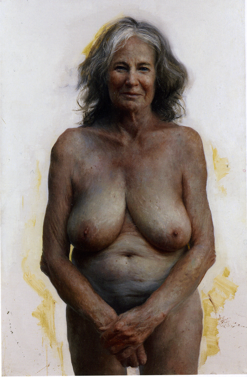
    As usual the winning picture, Auntie by 26-year-old American Aleah Chapin, is not the most refined effort though it deserves commendation –­ if only because the sitter has comfortably the noisiest breasts in the show. One subject of the picture is perhaps what the ageing process does to flesh and muscle, although the painter has presented it in an original and not necessarily unflattering way, suggesting that while the run in to death might be sad it is not always unsightly.

    Somewhat off sharp focus and pinned specimen-like to an unfinished background to which the figure’s outline is here and there uncomfortably cut, the sitter confronts us very slightly as if from the past, as though the painter has approached her subject wistfully. Auntie seems not to be fully in the present and invites thoughts of how in old age personalities, histories, gradually dissolve. It is a nicely judged picture, and there’s love in it.

    Isabella Watling presents The Importance of Being Glenn. Less conspicuous and subtler than the winner, it is duller but arguably more artfully painted. Watling is the more impressive painter for having been classically trained at the Charles H Cecil Academy in Florence, where she is still a student. Indeed, the winner of the Young Artist’s prize, Jamie Routley, is also a graduate of this school, as is another potentially successful young artist Tim Gatenby, for a portrait of his grandmother. Any of these three might win the prize in the future. The work of the Cecil Academy’s graduates – the impressive Frances Bell is another – stands out in the context of those paintings which use overbearing narratives, a cornucopia of details, sloppy painting and overblown heads copied from photographs or projections. Look out for this quartet, their pictures sit back and wait for the discerning passer-by.

    There were also convincing efforts by Antonio Barahona, Roni Taharlev, Benjamin Sullivan and Ben Ashton, all of whom rely on expression through observation rather than deliberate sloppiness and vulgar gimmicks.

    An intriguing oddity is a stylised scene in a Japanese sushi restaurant, painted by Carl Randall (who won the Travel Award), which is not strictly speaking a portrait so much as a novel documentary. Seen almost from above, assorted diners are trapped in their own worlds and silhouettes while troughing busily with chopsticks.

    One welcome addition this year is the judges’ statements – albeit too brief – as to why they selected the prizewinners. This should be done as a matter of routine in all competitions of this sort. If organisers are to continue with such elaboration it must be better done next year. Third-prize winner, Alan Coulson, is praised as follows: “The modulation of tone and attention to detail successfully brought the style and subject together.” ‘Modulation of tone’ is a cliché, doubly unhelpful in this instance because Coulson’s isn’t a tonal painting. Perhaps what is really meant here is the even gradation from light to dark, which is indeed carefully modulated in the sitter’s white T-shirt, but nowhere else. Looking at the list of judges, it occurs that there isn’t a painter present, an accomplished sculptor yes, but not a painter. A painter as a judge in a painting prize may be too obvious a step for the State Art establishment but it would have saved them making such a ham-fisted mistake.

    The second prizewinner, meanwhile, was chosen because it was “intensely atmospheric, thoughtful and focused” – “murky” seems more appropriate. If you’re desperately trying to find something to say this is the kind of adaptable phrase applicable to most paintings. When justifying a choice, it must be done more convincingly than this by avoiding such flannel, so that we viewers enjoy the benefit of the judge’s greater expertise – then we are able to say “Oh yes, well spotted, so it is”, and not respond with a bewildered “Eh?”. As it stands with this year’s explanatory efforts one can have no confidence that the judges have a clue why those selected for honour are outstanding in the company.

    For all its usual failings – not least the fact that a good twenty pictures don’t deserve to be hung at all – this is a moderately diverting exhibition in which to dodge the showers.

    The BP Portrait Award is at the National Portrait Gallery until September 23rd; the Scottish National Portrait Gallery, Edinburgh from November 3rd to January 27th; and the Royal Albert Memorial Museum in Exeter from February 9th to May 19th, 2013.

    David Lee

    The Jackdaw, June 2012

  • Margate Express on Central Line

    Margate Express on Central Line

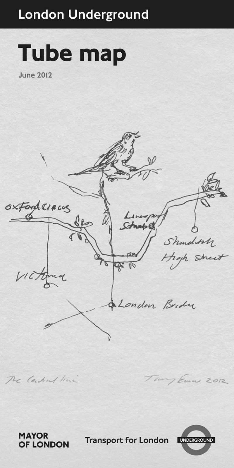
    The latest masterpiece from the Professor of Drawing is the cover for the tube map. She does a fair warbler with its beak open and trots it out at regular intervals. “When in doubt scribble a bird with its beak open,” advised the Prof as she stepped down from the Margate Express. It was commissioned for a special map to be handed out during the Olympics so that all the foreign visitors will be overwhelmed by the wealth of artistic talent in our country. Said the mayor of London, whose brilliant idea it was to approach the Professor: “How appropriate it is that our Olympic map should echo the advice of the mighty Apelles who drew birds as symbols of an athlete’s freedom of spirit.” Meanwhile, the willing idiot in charge of art on the underground spewed out what she always says when a new map is published: “The artwork presents a moving and unique interpretation of the capital.” Mrs Margi Doonham of Nottingham, who was up the smoke bargain-hunting for suicide potions, said after studying her map that she knew a disabled artist who could draw a better bird holding the pencil up his arse.

    She likes birds does the Margate Express – and every one a masterpiece. Some years ago we reported on her sculpture outside the Anglican Cathedral in Liverpool. It was sixty grand’s worth (courtesy of the BBC who for some reason paid for it) of tiny bird on a pole which some unimpressed scouser promptly sawed off. It was found nearby in a jiffy bag and reattached, following which it was nicked again. We are unsure of its current status, but do let us know if you are privy to information.

    David Lee

    The Jackdaw June 2012

  • One for the Royal Collection

    One for the Royal Collection

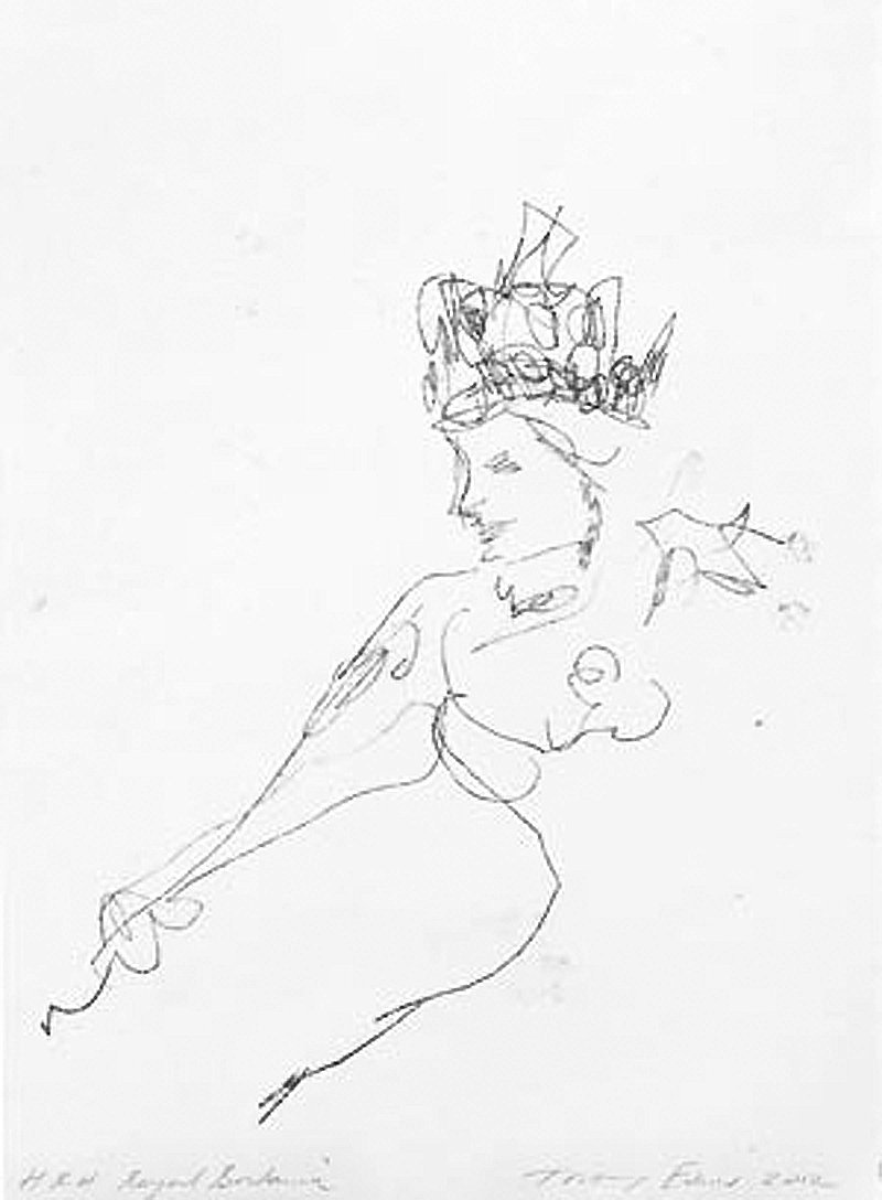
    It’s the headgear that does it. Gives it away completely. Without it you’d be none the wiser. But the miner’s lamp makes it beyond any doubt. This is the Professor of Drawing at work on her most important finished presentation piece yet, a celebration of the Wigan pit girls of the 19th century. Such economy of line, every mark counts, each and every one assertive, the impact one of dedication and duty, such superb proportion and foreshortening. It’s as though she was born to draw. So exact is its depiction you could have that miner’s lamp made by an artisan in an afternoon. Every detail is there. Likewise the smock. What seamstress couldn’t run up that durable uniform. She looked exhaustively at hundreds of photographs of pit girls in order to get the portrayal just so. Another triumph for the professor. “People have forgotten how hard these girls worked for a living wage what kept em in grinding poverty,” said the Professor in expansive mode. “They got a lot of stick for being manual but they were amazingly hard working and very glamorous,” she added.

    The pit girl is included in the latest exhibition put on by the professor – she has not after all enjoyed a show of recent work for upwards of six weeks. The new exhibition is in her home town, Margate, which is said to be reborn as a result of its association with her. “She is good for the town,” said Mrs Margi Doonham of Nottingham. “The cake shop has never been busier. And there’s more condoms in bus shelters than ever before. It’s as though the 1950s are back again with crowds piling in on Bank Holiday specials. Long live the Professor. She’ll be Dame Professor soon, and why not?”

    David Lee

    The Jackdaw June 2012

  • Tanks on the lawn

    The tanks are opening at the Tate on July 18th. These are the very same tanks that stored oil in the days when Bankside served the function of generating electricity by burning Arabia’s finest. And if the ignoramuses in the Tate’s PR department start cooing, and they will – they will – about said tanks being the first of their kind to be used for exhibition purposes then, as is their custom, they will be talking bollocks. There is a marvellous military museum on the Hoy banks of Scapa Flow in which a massive tank used to service the wartime fleet with fuel oil has been turned into an informative and atmospheric film and sound display. Exemplary of its modest type, it is run by a knowledgeable, approachable skeleton staff.

    The Tate’s tanks will be used to show film and performance, and other nonsense watchable only by those with a boredom threshold of hours learned at the knee of State Art’s robots. It opens with a 15-week ‘festival’ “celebrating performance and installation art and the historical works that have shaped it”. This will feature 40 artists from around the world of whom you’ve never heard of for the very good reason that they make ballbreakingly tedious films no one sentient could possibly watch for longer than it takes to fall unconscious under strong anaesthetic. ITV 3 suddenly seems appealing.

    ‘Highlights’ of the ‘festival’? “Aldo Tambellini will re-envision his seminal 1960s electromedia environments, examining space, light and sound through immersive projections and live musical and spoken word performances”. And if that isn’t tempting enough what about this: “Eddie Peake, an emerging artist who in a previous work choreographed a football game for nude players, will create a new commission for Tate Modern that explores sexuality and voyeurism.” And you can’t beat a bit of ‘exploring’.

    The record-breaking attendance figures for The Tanks have already been leaked to the press and disclose that in 2015 more people attended said Rommels than watched Premiership football throughout the previous season when, coincidentally, Manchester City won the title for the third year running. The President-For-Life commented: “This proves definitively that Contemporary Art has an audience second to none. Far from tanking, The Tanks prove that Britain is leading the way in its adoration of Contemporary Art. And the part played in this triumph by me has recently been recognised by my elevation to the peerage as Lord of the Challenger Tanks.”

    The rest of the Tate expansion will not be open until 2016, at which point it will surpass attendance figures even for The Rommels. It is conservatively predicted that by 2021 two-thirds of the world’s population will visit the Tate every fortnight. Visitors will all be shown collapsing ecstatically in devotion to the conceptual cause, like a crowd of North Korean midgets swooning over the mummified corpse of their leader.

    David Lee

    The Jackdaw June 2012