Tag: Tate

  • Champagne feminist

    Sixteen years ago, I wrote an article for a short-lived women’s art magazine called Make responding to a complaint on the letters page that only childless women could succeed as artists. Off the top of my head, I immediately thought of half a dozen artists who disproved this rule and I interviewed them for a piece called A Woman’s Work. They included Shani Rhys-James, Evelyn Williams, Susan Wilson and Sarah Raphael. A quote from Raphael, who had just had a third child, appeared to clinch the argument: “Motherhood is such an overwhelming purpose that it has to be very powerful, the urge to do the other thing. It cuts the crap. I just haven’t got the time to sit around wondering what sort of artist I am. The kids get their trainers, that’s the main thing. I think it’s horseshit, personally, that you can’t be both.”

    Gender studies have since moved on, along with definitions of mother and womanhood. We’ve had handbags at dawn between David Furnish – or was it Elton John? – and Domenico Dolce – or was it Stefano Gabbana? – over the dress designer’s suggestion that men can’t be proper Italian mammas, and Germaine Greer has been sent into purdah for refusing to recognise transgender women as women. This throws up some interesting artistic questions. If Caitlin Jenner re-reinvented herself as a woman artist, would she produce women’s art? Given that artists draw on their life experiences and Jenner’s, up till now, have been a man’s, her artistic perspective ought to be male. But who knows? These days there’s really no way of telling until s/he is imprisoned for violent assault, when a decision can be made according to the gender of the prison.

    It’s legitimate to talk about ‘women’s fiction’ because women buy it, but is it invidious to talk about ‘women’s art’ when the vast majority of collectors with disposable incomes to spend on art are men? (Interestingly no one talks about ‘gay art’, perhaps because if you removed all the homosexuals from art history it would knock a huge hole, so to speak, in the male art pantheon.) We live in an increasingly touchy world. Such are our sensitivities on gender issues that some in the trans community – smaller than the community of giant pandas, but more visible – are calling for gender specification to be dropped from official forms. Since one of the presumed points of official forms is to ensure fairness, others in the feminist community have complained that this will make it harder, all things being unequal, to monitor sexual equality. No sex, no equality – we’re British.

    It hardly seems worth getting one’s knickers in a twist when all the data on gender collected to date has had no visible impact on the only significant measure of equality, the pay packet. But now women artists have found a surprising champion in Charles Saatchi. The wife-throttling philanthropist has chosen to mark his gallery’s 30th anniversary with Champagne Life (until March 6th), an exhibition of 14 emerging women artists from around the world. In the wake of the gallery’s recent series of exhibitions of contemporary art from Africa and Latin America, Russia, Germany, the Middle East and China, comes a show of art from the planet Venus. Any Martian glancing through the recent programme might be forgiven for thinking the female sex was a foreign country.

    Aware of the problem, the show’s publicity stresses that it “does not offer an overarching vista of ‘female’ artistic practice, nor does it presume to state that there is such a thing”. There are plenty of people around, however, who assume there is. Most wouldn’t dare go as far as Brian Sewell and claim: “There has never been a first rank woman artist. Only men are capable of aesthetic greatness”. But Sewell did agree with the Make magazine moaner: “Maybe it’s something to do with bearing children.”

    Historically, this was obviously true. Greer’s The Obstacle Race is a catalogue of female artistic ambitions hobbled or snuffed out by childbearing; between domestic commitments to children, husbands, fathers and brothers, a woman’s work as an artist was never done. Equally damaging, in her view, was the imitative hero-worship squandered by women artists on male teachers or husbands – or both, in cases where love-struck women students married their masters. “The artistic ego is to most women repulsive in themselves, and compelling in men,” is Greer’s analysis of the situation. Or as Degas put it to Suzanne Valadon: “You must have more pride.”

    Male ‘aesthetic greatness’ often goes with showing off; the problem is that the public can’t tell one from the other. Not being natural show-offs, women artists are too easily diverted from the self-satisfaction of making reputations by the deeper satisfaction of making things. “No artistic success has given me as much pleasure,” said Liubov Popova, “as the sight of a peasant buying a length of material designed by me.” The artist of ambition, argues Greer, “must have a masterful attitude not only to his subject, but also to the beholder whose attention he claims”. This, she suggests, is why women have tended to work small.

    Not any longer. There are no small works in Champagne Life, with the exception of two little heads hanging amongst Jelena Bulajic’s monumental portraits of old women. Still in her 20s, this young Serbian artist – who had two paintings in last year’s RA Summer Exhibition – is something of a prodigy. Although shortlisted for the BP Portrait Award, her magnified grisaille faces showing every wrinkle are not photorealist: from close to, they break down into pointilliste confections of marble dust, ground granite and limestone, kaolin, graphite and charcoal. In terms of technique, most of the paintings in this show ­– from the densely patterned mythological images of American Mequitta Ahuja, executed in acrylic, coloured pencil, oil, watercolour and wax crayon on vellum, to the nude body landscapes of Korean Seung Ah Paik, with their perfect nipples stippled in pigment sealed with rabbit skin glue – are in a different class from the slapdash efforts of the mostly male artists in the gallery’s recent Pangaea exhibitions. These women artists take a pride in their work: they like making things.

    Is it patronising of a male patron to stage a women-only exhibition? The Tate has been promoting women’s art, but only through safe solo shows of established artists. Saatchi, meanwhile, has brought together 14 strikingly different young women artists in a group exhibition whose effect, intentional or not, is to blow the idea of ‘women’s art’ out of the water. Yet on the most basic measure of equality – money – art by women still ranks a distant second. In 2014 the holy cow of American modernism, Georgia O’Keeffe, broke auction records for a woman artist with the sale of Jimson Weed/White Flower No 1 for $44 million at Sotheby’s New York; the following year Picasso’s Women of Algiers sold for almost exactly four times as much at Christie’s. It puts the 20% gender pay gap in the workplace into proportion.

    One glass ceiling leads to another. As long as the art market is dominated by male collectors on whom a sniff of senescent Picasso acts like rhino horn, nothing’s going to change. Saatchi’s gesture is welcome, but any celebration would be premature. Until women’s work commands equal prices, the champagne can stay on ice.

    Laura Gascoigne


  • ‘Sculpture’ v. sculpture

    Martin Jennings

    Among the least impressive legacies of arts administrators’ obsession with Modernism and its aftermath is the impossibility of predicting a work’s status solely from its appearance. You might form your own view about it, but you can’t predict what State Art’s opinion will be because there are no published criteria or guidelines for making such a judgement. You can’t second guess a whim. The bottom line is that we have allowed a body of ‘experts’ to evolve who unashamedly make it up as they go along. This gullibility on our part for allowing it to happen, and the smug charlatanism of those in authority who are impervious to and ignoring of criticism, is the inevitable result of being for decades under the thumb of an establishment which – for all its daily protestations to the contrary – is not only awash with cash and therefore patronage, but has decided, god-like, that anything at all can be art if it says it is. In its way State Art’s is as extreme a form of capricious and intolerant dictatorship as any regime in North Korea.

    There is a useful current example of how fossilised prejudice and arbitrariness inform establishment policy. It concerns two works of public art each designed for city locations. Both are, on the face of it, conventional figurative bronzes. Superficially similar though they may seem, to the Arts Council there is an enormous gulf in acceptability between the two, a difference invisible to you and I. One of these works, that recently unveiled outside the tacky new public library in Birmingham and called A Real Birmingham Family, is a ‘challenging’ piece presenting two local women and their children. The other, depicting women in overalls and commemorating the crucial contribution of female workers to the steel industry during the World Wars, will soon be unveiled in Sheffield.

    The Birmingham sculpture is by former Tate trustee Gillian Wearing. Obviously she didn’t make the sculpture herself, a skilful craftsman will have run it up from snaps. The result is a hideous, styleless simulacrum of real people, the point of it being to promote the view that nuclear families are not now the norm – how very trendy, how perfectly BBC. This sort of conceptual conceit must of necessity be a sculpture-free zone because the last thing Wearing wants is for the object to be gauged by its form rather than for its ‘idea’ – albeit one which, to the rest of us, would be so small as to be not worth the effort and expense of illustration. As sculpture it stinks, it’s stillborn.

    In contrast, the Sheffield piece is a work of imagination and looks like a sculpture because it was made, with his own hands, by Martin Jennings, a renowned specialist in this area of modelling and invention. To State Art this sort of traditional approach is vile anathema.

    But here’s the real rub. Conceptual art, even when it comes in the otherwise despised bronze figurative form, is funded by the Arts Council, to whom Wearing is well known. She has had two national touring shows and has exhibited in every ACE-funded gallery. ACE also bought in 1999, for £30,000, her Turner Prize winning film in which two dozen coppers stand silently still for an hour. Confirmation of her A-list status is supported by the fact that 31 of her works are in the Tate, Arts Council, British Council and Government collections: curiously, all four own an edition of the same print, unnecessary duplication of a kind that ought to have been outlawed years ago. Wearing’s family sculpture was administered by local Ikon Gallery, which itself receives over half a million a year from the public.

    In contrast, Sheffield had to find all the money through public donations because Martin Jennings is the wrong kind of artist.

    State Art always prefers ears to eyes and has never based funding decisions on the merit of what you actually see. Why artists nationwide are not campaigning about ACE’s continued unfair discrimination and casuistry is baffling.

    Here is yet another filthy, indefensible racket.

    David Lee

    Jan/Feb 2016

    http://www.martinjennings.com/Biography.aspx

  • Multinational art

    Multinational art

    In the dash to internationalism the national is trampled underfoot, argues Laura Gascoigne.

    In November, Lund Humphries celebrated 75 years of publishing books on British art with an anniversary talk at the ICA titled ‘Is there such a thing as British art?’ It was chaired by Tim Marlow, now of the Royal Academy, and debated by a panel composed of Iwona Blazwick from the Whitechapel, Emma Dexter from the British Council and artists Nathan Coley and Yinka Shonibare. Don’t ask me what was said, as the event was so oversubscribed I couldn’t get a ticket.

    British art is on a bit of a roll. True, no YBAs made it onto ArtReview’s Power 100 list last year, but Cameron’s gift to his new ‘bro’ Obama of a Henry Moore print of Stonehenge did seem to reflect a newfound confidence in our national art. It certainly upped the ante on the special gift-giving relationship after the boxed set of classic American film DVDs presented by Obama to Gordon Brown in 2009. But while national pride in the art of the past still seems permissible, it has started to look iffy when applied to the present. Patriotism has no place in a global art world. Hence the further questions raised by the Lund Humphries debate: “Is there an inherent, identifiable ‘Britishness’ in the art made in these islands today? Or is any notion of a culturally significant Britishness now redundant?”

    In his autumn pep talk to participants in the 56th Venice Biennale, President Paolo Baratta recalled the reaction against national pavilionism in 1999 that prompted the creation of the International Exhibition “to offer the world a global sounding board”. The man in charge of this year’s sounding board is Nigerian Okwui Enwezor and his exhibition, inclusively titled All the World’s Futures, will invite visitors to “read the Giardini with its [sic] ramshackle assemblage of pavilions as the ultimate site of a disordered world, of national conflicts, as well as territorial and geopolitical explorations.”

    In a disordered world, blowing one’s national art trumpet is obviously out; the polite thing to do is to tootle on the trumpets of one’s fellow nations. And currently auditioning for the post of international trumpeter-in-chief is the director of our very own Tate Modern, which has been scrambling to diversify its collections in preparation for the post-pavilionist age. In November 2012 a special report on Tate’s International Activities announced the formation over the previous decade of a series of Acquisitions Committees supporting “Tate’s global reach”. Between them, the North American (2001), Latin American (2002), Asia-Pacific (2007), Middle East and North Africa (2009) and African (2011) committees have added over 100 works to the collection. Two more committees – South Asia and Russia & Eastern Europe – are in the pipeline.

    It was Serota’s cultivation of a global powerbase, rather than his winning personality, that won him top spot in last year’s Power 100. “Tate Modern very aggressively internationalized quite quickly,” explained ArtReview’s editor Mark Rappolt. “It is not a national collection, it is an international collection that happens to be in London.” Like the British Museum, in other words, except that the nations from which the Tate is acquiring this stuff are unlikely to hire Mrs Clooney to get it back.

    In our hyper-connected world, global art is a development as unavoidable as global terrorism. But whereas global terrorism has a clear idea what it’s about, global art is undecided. At the moment it’s professing anti-capitalism in a general, innocuous sort of way. Enwezor’s Venice exhibition will open with a live reading of all four volumes of Marx’s Das Kapital, “building into an epic display of orality”. Groan if you will, but Enwezor is a global player with a bunch of biennials under his belt. He curated the Lagos section of Tate Modern’s Century City in 2001 and was responsible for fellow-Nigerian Meschac Gaba’s Museum of Contemporary African Art 1997-2002 – “challenging ideas of an authentic ‘African’ experience” – that took over several rooms of Tate Modern in 2013. I remember it as a pleasantly shambolic collection of brightly coloured ephemera with interleaved bank notes representing capital. When the rooms were cleared, the Museum was put into storage. It was an early purchase by the African Acquisitions Committee.

    I’m wary of art acquisition by committee, believing that great collections are formed by individuals, but acquisition by foreign art committee – if you can still say ‘foreign’ – is far more worrying. On its leader page the Russian-owned London Evening Standard welcomed the Tate’s 2012 announcement of its international activities on the grounds that its ambition to “build itself up as an international brand… can only help to add to London’s image in the world”. Hang on there, Lebedev. Tate & Lyle is an international brand. The Tate is, or was, a national art gallery. It is responsible to the nation for many images, but London’s isn’t one of them. It is also expected to maintain ethical standards a notch or two higher than your average multinational. Two more reasons given by ArtReview for Serota’s global domination of its Power 100 were the amount of income the Tate receives from foreign private sources and the number of collectors on its international acquisitions committees – collectors who are presumably honour bound to recommend the artists in their own collections.

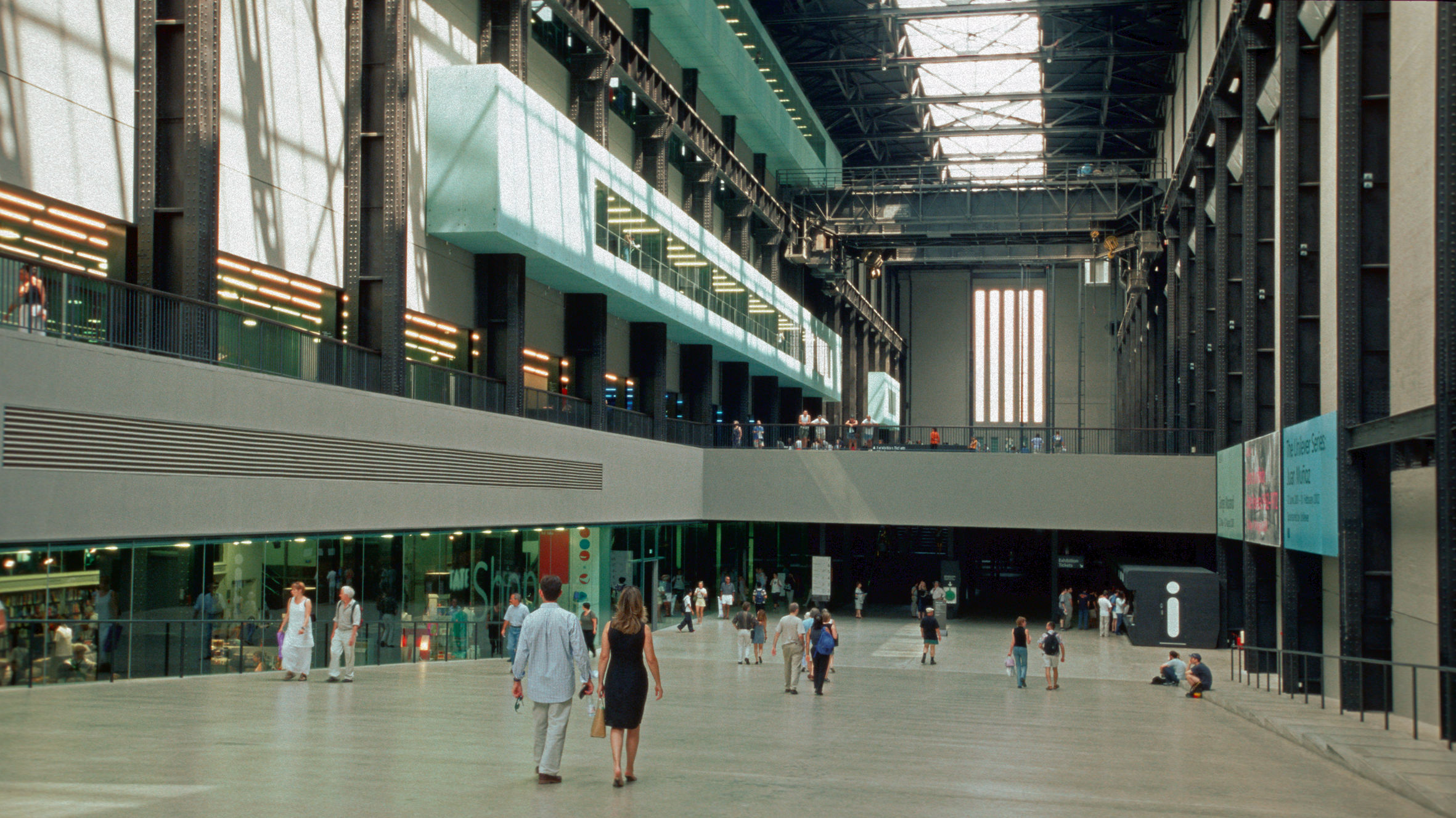
    Are these acquisitions really necessary? If the object is to introduce audiences to art from around the world – and ‘ART FROM AROUND THE WORLD’ is what it is currently advertised on the builders’ hoardings outside Tate Modern – there are cheaper alternatives to acquisitions, known as loans. But as you will have noticed, this spurt of international collecting activity coincides with the tacking of Herzog & de Meuron’s multistorey starship park onto the back of Giles Gilbert Scott’s former power station. The Tate is looking to its international committees and foreign income sources to solve the problem of filling this vast unwanted space on the cheap by shopping in relatively undeveloped markets. But it could shop even more cheaply at home if it was prepared to look at national artists without international reputations.

    “Real Art history is always part of national history,” wrote the Russian critic Boris Groys a few years ago. “There is a global art market, but there are no international institutions.” The Tate aims to change that. Assuming its extension is ever finished – and mothballing it would take a mountain of camphor – its internationalism may give it short-term novelty appeal. If it succeeds, other national galleries will follow and the world will be dotted with multinational outlets offering sameness rather than diversity in the name of universality. What will be lost in translation will be local dialects, the nuances of expression peculiar to art that is rooted in a shared culture in a particular place.

    The test of universality in art is not its ubiquity but its ability to communicate on a human level across cultures. Here’s what the cosmopolitan Kitaj had to say on the subject: “I have a hunch that pictures only achieve universal interest by way of the muddle of obsessed attentions (the stuff that excites one in life) to which a very skilled painter exposes his or her picture… That attention might be variously Christian, African, Neurotic, Alien, Decorative, deeply English or any complex sensibility – you name it, but I wouldn’t trust an art too much if it was damn well determined to be universal like Esperanto, which a lot of art now looks like… because you are what you are and what can be more human than that?”

  • Building brands, ruining reputations – Laura Gascoigne on the Tate

    Nothing is too squalid for Brand Tate, argues Laura Gascoigne.

    ‘Change the name and not the letter, change for the worse and not the better,’ ran the old wives’ saw on choosing a husband. Nowadays, in the wider world of consumer choice, a change of name is almost always a change for the worse. Whenever a familiar product is rebranded, a deterioration in quality is guaranteed. And when a corporation renames itself, as sure as eggs is eggs (assuming one can still be sure of that) it’s up to no good.

    Last July, there was suppressed hilarity in media circles when multinational accounting firm Ernst & Young announced that henceforth it would be trading under the snappier acronym EY. Unhappily, some in the press pointed out that the initials adopted by the company to “demonstrate boldly and clearly who we are” were confusingly already in use by another entity, the junior beefcake magazine EY! – or Electric Youth!, to give it its full name – a publication equally unafraid to demonstrate boldly and clearly what it is. A typical cover on its website features teen model Sergio Carvajal lifting his Spain 2012/13 Confederations Cup football shirt with one hand while pulling down his pants with the other, alongside the cover line: ‘The beauty and joy of young boyhood’. What’s the male equivalent of nubile? Pubile? Anyway, you get the picture.

    Commentators remarked that it was odd that a firm like EY2 that employs 167,000 people hadn’t done its research before changing its name but not its letters. The reason is, it was in a hurry. The name change came just four months after the then E&Y was persuaded by US criminal prosecutors to reach a $123m settlement with the IRS for marketing tax avoidance schemes that cost the US economy $2bn in lost revenue between 1999-2004. The dodges, dreamed up by a unit called VIPER – Value Ideas Produce Extraordinary Results – included fake investments with names like COBRA – Currency Options Bring Reward Alternatives – for the creation of which four of the company’s magic bean-counters were sent down in 2010.

    A spokesman for E&Y quickly announced that it was “pleased to put this matter from a decade ago behind us”, but unfortunately matters didn’t end there. When top executives from Amazon and Google were hauled before our own Commons Public Accounts Committee last November for a grilling by the terrifying Margaret Hodge as to how they got away with paying almost no taxes, the schemes allowing them to do so, it transpired, had been hatched by er… the erstwhile Ernst & Young. Before people with long memories started to cast their minds back to the collapses of Anglo-Irish Bank and Lehman Bros and to recall the identity of their auditors, a nifty change of name was obviously in order.

    Where’s all this heading? In case you haven’t noticed, Tate Modern’s big autumn exhibition is being marketed under the title The EY Exhibition – Paul Klee: Making Visible. Why, oh EY? Because in July, within days of their name-change, EY signed a three-show sponsorship deal with Tate Modern, publicized in a wince-inducing press release picturing the Tate director and the EY chairman standing shoulder to shoulder with matching business suits and rictus grins, one without a tie (creative industries), one with (creative accountancy). “This collaboration between two internationally-recognised institutions,” the release announced, “has the potential to help build a better working world for their visitors and clients respectively and the communities in which they work.” Take your fingers out of your throat, because it gets worse. It ended with this assertion from the EY chairman: “The arts and services sector can make a significant contribution to building brand Britain.”

    Building brand Britain? I bet Paul Klee had no idea when helping to design a brave new world at the Bauhaus that his name would be posthumously linked with such a preposterous piece of corporate jingoism, and I don’t suppose he’d have been best pleased about it. It’s obnoxious. There may be a respectable tradition of calling lecture series after distinguished scholars, but there’s nothing respectable about flogging a dead artist’s arse to a dodgy firm of accountants and allowing them to brand their initials on it. The Tate would do better to get EY! to sponsor the gents toilets and at least encourage some active philanthropy while they’re at it.

    Fortunately for the survival of old familiar unbranded Britain, there are signs that a rebellion against brandalism is brewing. In September the felicitously named Russell Brand loosed a well-aimed volley at the GQ Men of the Year awards – where he was collecting an award as an ‘oracle’ – when he stood on a stage papered in the logos of the event’s sponsors Hugo Boss and pointed out the absurdity of the fact that German outfitters who supplied uniforms to the Nazis were still trading as a fashion house under the same name, “and the ludicrous necessity for an event such as this to banish such a lurid piece of information from our collective consciousness.” He may cultivate the appearance of Edmund Blackadder’s sexier younger brother, but Brand is more than just a pretty face. He earned his ‘oracle’ award, in spades.

    To the innocent observer, the shocking thing about these you-scratch-my-brand-and-I’ll-scratch-yours relationships is how openly they are conducted. When accepting sponsorship money stolen from the taxpayer, you’d think a public institution would want to keep it quiet. But the Tate is so intoxicated with its own brand that it seems to have lost all sense of propriety. At the risk of turning really green at the gills, visit the Corporate Support page of the Tate’s website and watch it flogging its own arse to prospective sponsors as “one of the best-loved brands in the world… central to the UK’s cultural vibrancy, an agenda-setting arts organisation internationally [which] regularly features in industry round-ups of ‘cool’ and ‘favourite’ brands. Choose a Tate exhibition,” it coos, “and together we can build a package to mirror your brand, ethos and style”. But if Tate is really such a favourite brand, shouldn’t it be in a position to set conditions and bury EY’s involvement in the usual small print? Now that it has rolled over and given EY top billing, every corporate sponsor will expect the same treatment. If anything, their demands will escalate.

    It doesn’t have to be this way. Four years ago the then director of the Fitzwilliam Museum, Timothy Potts, forfeited £80,000 of funding towards the acquisition of Marcantonio Bassetti’s The Dead Christ Supported by the Virgin and Mary Magdalen when he refused to display the Art Fund’s naff new pink heart logo on the label – a logo The Burlington Magazine thought more appropriate to “a mail-order firm for adult lingerie”. Potts agreed to a credit line, just not the logo. “Logos are the currency of marketing and commerce,” he said, “and this introduces a promotional element into galleries that we regard as an unnecessary and unacceptable distraction.” The museum lost the picture but kept its dignity. There were no hard feelings: the Art Fund helped the Fitzwilliam (with Potts still in post) to raise the £3.9m needed to acquire Poussin’s Extreme Unction last year.

    “Economics are the method; the object is to change the heart and soul,” said Margaret Thatcher. When an art institution accepts the currency of marketing and commerce, it risks losing its heart and soul along with its dignity.

     Laura Gascoigne

    The Jackdaw, 2014

  • David Jones – painter Desmond Sloane on an important British artist and poet

    Painter Desmond Sloane rehearses the career of an important British artist and poet who fought in the trenches and whose work is too often overlooked.

    ‘Part of me, the artist within me, has never left the trenches.’ So wrote the artist and poet David Jones about his service as a front line soldier in the First World War. Jones was never an official war artist, and yet his wartime experiences dominated his life and work, in a way which was not true of, say, Paul Nash, or any of the other artists who were. In this sense, Jones is the quintessential artist of the Great War, and the centenary of its outbreak seems a good moment to remember him.
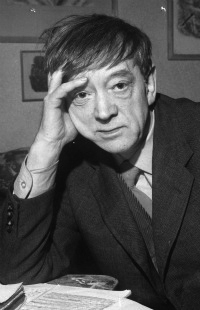
    David Jones belongs to the rich tradition of British artist/writers – Blake, Rossetti, Lear, Wyndham Lewis – but he is probably the least familiar of these today. Nor was he well known in his own lifetime (1895–1974), as either artist or writer, although he had influential supporters. Kenneth Clark was a fan of his paintings, and John Rothenstein bought them for the Tate. His work was shown intermittently by commercial dealers, and also at the Tate in 1954. The Royal Academy offered him membership, which he turned down (‘a loathsome institution’). W B Yeats admired his epic war poem In Parenthesis, as did T S Eliot, who called it ‘a work of genius’. W H Auden considered a later poem, The Anathemata, to be ‘probably the finest long poem written in English this century’. Official recognition came in the form of a CBE in 1954 and a CH in 1974. But although he achieved a succès d’estime, acclaim by a wider public eluded him, as did financial security – ‘Whatever I do’, he complained, ‘I can scarcely make ends meet and I work till 2 a.m. always.’

    However, interest in Jones has been picking up recently. A number of books about him have appeared, including a (not very good) biography in 2003. But as an artist he has not had the recognition he deserves. Attention has focussed on his writing rather than his art – his poems are dense, difficult, full of obscure references, the kind of thing that literary academics love to get their teeth into. Another problem is that much of his best visual work is in watercolour, a factor which has limited its public exposure. His paintings are delicate, evanescent works, difficult to display and, perhaps more importantly, to reproduce. Jones stated the problem himself: ‘the subtly differing colour-changes & barely visible smudges & bits of pencil line & accents of water-colour here & there which hold the whole thing together, if with some fragility, in the original, become just a pallid mess in ordinary reproduction.’

    In some ways his strengths as an artist have turned out to be weaknesses as far as his long-term reputation is concerned. Even apart from his literary output, the range of his work is extraordinarily wide – drawings, oil paintings, watercolours, wood engravings, copper engravings, drypoints, carvings, inscriptions. He never stood still, was always developing his work in new directions, and yet it remained distinctive and could never be mistaken for anyone else’s. Like all really interesting artists he went his own way, was a member of no school. All this makes him a fascinating figure, but one who is hard to categorise, and therefore uncongenial to the kind of curators and art historians who like to slot people into neat pigeonholes. Shortly after Jones’s death the critic John Russell said of him that he ‘fits nowhere in today’s canons, but it is a wonderful thing to have him.’

    His friend, the poet Kathleen Raine said of him that ‘he had a fragile hold on life and needed love and beauty’. There is a sense of his being a spectator of life, rather than a participant. He never married, never had a job (apart from his army service), never earned his living, never had a studio. For much of the time he depended on other people for  money and a roof over his head. When, at the age of 46, he moved into a rented bedsit in Kensington, it was the first time he’d had a home of his own. In 1914 Jones had already spent 5 years at art school (supported by his parents), and was uneasily aware that he would soon have to leave and make his way in the world. This was not something for which he was well suited by temperament, and enlistment in the army provided a welcome alternative. Horrible though his frontline experiences were (he was wounded in the Somme campaign), there were aspects of army life which suited him very well – the anonymity, the camaraderie, the lack of responsibility. He retained a penchant for army slang and military metaphors throughout his life, and the image of the soldier (20th century, Roman, medieval) appears repeatedly, in his writing and his painting.

    The end of the war saw Jones back at art school, but he began to feel that this would not give him the apprenticeship he wanted. He said later: ‘I thought and I still think that art schools are pretty hopeless’ (though he spent seven years in one). It was not until 1921 that he began to find a way forward. In that year he converted to Roman Catholicism and met the sculptor Eric Gill, who was then living among a guild of Catholic craftsmen at Ditchling in Sussex. Jones was impressed by Gill, and soon joined his group. The Ditchling community was ideal for Jones. It provided a refuge from the rough and tumble of the outside world, but also linked him to the London art scene via Gill’s connections with galleries and patrons.

    Much of his time at Ditchling was given to wood engraving, strongly influenced by Gill’s pseudo-medieval style. Then, in 1924, Gill upped sticks to Capel-y-ffin in the Welsh Borders, and Jones followed. It was here that Jones found himself as an artist. Though he grew up in suburban London, he always felt a special affinity for Wales through his Welsh father, and his Welsh heritage was crucial to his sense of history and the importance of the Celtic dimension in British culture. He had no interest in modern Wales – the Wales of coal mines, steel works and rugby clubs. The Wales he loved was a country of myth and not of fact, and it fed his imagination and his work for the rest of his life.

    After the move to Wales Jones began to free his style from the primitivist idiom borrowed from Gill. His early Welsh paintings still have something of the feel of wood engravings about them – they emphasise pattern and the decorative qualities of the design, with strong lines and carefully placed figures. But he soon evolved an idiosyncratic approach of his own, using pale colours applied discontinuously in dabs and strokes, giving an effect of vibrancy and movement. His work began to attract the attention of the art world. He was shown in West End galleries and, in 1928, joined The Seven and Five Society, at that time the most progressive group of artists in Britain – amongst others, the membership included Ben Nicholson, Barbara Hepworth, Henry Moore, Ivon Hitchens and John Piper.

    Although Gill’s influence on Jones’s work was short-lived, the sculptor’s ideas, and the ideas he transmitted from others, did have a lasting influence on his thought. Gill’s reputation has been damaged by lurid revelations about his sex life, but he is an important figure who deserves to be properly assessed. What Gill (and the Catholic Church) gave to Jones was a degree of certainty, an intellectual underpinning for his artistic instincts. Gill, like many Catholic artists, was captivated by the ideas expressed by the neo-Thomist philosopher Jacques Maritain in his book Art and Scholasticism, and he passed his enthusiasm on to Jones. Up to this time Jones had been, in his own words ‘completely muddle-headed as to the function of the arts in general.’ He now began to see how the developments in modern art that attracted him could be combined with his religious concerns. He later wrote that the aim of the Post-Impressionists was ‘to make a ‘thing’ – lets say a mountain … under the form of paint, and not an impression of a ‘mountain’ … this idea was … similar or analagous to what, I understood, the church held with regard to “the Mass”.’ In the Mass the priest re-presents Christ’s sacrifice under the form of bread and wine, just as a Post-Impressionist re-presents a mountain in paint, ‘as a made ‘thing’ a signum of a reality of some sort’. What is represented becomes a sign of something else, and if that something else is a sign of something divine, then the art can claim to have a sacred character or function. Maritain wrote that the impact made by a work of art is in proportion to its power of signification, the ‘more a work of art is laden with significance … the vaster and richer and the higher will be the possibility of joy and beauty.’ Maritain’s influence was not, however, entirely beneficent. His doctrine of signification was one source of the overloading of Jones’s later pictures with history and mythology.

    Jones’s mature works, the ones that he regarded as perhaps his best, were painted in the late 1920s and early 1930s (in 1932 he suffered a nervous breakdown which stopped him painting for several years). He said that what he wanted in his paintings was ‘a certain affection for the intimate creatureliness of things – a care for places, men, trees, animals, and yet withal a pervading sense of metamorphosis and mutability’, and this is what he achieved. He painted the world as he saw it, but it was a world in a state of flux. The usual spatial relationships are overturned – distant objects float into the foreground, while near objects are fused into the background. Some parts of a picture are detailed, some left vague. Jones said (echoing Maritain): ‘our business here below is to make the universal shine out from the particular’. This is why individual objects in his paintings – a razor, a toothbrush, a pair of scissors – seem to have a life of their own, animated by some mysterious force.

    Jones was surely right in thinking that these paintings were his most successful. Dancing colour is combined with intricate drawing, form is reconciled with content, unity is combined with movement. But this success was achieved at a cost. It is hard not to interpret a picture like Curtained Outlook, painted just before his breakdown in 1932, as a reflection of his troubled psyche – the world he depicts seems about to dissolve, inside and outside mingle, one plane merges into another, walls crack, curtains almost burst into flames. He never liked to repeat himself, was pushing himself in new directions all the time, was fiercely self-critical, and the strain was making itself felt. In 1928 he complained: ‘I’ve done so many utter duds – it’s so exhausting and depressing’. And in 1931: ‘[I’ve] been trying to paint but with no result save intolerable annoyance and rage’. Not only was he trying to paint, he was trying to write at the same time – in 1928 he had begun work on his war book In Parenthesis. He wrote in 1932: ‘I’ve done no painting – it’s awful – struggling with this beastly book and I really now think it’s awful rubbish.’

    In Parenthesis was finished in 1932 (though it was not published until 1937), and shortly afterwards Jones suffered the first of the nervous collapses which plagued him for the rest of his life. What caused it? His fight to express his vision in paint and the sense that he was falling short must have played a part. He wrote later: ‘the 1932 group [of paintings] got nearest to what I had in mind – but a very long way from the goal. (I suppose that may partly explain my complete crash – I was conscious for some time before it came that I was straining every nerve to do something more than I had power to do).’ His uneasy social and financial position may also have contributed. He had begun to move in a world of Catholic intellectuals and wealthy art patrons, where he often felt out of place and an ‘imposter’. Yet he no longer felt comfortable in the lower middle-class suburban world of his youth. The asocial context of the army and communities like Ditchling suited him better than this social no man’s land. His confused sexuality probably played a role – his later pictures are littered with sexual symbols, which suggests that there were all sorts of unresolved conflicts lurking beneath the surface. The delayed impact of the war must also have been a factor, perhaps the most important, in triggering his breakdown. A friend wrote: ‘every impressionable person who fought in the front line trenches did suffer some permanent damage which went under the generic name of shell-shock.’ It is significant that the crisis came just after Jones finished the book which recalled his wartime service. The year before, he had painted a view of the sea called, prophetically, Manawydan’s Glass Door. The title is from The Mabinogion, a collection of Welsh heroic tales. It refers to the door the Welsh warriors are warned not to open, lest they see again all the terrible things they have experienced.

    After the breakdown he lost his artistic momentum. Painting was difficult for him, as it tended to bring back his nervous trouble, something he found incredibly frustrating. ‘It seems so maddening that all I want to do and care about is paint and that is the one thing that makes me really ill. What a fate … it is absurd.’ He went to live in a hotel room in Sidmouth in Devon – while he stayed, as he put it, ‘in hiding’ at Sidmouth his nerves ‘were not so bad’ but they deteriorated as soon as he ventured ‘into the great world!’ Inevitably, he lost touch with the contemporary art scene. He wrote to a friend in 1936: ‘I have just received a communication from the Worshipful Company of 7 & 5 to the effect that I am not a member – having only registered 2 votes at the last election. What a pity I did not send in my dignified letter of resignation a year ago – but in a way it’s much nicer to be hoofed out.’

    Jones eventually returned to London, in 1940. There he started to paint his ‘subject’ pictures. These are no longer paintings from life of straightforward objects (however unstraightforward the treatment). They are complex, carefully constructed pictures, highly detailed, with multifarious undertones and overtones. Jones had a wide, though unsystematic, range of knowledge – classical, Welsh, archaeological, theological – and he poured it into these pictures. The painting process became much more laborious than in the past, when paintings were often completed in a day or two. They could now take years, endlessly revised and worked over. Jones himself regretted this, but couldn’t seem to do anything about it: ‘What I want to do is one full of the complications and allusions but executed with the freedom and directness that used to be in my still-life and landscapes – that’s what I want to do before I die.’ He was trying to work out a form which would embody his vision – his sense of the past, of the process of redemption, of our mixed Celtic/Classical inheritance – but this became ever more difficult as his perception of things became deeper. In 1961 he lamented: ‘it’s an intolerable labour to turn out anything… I don’t believe it’s just laziness, I think it’s more the consciousness of the complexity of the problems – when one is younger one seems to see with a curiously simple yet clear vision, the things one wants to do – I’ve lost that.’

    What he saw as the erosion of signs was a particular problem for him, as a follower of Maritain. He regarded 20th century Britain as a ‘late’ civilisation, which was no longer part of an enclosed common culture. The inheritance of image, idea, and myth from past centuries was no longer there for writers and artists to draw upon. ‘The artist deals wholly in signs. His signs must be valid … for him and … for the culture that has made him.’ Otherwise, it ‘sets up a strain … produces a neurosis.’ Perhaps this was one source of his nervous troubles, and to his sense that his work had lost the ‘nowness’ which had always been important to him. ‘I often feel old and terribly outmoded nowadays’, he said, and was dismayed by the lack of understanding he received.

    As the years went by he became increasingly detached from the art world, indeed from the world in general. In 1947 he moved from London to a room in a boarding house in Harrow, in the outlying suburbs. He retreated from the commercial art world, broke with his dealer and refused to sell his paintings. Not surprisingly, he was short of money and complained incessantly about it – he was ‘obsessed with poverty’ noted one friend. He was dependent on supporters who either gave him money or persuaded official bodies to help him. Jones was quite happy to let other people sort out his financial problems in this way – it was one aspect of the avoidance of responsibility which was so characteristic of him. Jones ‘was used to being totally spoilt’, observed one friend, and another remarked that Jones thought it ‘perfectly right and proper that people with more cash than artists should give their patronage by giving money.’

    Though he was painting less at this time he was writing more, though in Jones’s mind the two activities were complementary: ‘I try to write by the same process as I paint. The two acts seem to me to present just the same problems as to ‘matter’ and ‘form’.’ He said that he regarded writing In Parenthesis as a challenge to see if he could make ‘form’ and ‘content’ work ‘in writing as compared with the same problems in the visual arts’. Indeed, In Parenthesis is a book of scenes, conceived pictorially (it was originally intended as a set of illustrations with long captions). The text of In Parenthesis mixes the language of the trenches with images from Celtic legend, from Welsh sources, from Malory, Milton, the Song of Roland, and the Catholic liturgy. In other words it is a mingling of cultural sources and of past and present, just as Jones’s paintings are.

    The culmination of his work as a combined writer/painter came in the inscriptions he began to make from the 1940s onwards, and which he developed into a significant independent art form. They offered a solution to the conflict between complexity and clarity which presented such difficulties in his pictures and his poetry. The inscriptions of their nature provided a simplification, as words are both abstract form and conveyors of meaning. His attitude to lettering was different from Gill’s, who liked the beauty of letter forms as such. For Jones they were also the means of conveying his manifold layers of meaning in visual terms. The letter forms he employed complemented the texts he used and carried in themselves the implications he needed. Just as passages in his writings refer to works in Latin, Welsh, Old English and Middle English, so the lettering in his inscriptions has Greek, Roman, Early Christian and Anglo-Saxon characters. They offer a clue to the artist’s thought, but the essence of the work is in the shape of the letters and their juxtaposition. The old problem of reconciling form and content is triumphantly solved.

    But despite the late flowering of his art his mental health remained fragile. By the 1960s he was dependent on a regimen of sleeping pills and tranquillisers. The side-effects of lethargy and loss of focus contributed to his feeling of ageing. He said in 1965: ‘I feel about twice as old as I did a couple of years ago’. He referred to his room as his ‘dugout’ and rarely left it. ‘I never go much beyond the hallway out there’ he told a journalist. He saw only those who came to see him, though these were many. In 1963 he had a visit from the composer Igor Stravinsky, who commented afterwards that it had been ‘like visiting a holy man in his cell.’ Others had also been struck by the quasi-priestly character of Jones’s life in his later years. He was regarded by many friends as an ‘honorary celibate priest’. At the time of his Tate show in 1954 Helen Sutherland, the most important collector of his work, told him: ‘They [the pictures] did seem like an offering, a sacrifice – a broken spirit and a contrite heart … but broken like the bread is broken, to make a new wholeness – a holy communion after their kind.’

    On July 2nd, 1935 Jones wrote to his friend René Hague: ‘On this day nineteen years ago I heard read by the Officer Commanding B Coy a document, a rescript from G.H.Q. announcing the initial success of the first attack on his trenches on the Somme. We were permitted to cheer. I can’t tell you the gnawing thoughts as well up in your bosom at this memory.’ If a by-product of the barrage of  First World War commemoration which will be unleashed on us is a revival of interest in David Jones, then that will be one small thing we can cheer about.

     Desmond Sloane

    The Jackdaw, 2014
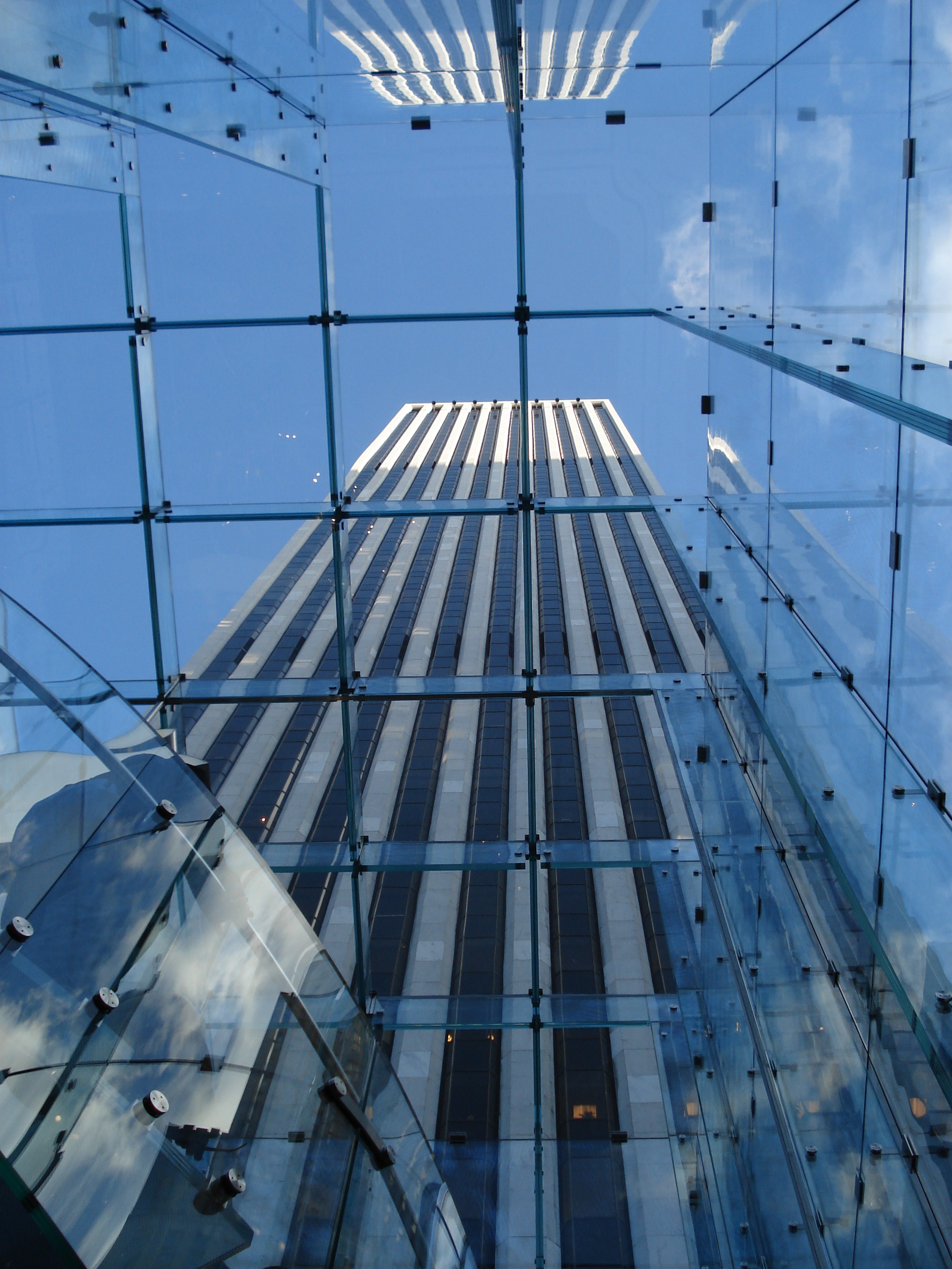
  • Kenneth Clark at Tate Britain: the great panjandrum

    Edward Lucie-Smith discovers that their tribute to Kenneth Clark is not as complimentary as the Tate thinks it is

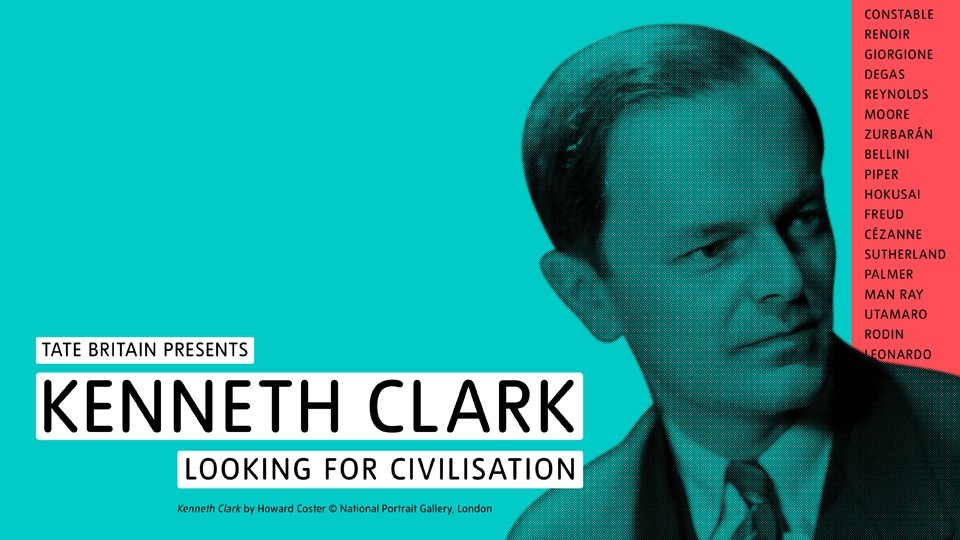
    The Tate Britain show devoted to Sir Kenneth Clark – ‘Lord Clark of Civilisation’, as he came to be called – was a slightly strange phenomenon. It defined a whole tract of the recent history of the visual arts here in Britain, but in the end fell short of being a genuine celebration. Going round it, examining what was on view, one noted how much things have changed. And at the same time, how much they haven’t.

    Clark’s career can be thought of as making a bridge between Roger Fry and the Bloomsberries on the one hand and the achievements (and failings) of Sir Nicholas Serota on the other. Brought up in what seems to have been gilded solitude – the only child of a very rich man whom the Tate catalogue describes as an idler – he was the privileged inhabitant of a variety of different but related social worlds.

    His ascent through the pre-war British art world, also through at least one major tribe of the international art world, was extremely rapid. From the circle surrounding Roger Fry he passed, with remarkable ease, into that surrounding Bernard Berenson at I Tatti on the outskirts of Florence. The famously formidable Berenson asked Clark, who was still in his early twenties, to work on a new edition of his celebrated catalogue of drawings by Florentine painters, first published in 1903, the year of Clark’s birth.

    The Tate catalogue makes some significant remarks about this, worth quoting here at some length, though with a bit of necessary compression: “The time Clark spent at I Tatti with Berenson was an education in a very different approach to art: that of connoisseurship. Having an ‘eye’ meant the ability to discern on the basis of simply looking at a work, who might have made it and when… Attribution was a gentleman’s sport, and for Clark it seemed at the time ‘the only game worth playing’. Not, he was careful to add, for the money, but for the glory of having an eye and being right.”

    Read in the context of what was actually on view at the Tate, this paragraph made a very peculiar effect. True, Clark at this period wrote an authoritative catalogue of the Leonardo drawings in the Royal Collection at Windsor. As the Tate catalogue rather smugly remarks: “[It] remains unsurpassed (if in a quite specialised genre). And many of his identifications, both attributions and de-attributions, as well as datings of the drawings, have stood the test of time.” Two genuine Leonardo drawings, plus a non-Leonardo with the same provenance, were included to prove the point.

    It was the other Old Master items that formed part of the Tate’s exhibition that supplied a bucket – several buckets – of cold water. What one got was a parade of duds. The show included, for example, the four little panels by the very minor Andrea Previtali that Clark bought for the National Gallery during his period as Director, in the belief that they were by Giorgione. Worse were some items that the great panjandrum had actually owned himself. For example, a much scraped and over-restored School of Pontormo Madonna and Child that Clark thought was an original Rosso, and a dreary John Wootton landscape that he believed to be by Claude. Also a battered fresco fragment representing a putto that he hoped was the work of Giorgione. Even undoubtedly genuine works were sometimes the dullest possible examples of a particular master.

    Clark, for example, owned two paintings by Seurat. The one shown at the Tate, The Forest of Pontaubert, was painted in 1881, when Seurat was just 21 years old. It’s an uncertain, obviously juvenile work. I don’t think Clark himself thought much of it by the time he reached old age. I met him once, in his last years, to do an interview about Graham Sutherland, one of the British artists who benefited from his support and patronage. He was then living in a spacious but curiously characterless bungalow built at the gates of Saltwood Castle, which had been handed over to his son Alan. The Seurat was not on a wall, but was propped up on the floor of a cloakroom where I went to pee. It was fairly obvious that nobody loved it or bothered to look at it.

    There were some good things in Clark’s possession, notably a group of paintings and drawings by Cézanne that he had the good fortune to buy from the artist’s heirs in the 1930s. He also once owned (but it wasn’t in the show), a large icing-sugar sweet Renoir nude from the early 1880s, now in the Pinacoteca Agnelli in Turin. This flamboyantly vulgar object would undoubtedly excite new-rich billionaire collectors if it appeared today in a Sotheby’s or Christie’s auction. Clark’s protégé Victor Pasmore said the Renoir nude set his teeth on edge, and painted a hostile paraphrase to prove it. Clark was sporting enough to buy it.

    As a practical demonstration of Clark’s pre-eminence as a connoisseur, a supreme aesthete, the exhibition was a bust.

    On the whole, the show served instead as a refutation of a once-powerful but now largely discredited myth, sedulously propagated by Berenson and his circle, and also by a platoon of other professional ‘art experts’ covering about three generations, that there existed, occupying deservedly privileged positions in civilised western societies, oracular figures who could produce the right attribution for almost any Old Master painting, drawing or sculpture, simply by gazing at it steadfastly for a few moments. Almost nobody believes that today.

    Kenneth Clark’s importance to the art world was quite other, and had nothing to do with his failings as a connoisseur. His gifts were as an administrator and, above all, as a communicator. As director of the National Gallery during the war years he saw to the safety of the collection and yet kept the gallery alive as a cultural focal point in a London battered by bombing. He brought a group of leading British artists together – prominent among them Henry Moore, John Piper and Graham Sutherland – who seemed to express some kind of national essence.  During the war they made works that successfully heroised and commemorated the national ordeal, drawing on pre-Modernist roots in the English Romantic tradition. This development did a great deal to reconcile a previously sceptical middle-class public to the ideas and theories of the 20th century Modern Movement.


    Above all, he wrote books that communicated ideas and theories about art in clear, non-specialist terms– The Nude and Landscape into Art are cases in point. And he engaged with the new mass medium of television. The Nude, with its crucial distinction between ‘the naked’ and ‘the nude’, remains influential today, though it was published as long ago as 1956. Some scholar needs perhaps to go through it now, and calibrate what it says with the rise of Pop Art, where representations of the nude play no inconsiderable a part. Are Pop nudes ‘ideal forms’? In a way, yes, they are. Come to think of it the sugar sweet Renoir nude that Clark once owned takes on a different inflection if one examines it in the light cast by the Pop movement.

    Most of all, Clark embraced the new medium of television. The marriage was at first sight a curious one. While being obviously at ease in front of the camera, he lost no trace of his grandee manner. In fact, it qualified him to tell us what he was confident we didn’t know.

    Looked at now, Clark’s conception of ‘Civilisation’ seems limited. It is essentially Western, though he had an early taste for Japanese art – Japanese prints were almost the first things he collected. André Malraux’s concept of an ‘imaginary museum’ or ‘museum without walls’, embracing all visual cultures, was first presented to the public in 1947. Clark’s Civilisation series began transmission as late as 1969, a whole generation after that.

    It is possible to see Civilisation as a very successful attempt made by the then existing establishment to retain control of the cultural narrative. A similar sort of attempt, though with somewhat less success, is currently being made by the collective of Tate galleries. One is the very space where the exhibition devoted to Clark took place.

    Something that has changed quite radically since the reign of Clark is the way in which ideas about art – indeed ideas about everything – are communicated. Television centralised communication, but its period of total domination was remarkably short. The Internet has instigated a rapid devolution, a change from the hierarchical to the democratically lateral. Our taste in presenters has changed too. In October 2013 Grayson Perry gave the first of the most recent series of Reith Lectures, one of the BBC’s most sacred occasions. It was recorded, sure enough, in the equally sacred halls of Tate Modern. Perry was as much at ease as his predecessor Sir Kenneth, while performing a very similar task, and addressing, one is permitted to think, a similar audience. The visual aspect of the event did at first seem quite different. What you got when you looked at the screen was not a grandee in a Saville Row suit, but the Widow Twanky in her best frock. Shut your eyes, however, and the slightly posh accent was exactly the same. Clark’s legacy lives on, despite the evolution of technology.

  • Matisse at the Tate: cut and paste

    Edward Lucie-Smith admires an ambitious exhibition but with the reservation that something is missing

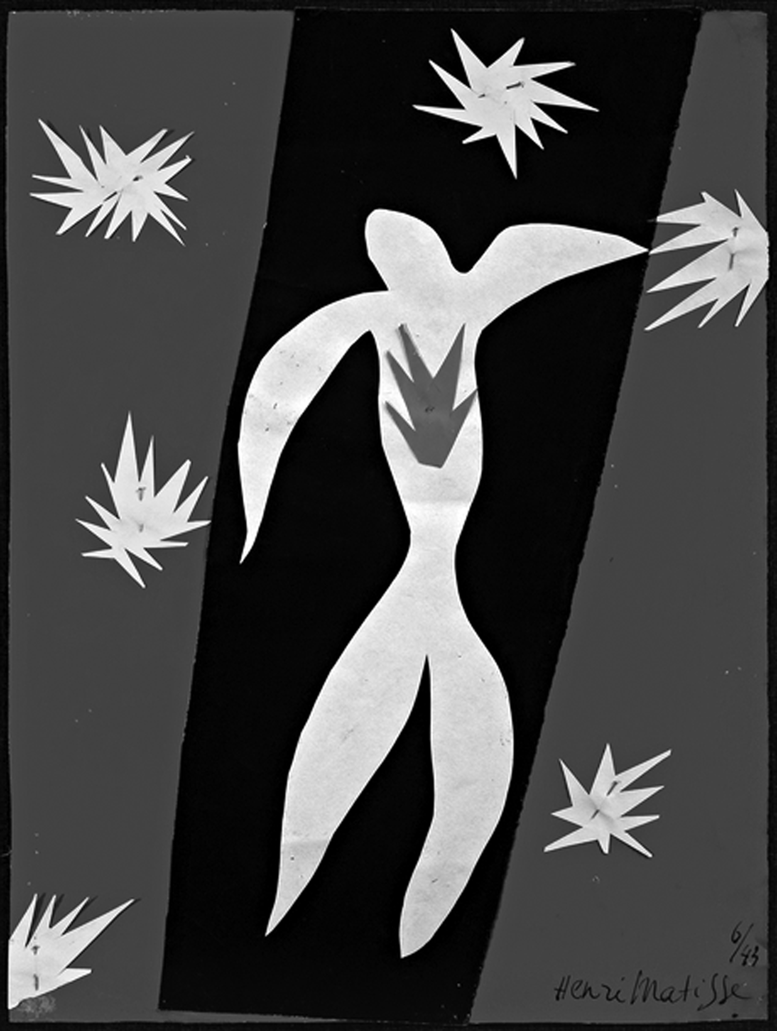
    The big new exhibition of Matisse’s Cut-Outs at Tate Modern in London is, certainly on the face of it, everything that a major museum of Modern and Contemporary Art should be doing. It is beautifully presented, very professionally curated, has an extremely thorough, excellently illustrated catalogue and has been greeted with ecstatic reviews. It is thronged with visitors, but fortunately not to the point of suffocation (as was the case, alas, with the National Gallery’s recent Leonardo da Vinci exhibition). The rooms in which it is shown are big enough to allow the visitor enough space to view the exhibits from a variety of distances, and the works themselves are often on a suitably grand scale.

    I departed from it thinking that here was exactly the kind of show that an institution of this kind ought to present. Tate Modern is, currently, the most visited gallery of modern art in the world, outstripping both the Museum of Modern Art in New York and the Pompidou in Paris, although, to be frank, its own permanent collection is not on a par with the stellar holdings of either of these rivals. It was only after I left that doubts began to make themselves felt, and I’m not sure that these doubts are the fault of Tate Modern or of the organizers of the occasion. Perhaps they are inherent in our present cultural situation, where the creative force of the Modern Movement seems to be inexorably dwindling away.

    Just over 113 years ago, in November 1910, the Grafton Galleries in London opened a show called Manet and the Post-Impressionists. It was apparently the first time that the term ‘Post-Impressionist’ was used in English. Matisse, who had sprung to fame at the Paris Salon des Indépendants of 1905, was one of the artists included. The British press was excoriating about the exhibition. The anonymous reviewer in The Times of London commented that the work shown “throws away all that the long-developed skills of past artists had acquired and bequeathed. It begins all over again – and stops where a child would stop.” How times have changed!

    Yet it is immediately obvious that in some respects Matisse’s work during his last years did not move very far from what was shown in Paris in 1905 and in 1910 and in London. The famous Luxe, calme et volupté, shown at the Indépendants in 1905, and now in the collection of the Musée d’Orsay in Paris, is a very recognizable ancestor of the compositions with nudes shown in London.

    What changed was the technique. The compositions were no longer painted, they were made with pieces of cut paper. Matisse did the cutting, and the papers he used were painted in gouache to his exact specifications. Once cut, they were pinned in place according to his directions.

    Matisse had already experimented with designs made from cut and pasted paper in the 1930s – the projects he tackled included decors for the ballet and maquettes for book covers. When he did these collage was already long established as one of the typically ‘modernist’ methods of image making. Picasso and other Cubists had made radically experimental use of it. Collage techniques had also been extensively employed by amateur artists throughout the 19th century. Interestingly the word ‘collage’ seems to be absent from the catalogue. Matisse was not completely an innovator in this phase of his work.

    The real starting point for the Cut-Outs was the serious illness that Matisse suffered from in 1941. He was operated on for duodenal cancer and nearly died from resultant complications. As a result he was unable to stand up for long periods, and had to make art while seated in a wheel chair, from another specially adapted chair, or reclining in his bed. Using scissors and cut paper he could, with the help of assistants, continue to create work on an ambitious scale.

    Because of Matisse’s long-established celebrity the process of making these works and the various stages they went through were extensively documented photographically. The catalogue published in connection with the current Tate Modern exhibition has a very rich series of illustrations of this kind, made by various photographers, some working under the artist’s direction, and some not.

    If one reads the Tate catalogue attentively, it is possible to detect a certain note of nostalgic regret that appears when these records of the images in situ in Matisse’s several studios are discussed. What the authors of the various essays seem to long for is permission to hail Matisse as the pioneer, perhaps even the God the Father, of the current Post Modernist tendency to promote installation as the pinnacle or ne plus ultra of late Modernist and Post-Modernist creativity. The problem is that they can’t quite bring themselves to say this in so many words. As it happens, their silence is justified by what one actually sees at the Tate.

    Wonderfully decorative as many of them are, it is clear that a certain loss of freshness took place when the Cut-Outs were removed from Matisse’s studio and made ready for public exhibition. All too often, one feels as if one is looking at an exquisitely beautiful, immaculately preserved corpse. There is another problem as well. The aged Matisse, armed with a pair of scissors, confidently slicing through the sheets of coloured paper prepared for him, was wonderfully skilful at simplifying natural forms – nude female bodies, birds, fish, leaves, even algae floating in water. Yet the compositions only occasionally add up to something more than decoration. Some extra dimension of emotion is missing.

    Towards the end of the presentation there is something not technically a Cut-Out – a stained glass window called Christmas Eve, commissioned by Time Inc. in New York. The composition is curiously perfunctory – banal symbolism for a safely ecumenical Christmas card.

    Despite the fame of the Matisse-designed chapel at Vence – maquettes for its windows are also included in the show – religious emotion was clearly not part of Matisse’s temperament. With this exhibition ‘What you see is what you get’. Exactly what you get – don’t ask for more. I left thinking it was 99% wonderful, and regretting the missing one per cent perhaps more than I should have done.

  • Perming eight from twelve: Lowry and the painting of modern life at Tate Britain

    Perming eight from twelve: Lowry and the painting of modern life at Tate Britain

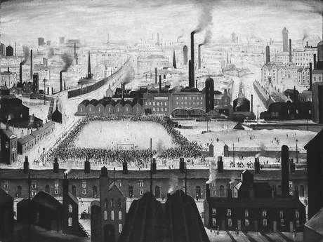
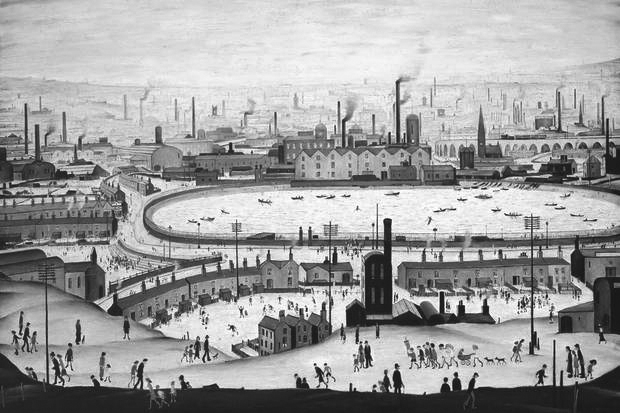
    Lowry deserves treatment as a serious artist, though more usually such an approach is denied him because of, firstly, his suspiciously wide popularity and, secondly, what is mistakenly characterised as stylistic primitivism. A strong whiff of the patronizing informed reviews of this exhibition, as though the work was a tad unsophisticated for critics used to rambling on for pages about the corners of conceptualism they prefer. The tongue-in-cheek reference in the exhibition title, Lowry and the Painting of Modern Life, didn’t help because it aligned the Mancunian to a story of modern art that doesn’t really apply to him – even the curators’ inspired casuistry couldn’t shoehorn a sui generis Lowry into any wider avant-garde narrative. Guys, Manet and Baudelaire are one thing, the experiences of a visually alert rent collector a lifetime afterwards quite another. That said, this is an excellent exhibition, intelligently, provocatively organized and with catalogue essays more elegantly written and thought through than the drivel customarily accompanying Tate advertisements for recent art. Even for those of us who met him and have often agonised over the real significance of his work, this exhibition helps us to see the Lowry phenomenon more clearly than ever we did before.

    Let’s put one fallacy to bed straightaway. If his pictures look hamfisted it was because he was happy for them to look that way. He knew exactly what he was saying with his style, was knowledgeable about events in both the art of his time and just before, and if his work appears mechanically simple then this was as deliberate as the simplifications and shortcuts informing much else in museum-approved Modern Art. His avoidance of clever-dick explanations when talking about his pictures, for example, is entirely refreshing in the context of unintelligible spoutings by the likes of the usual suspects.

    He attended art school for ten years, where he had a fine teacher whom he respected. Lowry’s personal solution to his own peculiar expressive needs arrived only slowly – as with Constable he was a late developer. And like many who discover an instantly identifiable personal idiom, he stuck to it because it worked, both for him and, more increasingly, for his rapidly developing and appreciative market. This ‘look’ said what he wanted and there is almost no stylistic development from first to last, except that as a pictorial formula it became tired and the execution slapdash. He must have been aware himself – perhaps even painfully – of this late tendency to self-parody. In the industrial scenes at least, his technique, brushwork and approach remained essentially unaltered for nearly fifty years. Painting conventional industrial landscapes, based on observation and spiced with a splash of ‘impressionism’, would not have spoken in the same way. In order to pack in the kaleidoscope of his observations he needed to invent and combine disparate elements, for his, more than most, is an imagined world inspired though it was by actual experience. The working class was for him amusing and impenetrable, a species apart to be observed with curiosity.

    Like Stanley Spencer, Lowry realized from an early age that his subject was all around him. So what inspired this new style? It is tempting to attribute the reason to the fact that his teacher, Adolph Valette (1876-1942), painted the concentration of industry and suffocating air of Manchester and Salford in a way which must have seemed startling to those for whom city scenes were suspect subjects for serious art. Clearly Lowry realised that Valette had exposed the potential of a vital new subject, at least to his eyes. He might also have been aware of Pictorialist photographs by John Dudley Johnson (1868-1955) showing the gloomy effects of a century of industrial revolution on inner Manchester and Liverpool. Both these guides demonstrated that ugliness and filth might be redeemed by beauty of form. Is it too fanciful a suggestion that, as a rent man, Lowry trudged about the city with eyes awakened by his tutors to the unique shapes inflicted on open spaces by heavy and uncontrolled industrial development?

    Lowry’s archetypal industrial ‘scene’ began to emerge around the First World War – a conflict in which he did not fight. From 1909 his family, though desperately aspiring to the middle class, lived modestly in Pendlebury, a working class suburb of north Salford overlooking the Irwell valley. As Ian Jack recently pointed out in the Guardian, this exact area was described by J B Priestley in English Journey in 1934 as having “an ugliness so complete that it is almost exhilarating … it challenges you to live there”.

    Lowry was daily aware of this mesmerising, infernal panorama as soon as he opened his front door. Additionally, his duties as a rent collector introduced him to the sights of even more disadvantaged areas than his own. Just as Charles Dickens and Frank Holl toured the East End of London in pursuit of hard-hitting subjects, so Lowry walked the east of Manchester to observe the raw desolation of the other half. Even within the working class itself, Lowry’s beat of Harpurhey, Ancoats, Miles Platting, Beswick and Newton Heath were renowned as a cut below the rest. As late as the 1950s, and my own experience, these were still scarily impoverished places. Lowry’s view of ragged, hopeless, exhausted people is more accurate than quaint. Luckily for him, social life took place outdoors. Few were the cars and, whenever possible, children especially tended to live in the street in preference to their dark, damp houses. It was impossible to walk around Manchester in the 1950s and not notice cripples, the mad and utterly destitute who were prominent on virtually every street. No             question there is a truth at the heart of Lowry’s vision.

    He tried to paint with originality what he knew, but there is no trace of political motive or social criticism in what he describes. He merely watches, fascinated. Factories, gasometers, coolers, ginnels, long viaducts, cobbles, collieries, bird-cage bridges, back-street bookies, chimneys, churches and classical chapels, and mill blocks interspersed with the incidents of daily life; brawling, death, arguing, evictions, accident, toil and chronic need… These are the elements used by the outsider to orchestrate his scenes with their syncopated verticals tiptoeing across the picture. Each is a complete world in itself. And it’s always grey, weather-free, even on Bank Holiday Monday.

    Immediately on entering the exhibition, you realize how draining and repetitive this all is, the mood unaltering, relentless. He painted the same picture with the same message in slightly different ways. And most of what comes after 1955 is the work of a retired, comfortable old gent with time on his hands. You also realise that the style doesn’t travel well. Specifics originated for one location look contrived when applied elsewhere. With few exceptions, perhaps a handful of scenes in Sunderland, his work depicting places outside Lancashire, is  unsuccessful, the effect half-hearted. They reek of tourism, of holiday art, of unfelt work which didn’t need to be made. The panoramas of South Wales, for example, are failures for being half topography and half ‘style’. Even the considerable natural gift, apparently effortless, for achieving compositional balance deserts him in these scraps and oddities. A more selective artist would have destroyed them. If you lived in Lowryland and were fortunate to escape it for a few days, when you returned it instantly struck home that nowhere else, anywhere, looked anything like this particular place.

    The exhibition shows us Lowry’s originality and his limitations. There is truth here, yes, about both the mental and physical conditions of the interwar populace, but it is hard to escape a conclusion that his descriptions, seen like this en masse, quickly arrive at decoration and formulaic pattern. Repeated mannerisms obstruct the emergence of something more profound from what was a horrifying subject.

    David Lee

  • Martin Creed: new definitions for ‘gift’

    Regular readers may recall from a recent editorial that when ‘we’ bought Yinka Shonibare’s Trafalgar Square bottle to stand outside the National Maritime Museum ten times more was paid for it than had ever been paid for a work by this artist at auction.

    That story of casual profligacy is now repeated in respect of inarticulate chancer Martin Creed, whose entire career is the creation of State Art. Without the life support machine of public patronage the likes of Creed would be stacking shelves.

    In September 2013 the Tate bought Creed’s work no. 227, the lights going on and off, for £122,000, to add to the twelve other works it already owns by him. In passing, one of these is an editioned sheet of paper with ‘fuck off’ typed on it, a masterpiece considered so significant the British Council also owns it; indeed, four of the five Creed works in the British Council’s collection are duplicated in at least one other of the Tate’s, the Government’s or the Arts Council’s holdings. The Art Fund contributed £40,000 of their charitable donors’ money to the acquisition of no. 227. The fact that the Fund had already contributed to seven other Creed ‘gifts’ to the Tate via the Artist Rooms Endowment and to another work for the Scottish National Gallery of Modern Art indicates the now symbiotic relationship existing between The Art Fund and State Art – the Fund’s head is, of course, a former director of Tate Britain. To call this network an incestuous racket is to compliment it.

    Ownership of work no. 227 is in the form of a certificate bearing a terse description of the piece, which comes officially in an edition of two plus one artist’s proof. The idea of an ‘artist’s proof’ existing for a sheet of typed paper is, of course, ridiculous, a misuse of an otherwise important distinction. Sadly, this is the sort of mercenary scam we have come to expect from fashionable contemporary art. Work no. 227 is actually in an edition of 3. One of the other two pages was bought in 2005 by the Museum of Modern Art in New York, one of seven Creeds in their collection. MoMA won’t say how much they paid for no. 227 as they don’t “share information about the acquisition of objects”.

    £122,000 is a sum significantly greater than has ever been paid for any other work by Creed. It should have cost much less. A more financially savvy Tate could have bought at auction a similar work in July for a quarter of this sum.

    In 2001 Creed won the £20,000 Turner Prize. He was nominated for a touring retrospective – he was the grand old age of 32. His Turner exhibition party piece was, famously, work no. 227, which was ‘made’, typed presumably, the year before. It caused the kind of concerted debate which instantly projects a merely notorious work to the status of modern classic. Creed became famous overnight. Before the Turner parade, the Tate could have bought no. 227 for well under £10,000.

    When tracking sales of such works the process is confused because there are at least two durations of lights, of five seconds (work no. 227) and thirty seconds (work no. 127), which are sold as different pieces. Then there are other works in which lamps go on and off and buildings in which all the lights are turned on and off at the same time. It is symptomatic of State Art that once a line of merchandise becomes established in the canon, its secure infamy can be milked for profit: perhaps the best example of this is that there are now no fewer than nine pickled sharks.

    In 2010 Creed gave an interview to The Independent in which he stated that he had given the lights going on and off (in its Turner Prize manifestation of five seconds duration), worth, he claimed, £110,000, to the Tate. This was among seven other works, also ‘gifts’, which he claimed were worth £162,000. At this time he refers to the lights being in an edition of three with the other two being in “private collections”. ‘Private collection’ is a curious way – is it not? – of describing MoMA New York.

    In fact, this was all my eye and Peggy Martin, the on-off light was not included in any ‘gift’ otherwise the Tate wouldn’t have had to pay over the odds for it in 2013. And of the seven other works in the Tate’s collection which are said to have been gifts, all are stated on the Gallery’s website as having been contributed to by the Artists’ Rooms Endowment, the Henry Moore Foundation and Tate Patrons. When this group were exhibited at Tate Liverpool in 2012 they were described in publicity material as ‘gifts’. Demonstrably this is nonsense. I have been unable to ascertain – not least because none of the parties will tell me – what proportion of this group acquisition was a genuine gift. We should all be interested to know, if only because the value of these works stated by Creed – £162,000 – is a colossal misrepresentation of their real market potential. Of the seven works ‘gifted’ four are watercolours – crude ziggurats painted in diminishing horizontal blocks of different colours – from a series which until recently fetched between £350 and £1,700 each at auction. For some reason these scraps are very popular with State Art; the British Council and the Government Art Collection also have one each. The other three works ‘gifted’ might have fetched fifty grand on a good day. £162,000 for this stuff is daylight robbery.

    On July 1st in Christie’s evening sale – i.e. a sale usually reserved for blue chip material – Creed’s no. 127 was offered. It was No. 2 in an edition of 2 (also actually 3!). This work had sold first in 1995, then in 1996 for £3,000, and in 2006 at a Kentucky auction for £22,000. The estimate this time (based no doubt on the common knowledge of what the Tate had forked out for their five-second version) was pitched at £50,000 to £70,000, doubtless in the hope that with some fancy footwork an auctioneer might edge the hammer price towards the magical six figures. Christie’s pulled out all the stops, praising its “minimal elegance and formal drama”. They went on: “By redefining the parameters of the viewer’s experience and rupturing perceptual norms, Creed forces us to engage with our surroundings in new and provocative ways.” Naturally, they didn’t bother explaining how our ‘perceptual norm’, whatever that is, had been ‘ruptured’ and what exactly ‘provocative’ might mean in the context of a light being switched on and off. Even had it sold for its high estimate, no. 127 would have been the cheapest work in the auction by four times. On the big night bidding never got beyond £32,000 and it didn’t sell. Not even the artist’s dealer, Hauser and Wirth, was prepared to underwrite the low estimate price, which is unusual in an evening sale where a conspicuous failure can fatally wound a reputation. This showed a distinct lack of faith all round in Creed’s market viability. Christie’s won’t answer questions on this fiasco and mention of it was left out of post-sale results. And as far as the auctioneer’s website is concerned no. 127 has ceased to exist. Rest assured we won’t be seeing a work by Creed feature in a flagship auction any time soon.

    At Christie’s the day after no. 127 failed, another Creed, a watercolour ziggurat from the same series as four of the seven works ‘gifted’ to the Tate said to be worth £162,000, sold for £2,500 – the lowest sum achieved in the auction. The day before at Sotheby’s a large neon work, also akin to one in the £162,000 ‘gift’ sold for £10,000, which was 25% below its low estimate.

    In the context of this embarrassing rejection, the Tate’s acquisition of no. 227 for £122,000 looks like a reckless waste not only of their own money but of The Art Fund’s and the work’s other donor, a dodgy Ukrainian oligarch. They were all taken for a ride.

    If they must buy fashionable trash like no. 227, the Tate should be instructed to do so at auction instead of buying expensively elsewhere. We should also be told what is their working definition of a ‘gift’. And I’ve mentioned many times before the wastefulness of State Art’s main collections buying the same stuff.

    David Lee

  • The Art Fund subverted: they were only playing leapfrog

    The separate bodies contributing to State Art are now so interrelated, so cosily acquainted, their personnel so readily interchangeable and of identical mindset, that they might as well join forces. (… Liz Forgan is sacked from the Arts Council but remains a Trustee of the Art Fund; James Lingwood swallows his annual  million from the Arts Council and also sits as a Trustee of the Art Fund which has bought a work he commissioned, and so on – I could fill this column ten times over with similar complacent overlaps.) Imagine the savings on personnel and rent alone if the Contemporary Art Society (now funded and run by a former employee of the Arts Council), The Art Fund (headed by an ex-director of the Tate), the Arts and British Councils and the Tates (also directed by a former Arts Council employee) stopped pretending they pursued distinct objectives and pooled resources.

    The Art Fund is the latest to dump any semblance of independence. It is nominally a charity, if, that is, you count bankrolling the already well supplied as ‘charitable’. If the Salvation Army doled out caviare to nobs in Mayfair there would be a fuss. But the Art Fund regularly does the equivalent.

    It was founded by altruists in 1903 solely to help museums buy works of art. It gives £6.3 million a year in grants, spreading it thinly across scores of acquisitions, including some important ones. Its core activities are still nobly worthwhile and more than ever necessary.

    Recently, it announced it would fund two British tours: Jeremy Deller’s ‘immersive works’ (don’t ask) created for the British pavilion at this summer’s Venice Biennale, and Grayson Perry’s six large caricature tapestries on the subject of British life and taste. Why is a charity sponsoring the promotion of Perry and of a Tate trustee, Deller, who are among the most visible, wealthy and successful of recent British artists? And why aren’t their dealers paying for these tours from which they will all benefit? Deller’s exhibition in Venice, funded by the British Council (the tour of his inflatable Stonehenge is already, by the way, covered by the Arts Council), cost over half a million of public money to stage. Why is Deller worth even more from the limited resources of yet another much tinier charity? None of this makes sense. Unless of course there is a privately agreed national consensus between a raft of organisations, public and private, whose objectives – for whatever reason – are to promote the same few reputations.

    In their recent accounts the Fund crows its contribution of £200,000 towards Rachel Whiteread’s infantile defacement of a listed masterpiece, Charles Townsend’s Whitechapel Art Gallery. Again, here is lavish support of a successful, regularly exhibited artist represented by a leading world dealer. Charity? Really? Additionally, they funded the Tate’s purchase for £125,000 of five Whiteread ‘drawings’, or diagrams as they used to be known – they now have 30 of her works.

    The Fund also oversees the annual £100,000 Gulbenkian Museum of the Year whose judges are perennially lazy, predictable and uninspired. It is responsible too for administering ‘Artists’ Rooms’, an overpriced and dubious blunt instrument of State Art which ensures the circulation of work by top brands around regional museums, apparently ­– God help us – in perpetuity.

    The Fund’s magazine, Art Quarterly, formerly a purveyor of scholarly articles, is now a yappy promotional brochure for State Art. The current issue advertises three artist trustees of the Tate, each of whom receives the Fund’s cash. In the case of Wolfgang Tillmans, they contributed £95,000 towards buying 15 of his pictures for Glasgow Art Gallery having the previous year given £62,000 for the purchase of nine others of his works by the Arts Council, which has £450 million a year of its own to spend. The Tate already owns 62 works by Tillmans. Why this obsession with an indifferent German photographer?

    But all is not bleak. In 2011 when the Fund announced public purchase of Yinka Shonibare’s Fourth Plinth bottle the published cost was £362,500. As we demonstrated at the time this was a lie repeated in all newspapers. In their recent accounts the figure has now shot up to £650,000. They’re getting there, slowly.

    David Lee

    The Jackdaw, September/October 2013