Tag: Martin Creed

  • Sense and Sensibility

    HalfordsSo it’s goodbye Cornelissens hello Halfords.

    Laura Gascoigne parks her brush and tries to follow the instructions for flatpack art, but has the picture upside down

    It’s a dull job being a customs officer, sitting on the border twiddling your thumbs until the next teenage drugs mule comes along. So it must have added to the gaiety of nations when in 2010 the EU Commission passed a ruling imposing full VAT import duty on electrical components and household appliances used in art. Henceforth disassembled light tubes from a Dan Flavin sculpture would be charged full whack at 20% of the work’s value instead of the preferential ‘art’ rate of 5%. It might be art when assembled in the gallery, ran the argument, but disassembled in transit it counted as light fittings. Sic transit gloria artis mundi.

    The wheels of the European Commission grind exceedingly slowly, but they’d better sort this one out before it causes tailbacks at Dover while fine art carriers loaded with DIY supplies discuss the finer points of art theory at Customs. Outsider artists have always used materials from hardware stores – nail mosaics are a popular genre, and a sealant Jesus sold a few years ago for £750 – but now that the definition of ‘found object’ has been extended to objects found in the aisles of Wickes, the DIY aesthetic has official sanction.

    We should have seen it coming when Jim Lambie was given planche blanche in 2003 to cover the floor of the Duveen Galleries at Tate Britain in trippy stripes of multicoloured vinyl tape. The previous year, the Taiwanese artist Michael Lin had carpeted the Palais de Tokyo in Paris in giant pink flowers inspired by Taiwanese embroidery. Since then the flooring contractors have been gaining ground, and commercial galleries are now entering the market. Two years ago the Alan Cristea Gallery transformed itself into a flooring showroom with the site-specific installation D.I.Y by Richard Woods, who covered walls and floor “in his trademark vibrantly-coloured and exaggerated wood-grain motif… installed as parquetry”. Naffness being a key ingredient in the DIY aesthetic’s demotic appeal, there is now apparently an art market for parquet.

    When Martin Creed clad the walls and floors of the downstairs toilets at the London Library’s new Mason Yard extension in his trademark vibrantly-coloured patchwork of marble tiles, I suspect he didn’t do the grouting himself, belonging as he does to the ‘You Do It’ YBA boomer generation. Today’s austerity generation of DIY strivers is more hands-on. For the tar and rubber paintings in his exhibition Freedom of Assembly at White Cube, Bermondsey (until July 5th), African American social practice artist Theaster Gates conscientiously developed “good roofing strategies… to arrive at painting or at least to get to the essence of roofing.”

    The aim these days is no longer for a high-tech Hirstian finish designed to appeal to billionaire collectors, but for a low-tech Bodgit & Scarper look – an abject object – worthy of exhibition in a socially responsible public gallery. It’s one in the eye for modernism’s utopian belief in the transformative power of functional form. As Ralph Rugoff said of the 30 international artists in the Hayward Gallery’s 2010 exhibition The New Décor, “what unites them is their ability to transform objects we associate with the everyday – a bed, a shelf, a lamp – into something uncanny and compelling [so as to] open up the discussion about interior space… with interpretations ranging from the absurd to the abject to the lyrical.”

    In this context, the lyrical tends to take the form of nostalgia for the bright new dawn of the post-war DIY movement. Today’s social anthropologists may claim that self-assembly furniture puts the contemporary male in touch with his hunter-gatherer roots – apparently it’s a stag night ritual in Sweden for the groom to bid a final adieu to bachelordom by assembling a piece of IKEA furniture – but wrestling a flat pack to the ground in a drunken stupor is a piece of piss compared with the challenges facing the original DIY pioneers. Their frontier spirit was celebrated in Untitled: Simparch, a 2005 exhibition at Tate Modern in which a group of American artists used instructions from the 1960s popular manual Plywood Working for Everybody to produce a range of exhibits from a ‘Fishing Tackle Cabinet’ to a ‘Storage Headboard’. The Tate described these objects, unfairly I thought, as “elements of an affluent, post-war vision of suburban domestic living” whose need was “fuelled by the ownership of material goods rather than basic necessity”. It seems to me that a fishing tackle cabinet is a must-have accessory for any hunter-gatherer, ditto a cupboard for storing trophy heads.

    But seriously, can this stuff be considered art? Those with doubts on the subject may be reassured to learn that amongst Franz Kafka’s early works was a volume entitled Accident Prevention Regulations in the Use of Wood-Planing Machines, dating from the author’s formative period in ’elf and safety (during which he is also said to have invented the hard hat). A Kafkaesque edge of surrealism is what most DIY artworks appear to aspire to. In 2003 the artist-run gallery Cubitt, at the cutting-edge of plywood as of so much else, hosted an exhibition cheerily titled HEY PRODUCTION! that took its cue from another pioneering handbook, Victor Papanek and James Hennessey’s Nomadic Furniture (1973). The show was organised by the self-styled Copenhagen Free University, a Danish outfit specializing in disseminating “forms of knowledge that are fleeting, fluid, schizophrenic, uncompromising, subjective, uneconomic, acapitalist, produced in the kitchen, produced when asleep, arisen on a social excursion – collectively”. They may have missed the passage in Kafka’s handbook warning against operating machinery when asleep, but fortunately no injury seems to have resulted.

    It’s fair to say that, apart an unhealthy obsession with subverting sideboards and debunking bunk beds – The New Décor included a bed shaped like an LA freeway overpass by Cuban carpentry collective Los Carpinteros – the DIY art movement does no real harm. All art is Do-It-Yourself, after all. If you’re alone in your studio, who else is going to do it? And functional failure is something every artist is familiar with. As the Swiss sculptor Urs Fischer put it in an interview: “As soon as I start to work with materials, things go wrong.” Still, when Baudelaire defined ‘modernity’ as “the ephemeral, the fugitive, the contingent; the half of art whose other half is the eternal and the immutable,” he wasn’t thinking of plywood, he was thinking of paint, a medium in which an eternal and immutable record of the ephemeral and fugitive can be trapped. DIY art is a whole other ball game: it makes a fetish of the fugitive and laughs at eternity. In Baudelaire’s artistic terms, it’s a game of one half.

    On this year’s Turner Prize shortlist is a collective of designers and architects calling themselves Assemble who “embrace a DIY sensibility”, according to the Tate. They’ve been nominated for their work with local communities improving a rundown estate in Toxteth, Liverpool and ‘rethinking’ an adventure playground in Dalmarnock, Glasgow. Adrian Searle predicts that making the world a better place through DIY efforts “is something artists… are going to have to be doing a lot more of in the coming years”. He may have a point, but it’s a limited one. DIY efforts can turn pedestrian dreams into reality, but only art can turn pedestrian reality into dreams.

    Laura Gascoigne
  • Martin Creed: new definitions for ‘gift’

    Regular readers may recall from a recent editorial that when ‘we’ bought Yinka Shonibare’s Trafalgar Square bottle to stand outside the National Maritime Museum ten times more was paid for it than had ever been paid for a work by this artist at auction.

    That story of casual profligacy is now repeated in respect of inarticulate chancer Martin Creed, whose entire career is the creation of State Art. Without the life support machine of public patronage the likes of Creed would be stacking shelves.

    In September 2013 the Tate bought Creed’s work no. 227, the lights going on and off, for £122,000, to add to the twelve other works it already owns by him. In passing, one of these is an editioned sheet of paper with ‘fuck off’ typed on it, a masterpiece considered so significant the British Council also owns it; indeed, four of the five Creed works in the British Council’s collection are duplicated in at least one other of the Tate’s, the Government’s or the Arts Council’s holdings. The Art Fund contributed £40,000 of their charitable donors’ money to the acquisition of no. 227. The fact that the Fund had already contributed to seven other Creed ‘gifts’ to the Tate via the Artist Rooms Endowment and to another work for the Scottish National Gallery of Modern Art indicates the now symbiotic relationship existing between The Art Fund and State Art – the Fund’s head is, of course, a former director of Tate Britain. To call this network an incestuous racket is to compliment it.

    Ownership of work no. 227 is in the form of a certificate bearing a terse description of the piece, which comes officially in an edition of two plus one artist’s proof. The idea of an ‘artist’s proof’ existing for a sheet of typed paper is, of course, ridiculous, a misuse of an otherwise important distinction. Sadly, this is the sort of mercenary scam we have come to expect from fashionable contemporary art. Work no. 227 is actually in an edition of 3. One of the other two pages was bought in 2005 by the Museum of Modern Art in New York, one of seven Creeds in their collection. MoMA won’t say how much they paid for no. 227 as they don’t “share information about the acquisition of objects”.

    £122,000 is a sum significantly greater than has ever been paid for any other work by Creed. It should have cost much less. A more financially savvy Tate could have bought at auction a similar work in July for a quarter of this sum.

    In 2001 Creed won the £20,000 Turner Prize. He was nominated for a touring retrospective – he was the grand old age of 32. His Turner exhibition party piece was, famously, work no. 227, which was ‘made’, typed presumably, the year before. It caused the kind of concerted debate which instantly projects a merely notorious work to the status of modern classic. Creed became famous overnight. Before the Turner parade, the Tate could have bought no. 227 for well under £10,000.

    When tracking sales of such works the process is confused because there are at least two durations of lights, of five seconds (work no. 227) and thirty seconds (work no. 127), which are sold as different pieces. Then there are other works in which lamps go on and off and buildings in which all the lights are turned on and off at the same time. It is symptomatic of State Art that once a line of merchandise becomes established in the canon, its secure infamy can be milked for profit: perhaps the best example of this is that there are now no fewer than nine pickled sharks.

    In 2010 Creed gave an interview to The Independent in which he stated that he had given the lights going on and off (in its Turner Prize manifestation of five seconds duration), worth, he claimed, £110,000, to the Tate. This was among seven other works, also ‘gifts’, which he claimed were worth £162,000. At this time he refers to the lights being in an edition of three with the other two being in “private collections”. ‘Private collection’ is a curious way – is it not? – of describing MoMA New York.

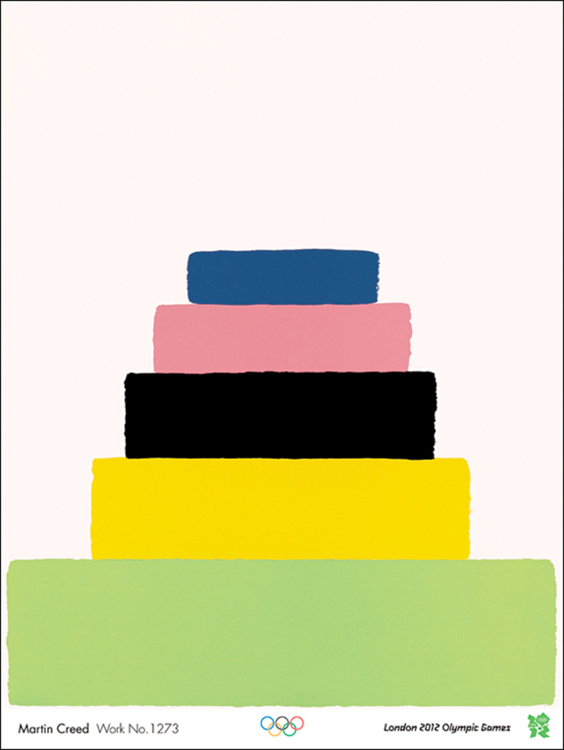
    In fact, this was all my eye and Peggy Martin, the on-off light was not included in any ‘gift’ otherwise the Tate wouldn’t have had to pay over the odds for it in 2013. And of the seven other works in the Tate’s collection which are said to have been gifts, all are stated on the Gallery’s website as having been contributed to by the Artists’ Rooms Endowment, the Henry Moore Foundation and Tate Patrons. When this group were exhibited at Tate Liverpool in 2012 they were described in publicity material as ‘gifts’. Demonstrably this is nonsense. I have been unable to ascertain – not least because none of the parties will tell me – what proportion of this group acquisition was a genuine gift. We should all be interested to know, if only because the value of these works stated by Creed – £162,000 – is a colossal misrepresentation of their real market potential. Of the seven works ‘gifted’ four are watercolours – crude ziggurats painted in diminishing horizontal blocks of different colours – from a series which until recently fetched between £350 and £1,700 each at auction. For some reason these scraps are very popular with State Art; the British Council and the Government Art Collection also have one each. The other three works ‘gifted’ might have fetched fifty grand on a good day. £162,000 for this stuff is daylight robbery.

    On July 1st in Christie’s evening sale – i.e. a sale usually reserved for blue chip material – Creed’s no. 127 was offered. It was No. 2 in an edition of 2 (also actually 3!). This work had sold first in 1995, then in 1996 for £3,000, and in 2006 at a Kentucky auction for £22,000. The estimate this time (based no doubt on the common knowledge of what the Tate had forked out for their five-second version) was pitched at £50,000 to £70,000, doubtless in the hope that with some fancy footwork an auctioneer might edge the hammer price towards the magical six figures. Christie’s pulled out all the stops, praising its “minimal elegance and formal drama”. They went on: “By redefining the parameters of the viewer’s experience and rupturing perceptual norms, Creed forces us to engage with our surroundings in new and provocative ways.” Naturally, they didn’t bother explaining how our ‘perceptual norm’, whatever that is, had been ‘ruptured’ and what exactly ‘provocative’ might mean in the context of a light being switched on and off. Even had it sold for its high estimate, no. 127 would have been the cheapest work in the auction by four times. On the big night bidding never got beyond £32,000 and it didn’t sell. Not even the artist’s dealer, Hauser and Wirth, was prepared to underwrite the low estimate price, which is unusual in an evening sale where a conspicuous failure can fatally wound a reputation. This showed a distinct lack of faith all round in Creed’s market viability. Christie’s won’t answer questions on this fiasco and mention of it was left out of post-sale results. And as far as the auctioneer’s website is concerned no. 127 has ceased to exist. Rest assured we won’t be seeing a work by Creed feature in a flagship auction any time soon.

    At Christie’s the day after no. 127 failed, another Creed, a watercolour ziggurat from the same series as four of the seven works ‘gifted’ to the Tate said to be worth £162,000, sold for £2,500 – the lowest sum achieved in the auction. The day before at Sotheby’s a large neon work, also akin to one in the £162,000 ‘gift’ sold for £10,000, which was 25% below its low estimate.

    In the context of this embarrassing rejection, the Tate’s acquisition of no. 227 for £122,000 looks like a reckless waste not only of their own money but of The Art Fund’s and the work’s other donor, a dodgy Ukrainian oligarch. They were all taken for a ride.

    If they must buy fashionable trash like no. 227, the Tate should be instructed to do so at auction instead of buying expensively elsewhere. We should also be told what is their working definition of a ‘gift’. And I’ve mentioned many times before the wastefulness of State Art’s main collections buying the same stuff.

    David Lee

  • Olympic posters: our native genius

    Olympic posters: our native genius

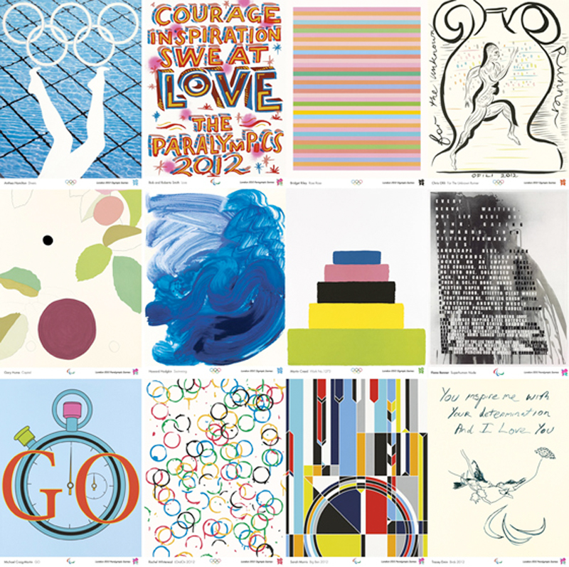
    The Turner Prize nominees and winners came up with a predictable set of embarrassing posters for the Olympics. Apart from the perpetrators themselves, no one could be found to say a good word about their efforts. Someone needs to get a grip. First we were presented with an inept logo which had cost £400,000 for what looked like two minutes work; then there was an artless rollercoaster sculpture selected by the President-For-Life; and now this lot of fashionable scribblers who couldn’t design a wheel from blueprints have done their worst, also, very conveniently, courtesy of the President-For-Life. Inevitably, as with Gibbereesh’s rollercoaster the PFL chose his reliable lackeys from the Turner Prize not to mention a serving Tate Trustee, Bob and Roberta Smith, i.e. one of those currently responsible for employing him.

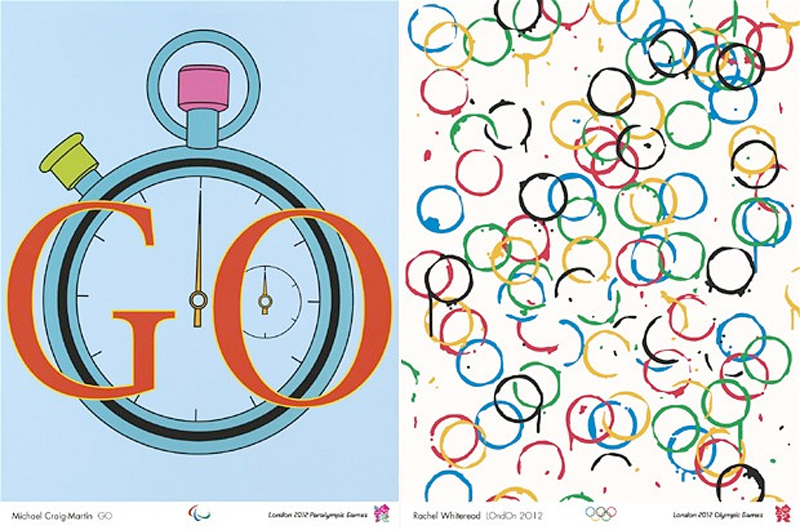
    Rachel Whiteread and Gary Hume excelled themselves with lovely colouring in – if their efforts had arrived crumpled from the nursery you might have fixed them proudly to the fridge. Bridget Riley knocked off her usual stripes. Each small poster – and these are nothing like the grand sheets of Lautrec – will be available to buy for £7 when an exhibition of the works opens at the Tate next summer.

    Now for the good news, that is if you are one of the participating artists. The posters are being released as signed prints courtesy of Counter Editions, thus enabling the artists to reward themselves in the manner to which they have become accustomed. Bridget Riley’s stripes, for example, is in an edition of 250 and started at £3,000 an impression – yes, that’s a gross of £750,000 for one signed screenprint, and it has already sold out. The Margate Express has hers in an edition of 300 at a throwaway £1,800 apiece – a mere £540,000… It is also sold out. The gross will, of course, have been far greater than the sums cited here as the cost of each print increased as the edition sold out. Still available however are ‘Professor’ Gary Hume’s blots (near right), a snip at £540 in an edition of 250 (£135,000 minimum gross) and Howard Hodgkin’s blue wave (£1,300, ed 300, minimum gross £394,000 – far right). No wonder the artists stood in a line laughing when their works were unveiled.

    Martin Creed, at last now widely regarded as educationally subnormal, said of his inspired marvel (£490, lithograph edition 250, minimum gross £122,500): “The colours are based on the Olympic colours but they are changed to make them nicer.” Here is the Mental Paralympian of State Art talking.

    What we got in this project was the usual bunch of over-rated contemporary artists promoting themselves and their art and not the Olympics. We can’t discover from anywhere what the deal was with the artists; were they actually paid to come up with their contributions or was their remuneration to be the loud ker-ching of limited editions? If you come across any information please let us know.

    … And then there was the dear old Margate Express. No are event is nowadays complete without her embonpoint rippling over the proceedings. On the same page of the papers when these Olympic efforts were announced you could look across from the Express’s maudlin scribble to Leonardo da Vinci’s drawing of hands on show in the National Gallery. An unfair comparison, yes, but it is surely impossible to look from one to the other and not think what a catastrophic deterioration has occurred not only in the technical ability of artists but in the willingness of those responsible for protecting standards in art to promote such conspicuous rubbish.

    By the way, if you wish to purchase all 12 of the posters you can buy the set in a nice box for £11,805. A commemorative heirloom for all the family to enjoy, and what a bargain.

     David Lee

    The Jackdaw, Jan-Feb 2012

    Latest News

    These posters are beginning to reappear on the market.

    Three editions sold out within days: they were Tracey Emin, Rachel Whiteread and Bridget Riley.  Now , one of the Rileys is being sold  at auction with an estimate of  £2,000-£3,000. This poster racket was not only a scam to line the pockets of already well-to-do artists but also to allow a quick turnover to collectors eager to cash in on the fever generated by the actual events.

    The complete set of posters are no on view/on sale at Tate Britain until September  23rd. So buy now. They’re crap, but what an investment.