Recent Articles

  • Moping Owl: Sooke Sayings…

    … from yonder ivy-mantled tow’r The moping owl does to the moon complain Of such as, wandering near her secret bower,  Molest her ancient solitary reign.

    SOOKE SAYINGS

    I fear I may have made a mistake in always taking Little Sookey for one of Old Mother Dorment’s gaggle of goslings down on Telegraph Farm. He is certainly still there in the rick-yard, waddling along after Old Goosey, gabbling away and picking up the scraps, only these days he seems rather more like a Twite, that little brown bird with a pink bottom and a merry cheep. Here he is now,  twittery-twiteing on about the work of The Glasgow Boys, yet another lot of painters he never quite got round to for his GCSE (art app & flwr arr). A ‘nebulous association’ he calls them, which is to say a ‘small, cloudy, foggy, misty cluster of indistinct stars.’ Quite good really, if he meant it. I almost wish I’d thought of it. I suspect he meant ‘loose’.

    You have to hand it do him, though: he does have a go at winging it, and talking about anything but painting. “Certain adjectives spring to mind”, he chatters on, “‘Charming’, ‘elegant’ and ‘lovely’ might judiciously describe their paintings” – which is of course what adjectives are judiciously supposed to do, or they’re not judicious. And there’s not much wrong with a spot of charming, elegant loveliness, I’d have thought. But no: our Sookey has a judicious doubt or two on that very point. “Whether or not these are admirable qualities, “he suggests, “depends on your point of view.” Well yes: I suppose it does.

    Yes indeed: Sookey takes judicious exception to all such admirable qualities, I mean seductive aesthetical traps and snares. We are not put into this wicked world for pleasure alone, he seems to say, and he’ll hammer the point home with every judicious adjective he can. Quite the Johnny Knox, he is. Take Guthrie’s Schoolmates, a ‘rustic scene’ of three ‘impoverished’ children walking along a lane: he doesn’t like it one bit. “Pleasing on the eye, it has been executed with skill, but the sweetness feels overdone: … the children’s faces have been meticulously finished to emphasise their pretty features and flawless, delicate complexions. The result (here we go) is a piece of whimsy (surely not) that indulges  (can’t have that) middle-class fantasies about the countryside.” Oh dear: I shall have to have a word with the Vicar before all this gets out of hand, what with Christmas coming on and all – or is that a middle-class fantasy too?

    Lavery’s Tennis Party certainly is, which “offers a charming vision of the ball zipping back and forth, gilded in the foreground (no, not the ball) with dabs of white, primrose and cream that represent thick sunlight (??*!! – not such a judicious adj. there, Sookey old thing).  But everything about it is designed to flatter and seduce (oh the shock and horror and wickedness of it all), down to the detail of the gate opening on to the court (sheer depravity)  … to entice viewers (I can hardly bear to go on) into the action – promising that we too might mingle injudiciously with the rich and beautiful (smelling salts, Vicar, please).”

    No Sookey, you’re quite right. We must never mingle. Nor must artists flatter and seduce, let alone offer charming visions, meticulously finished. Whatever next? Perish the judicious thought.

    O WALLY WALLY

    I do sometimes worry about old Wally the Dodo. I mean to say, he’s still with us, even now after all these years, still chuntering around the wood on his Sunday Times Mobility Trolley (special offer), gibbering the first words that come into his head and crashing into everything that … no: crashing into everything. It would be a kindness really. It would help, perhaps, if he cleaned his glasses once a year. I’m sure he can’t see anything through them. And they were cracked to begin with.

    Here is, going on about poor old Tom Lawrence, as though he’s never heard of him, let alone seen him, ever before. “If Lawrence is not being given the credit he deserves, then the reasons for this neglect are clear: the modern world has put him down as a lackey. The National Portrait Gallery’s task is to prove us wrong.” How I love that ‘us’. Speak for yourself, Wally.

    Now his glasses have steamed up again. “The gallery began its defence with an ill-judged [attempt] to pass Lawrence off as a fascinating Regency sex pest.” Ah ha, Wally old thing: that’s more like it. “This nakedly (naturally) manipulative (I say, steady on: there are ladies present) press effort zoomed in on his simultaneous love affair with two of the daughters of (wait for it) the much-tortured Sarah Siddons.” Well, I must say: I know that Regency Society got up to all sorts of fun and games, but really. Much tortured, eh? Who’d have thought it? She of all people.  No wonder her hair went a bit grey and frizzy. Well I never.

    And a simultaneous love affair too, whatever that is, and which, Dodo primly quacks, “did nothing to nuance the young goat’s reputation.” Oh, come come, surely it must have nuanced it one way or the other, just a bit. Nothing like a bit of nuancing, now and again, I always say. So, where were we? Ah yes, on we go. “What a relief, therefore, to find the exhibition itself not only avoiding entirely the topic of his tortuous testosterone …” – and I had to stop reading at that point,  and give myself a stiff drink. Quite made my eyes water even to think about, and I still can’t quite get my poor old wits round what it means. Still, it all comes out straight enough in the end, as you might say, rather as it did for the Young Man from Kent – but we won’t go into that now: there are, as I say, ladies present. Anyway, in the event, and to Wally’s inestimable relief, the show proves, “beyond any conceivable doubt (which is what doubts are, of course) that our Tom of Bristol was indeed a much more substantial and talented artist than most of us had suspected.”

    “Than most of us had suspected”, Wally? Or weren’t you paying attention when were taking your art-history A Level resits down at the Poly all those years ago? “Substantial and talented”? Have you never noticed? You really should get out more. No, on second thoughts, better not. And mind that ditch:  right hand down a bit, no, no, yes, no .. I can’t watch. Straight in. Oooohh.

    OL History note

    Queen Charlotte, whose great portrait by Lawrence has graced the National Gallery for ever and a day, though somehow Wally must have missed it, was never “the reigning British Queen”, as he avers, therefore never Lawrence’s ‘monarch’. She hated the painting, and it remained unsold in his studio until his death.

    The Jackdaw Jan-Feb 2011
  • Style guide to obfuscation (new updated edition): Laura Gascoigne investigates the continued manglings of syntax and punctuation by those with space to fill and nothing intelligible to say

    “Nothing and no one ever heard so many stupidities as a picture,” remarked Jules de Goncourt, and since he made his observation things have got worse. The insults to intelligence endured by 19th century pictures were as nothing to those routinely heaped on contemporary art.

    Some things never change, however. Stupidity almost always originates in vanity, and art criticism is never more stupid than when it wants to sound clever. If the situation has deteriorated, it’s partly because conceptual art offers endless opportunities for cleverness. But other factors have contributed. For one thing, critical faculties are now weakened in advance by heavy shelling with stupid press releases and wall texts. For another, in order to praise a work of conceptual art it is no longer enough to wax stupidly lyrical; a lot of the time, you have to lie. And lying, for some physiological reason yet to be scientifically researched, affects the part of the brain that deals with sentence construction, resulting in obfuscation, the mortal enemy of intelligence.

    For the liar, tautology and tortuous grammar are lifelines. Consider this sample from a wall text for the 2007 Turner Prize: “Enrico David’s imagery has developed through his use of drawing and painting and also finds form in sculpture, painting and works on paper.” If a stress test is carried out on the meaning of this sentence it collapses into: “Enrico David draws, paints and sculpts.” So why the extra verbiage? Because, on the visual evidence available to anyone visiting the exhibition, he did none of those things. It beats me why the security services waste money on polygraph technology, when a simple, hands-free lie detector test is to listen for the strangulated syntax. Here’s Serota in 2008 defending the Tate against criticism of the Turner Prize selection process: “We’re at the forefront of being as open as we possibly can”. Beep! If the convoluted phrasing sounds familiar, it’s because it comes straight out of Bliar’s Grammar Primer.

    ‘Heavy on style and light on substance’ is the obfuscator’s mantra; once the tortured phraseology has been mastered, the only real obstacle in the way of success is words. If a word has a clear meaning, it must be excised and replaced with one that makes a significant-sounding noise without adding anything quantifiable to the sense. But the trouble with buzzwords, like bluebottles, is obsolescence – when the buzz becomes annoying, people reach for the fly swat. Since we published our A-Z of Artbollocks in 2004, the language has moved on. ‘Innovative’ has lost its novelty and ‘rigorous’ its stiffness. ‘Navigation’ has drifted off course and ‘negotiation’ is grinding to a halt. Even ‘interrogation’ may soon be over. It would no longer be sufficient to say of 2005 Turner Prize nominee Gillian Carnegie that she ‘interrogates painting’. The present climate calls for something tougher: ‘rendition’, perhaps.

    There are survivors from our earlier survey. ‘Investigations’ are ongoing and ‘exploration’ continues; ‘identity’, perforce, is ever with us. And there are newcomers. ‘Conversation’ and ‘discourse’ are now widely practised – witness Mima’s circuitously titled 2007 exhibition Draw: Conversations around the Legacy of Drawing and Kettle’s Yard’s 2008 offering Beyond Measure: conversations across art and space. Not to be left behind, in August the once fuddy-duddy Fine Art Society gave us Wit, Fear and Sarcasm, an exhibition featuring “the work of five artists whose practice presents a discourse with historicity”.

    But the most notable stylistic advances have been in the formerly neglected field of punctuation. The past decade has seen a relentless rise in the use of the hyphen, in defiance of Keith Waterhouse’s sound advice in his immortal handbook On Newspaper Style: “Hyphens should never be used when they have nothing to do,” he warns. “Before admitting one to the page, ask what it has come for. If it cannot say, or if its answer is vague… refuse it admission.” Waterhouse might have made a special case for ‘ludic-artistic’, but I suspect he would have been less welcoming to ‘venue-based’, ‘text-based’, ‘time-based’ or ‘process-based’ – though ‘pizza-based’ he might have allowed. And I doubt he would have given elbow room to ‘site-specific’, ‘semi-site-specific’ or the now preferred locution ‘location-specific’ – not to mention ‘non-specific’, an expression formerly only associated with STDs that now appears regularly in respectable ‘non-specific contexts’, such as the “non-specific sense of discord with the general state of things” experienced by contributors to the Cafe Gallery’s summer exhibition Personal Use. We know how they feel.

    A distinctive feature of the art hyphen is its decorative use, like a grace note, between a prefix and the stem of the word it qualifies. So we have ‘post-structural’ or ‘post-minimal’; if mail art was still in fashion, we might have ‘post-box’. But the art hyphen’s partner of the moment is the prefix ‘re’, sometimes italicised for added impact. In the endlessly repeating cycle of conceptual ideas, there’s no end to this little prefix’s usefulness. From ‘re-contextualising, ‘re-configuring’, ‘re-investigation’ and ‘radical re-visioning’ to ‘re-definition of space’, ‘re-investment in aesthetic language’ and ‘re-assessment of the relationship between realism and spectacle’, re is in a prefixal class of its own. If we’re to believe the publicity for FACT’s 2008 exhibition Sk-interfaces, it’s even capable of ‘re-virginisation’ – a felicitous coinage that, if it had any meaning, might absolve pious Muslims of the need for honour killing. Following the epidemic of art hyphens, we now seem to be experiencing an outbreak of art brackets. Originally introduced by abstract painters as a way of smuggling in a title behind the title Untitled, art brackets now perform a purely ornamental function, like emoticons emptied of emotion. The publicity for a 2010 exhibition organised by Romanian curator Mihnea Mircan for the David Roberts Art Foundation Fitzrovia contained a couple of choice examples: one exhibit was described as ‘a (counter-)manifesto etched in stone’ while another was titled ‘The Remains (The Making of)’. Mircan must be an indexer manqué, since his whole exhibition was filed under the title ‘History of Art, the’. But the prize for prettiest confection in the bracket bracket goes to Flowers East for its reference, re Jerry Judah’s 2009 exhibition Babylon, to “the redundancy of traditional hierarchies at the End of (art)-History”.

    And so we come to subverted commas. Just as inverted commas are used by tabloid headline writers around words like ‘MURDERER’ or ‘RAPIST’ as “typographical crossed fingers to ward off libel actions”, as Waterhouse describes it, subverted commas allow art commentators to shrug off responsibility for apparently loaded, non-relativist statements – or indeed any statements, full (old-fashioned-)stop. Thus the Arnolfini’s current series of exhibitions The Apparatus is “about the ‘makings’ of artists, of artworks, of institutions, and of a cultural infrastructure,” while Sharon Lockhart’s film-making, in the words of the Whitechapel, “looks back to the pivotal interest in gesture and the ‘everyday’ of the late 1960s and examines contemporary manifestations of ‘work’”.

    The ultimate syntactical shrug is, of course, the question mark. In this category Newlyn Society of Artists wins the pioneers’ prize for the trailblazing introduction of the Hispanic inverted question mark into the title of its 2005 exhibition ¿DRAWING? I’m not making this up. ¿Would I lie to you?

    The Jackdaw Nov-Dec 2011

  • Non-visual art: Laura Gascoigne argues for a restoration of the visual

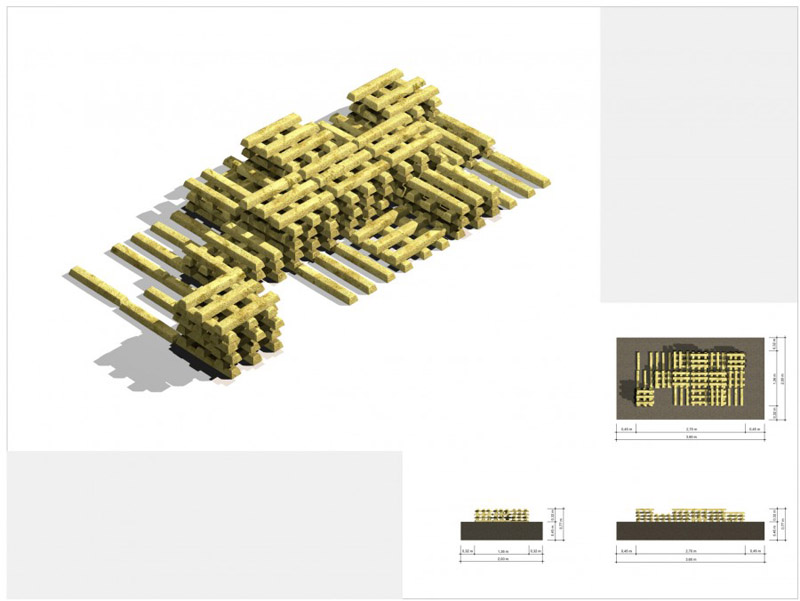
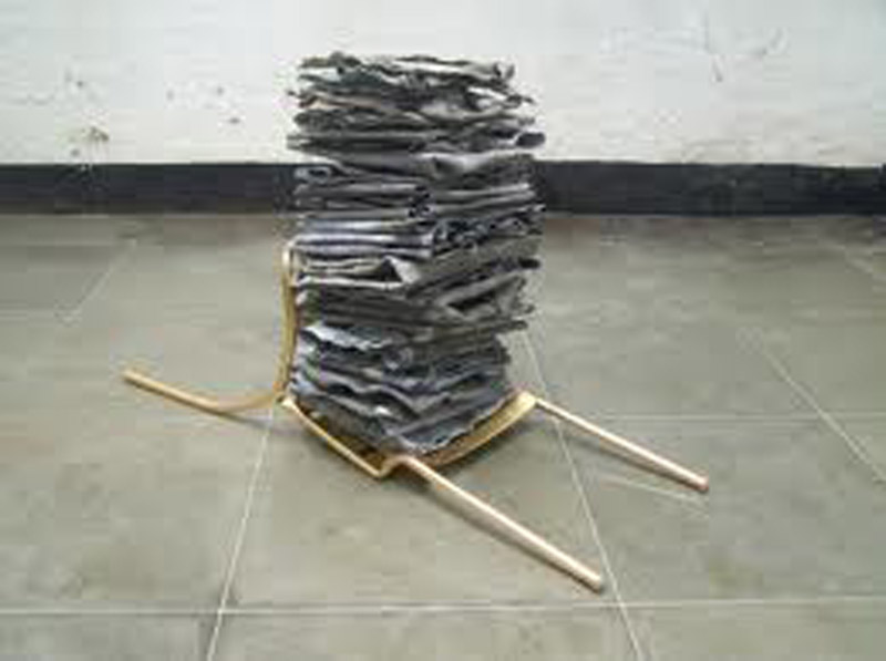
    Fritz Balthaus: Pure Moore

    The traditionalist lament for loss of skill is a distraction. The modernists were right about that: skill on its own is not enough. The first step on the road to recovery is to reinstate the visual as the sole and proper domain of art. Once it is generally agreed that art’s impact is essentially visual, the skills to make it so will resurface.

    It’s a paradox that we keep visual art in museums, when it’s the only branch of art for which there is no muse. Of the nine Greek muses, there was one for history – Clio – and one for astronomy – Urania – neither of which disciplines we now regard as arts. There was one for tragedy – Melpomene – and one for comedy – Thalia; one for music, naturally – Euterpe – and one for dance – Terpsichore. And there were no fewer than three for verse of different kinds: Polyhymnia for sacred, Erato for love and Calliope for epic poetry. But there were no muses for what we now refer to as the fine arts.

    It’s hard to explain why not, unless it has something to do with their parentage. The muses were the daughters of Zeus and Mnemosyne, memory, and memory was a basic requirement for the practice and perpetuation of the literary, theatrical and musical arts (plus history and astronomy) in the days before pen and paper, let alone computers. Nowadays only actors and dancers need rely on their memories, although they too have written texts and notes when learning their parts. But artists rely on a different sort of memory, a memory of the how rather than the what. For the Greeks, this was another distinguishing factor. The muses’ arts were learned via the ears rather than the eyes, with the exception of dance – and that went with music.

    Today we have different denominations and hierarchies. Astronomy and history are out; visual art is in, right up near the top of the table. So preeminent, in fact, has it become that it no longer needs a separate trade description and is classified simply as ‘art’ – except for the purposes of funding, when it is referred to as ‘visual art’. But the strange thing is, the more funding art absorbs the less visual it progressively becomes. Like a disease mimicking the behaviour of other cells, it increases its share of public funding by trespassing on the domains of other arts. How much of the art on show at Manchester International Festival was strictly ‘visual’? From the reviews I read of the exhibition 11 Rooms at Manchester Art Gallery, none. One room contained a live manga avatar, a second a naked woman with a hand-mirror, a third a war veteran standing in a corner, a fourth a man in bed. “In white room after white room you plunge in, 11 times, not knowing what you’ll find there,” wrote Adrian Searle in The Guardian. “More real presences, performances and theatre.” His review, headed ‘Room with No View’, was conspicuous for its avoidance of value judgements. His concluding observation, a propos Robert Wilson’s restaging of Marina Abramovic’s performances, was: “The images keep coming back.” So do traumas and undigested food.

    If critics don’t know what category they’re judging in, how can they judge? Contemporary art criticism is based not on visual grounds but on other criteria (which, appropriately, is the name of Damien Hirst’s outlet in New Bond Street). Other muses sit on art’s judging panel – chaired by Clio’s kid sister, the muse of art history – and the critical faculty they use is the ear rather than the eye. The arrival of word processors has accelerated the verbalisation of art. Curators wrap exhibitions in webs of words as if ashamed of their visual nakedness, while press offices seem actively determined to put audiences off with assurances that there’ll be nothing to look at. Take last autumn’s Gabriel Orozco show at Tate Modern. The press release told us that he was “a sculptor of global significance”: that he “draws on the histories of western and Latin American practice”; that he has a “fascination with combining the systematic and the organic”; that his work “has been informed by his extensive travels and his relationship to the various places he visits”. But nowhere did it suggest that his art was a visual pleasure which, in the event, it turned out to be.

    Non-visual art is by definition visually boring, so a campaign is now afoot to make ‘boring’ interesting. Two years ago Hoxton Square Gallery organised a competition for the title of ‘Most Boring Drawing’, accompanied by ‘Most Boring’ – A Performance. (Performances were sensibly limited to a single entry, or the jury might still be out). But why should non-visual art be boring when, say, non-visual poetry is not? Because it refuses to use the tools it has been given to stimulate the imagination. The connection of the arts with their mother Mnemosyne is umbilical; it goes a lot deeper than learning by rote. Art works on its audience by triggering memory. An education project at MoMA New York has discovered that, in front of paintings, previously vegetative Alzheimer’s patients are spurred to excited recollection. This could explain why ‘iconic’ art is at such a premium, because it occupies a place in our collective memory. Conceptual art, of course, can trigger memory too – we see with our brains – but the memory has to be of something outside itself to elicit a response. It can’t be a memory of another piece of art: ‘exploring issues of representation’ just doesn’t do it. Besides, without a nudge from Ma Mnemosyne artists would have no impetus (other than money) to make work.

    The process of paring away visual association can only go so far before the stimulus is too weak for memory to pick up. For the past hundred years avant-garde art has been on a forced march of progress, casting off aesthetic baggage as it went. First modernism stripped art down to formal beauty, then post-modernism decided that beauty exceeded the baggage allowance and dumped it, along with skill, by the side of the road, replacing it with found objects picked up en route. Last to go, ironically, was monetary value, now the principal support for the whole flimsy structure. The situation has been succinctly summed up by German artist Fritz Balthaus in his sculpture Pure Moore, a stack of 221 bronze bars representing the 2.1-tonne Reclining Figure stolen for scrap from outside the Henry Moore Foundation in 2005. Appropriately, it is now installed outside the German federal criminal police office in Berlin.

    The traditionalist lament for loss of skill is a distraction. The modernists were right about that: skill on its own is not enough. The first step on the road to recovery is to reinstate the visual as the sole and proper domain of art. Once it is generally agreed that art’s impact is essentially visual, the skills to make it so will resurface. The general public has never stopped responding to the visual, hence its perplexity in front of much contemporary art. All that’s needed now is the insistence that, to qualify for funding, visual art has to be overwhelmingly visual – as opposed to just visible – and our problems will vanish. So let’s drop the ‘fine’ and accentuate the ‘visual’. ‘Fine’ is a value judgment that has to be earned; ‘visual’ is a simple and crucial criterion by which to judge whether a piece of art is good or bad. Enforce it, and we may find our misnamed museums restocked with things that are worth looking at.

    The Jackdaw Sept-Oct 2011

  • Misplaced trust: tripping along with the teddy bears’ picnic, Laura Gascoigne looks at the obvious mismatch of the National Trust and contemporary art

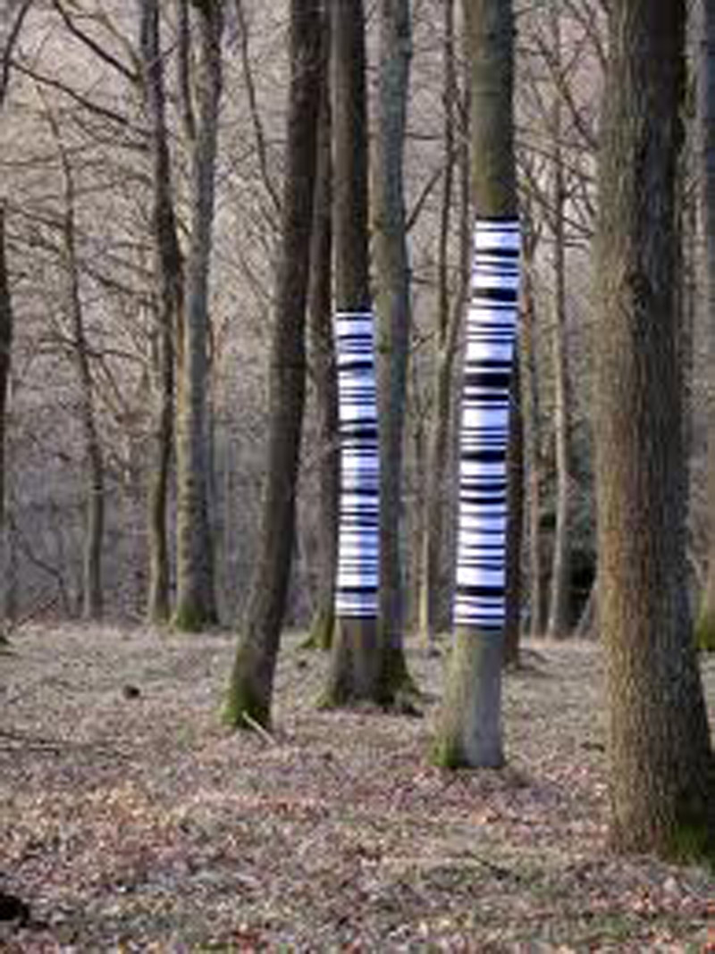
    Philippa Lawrence, Barcode: FB184

    If you go down to the woods today, you’re sure of a big surprise. That’s if the woods are Mortimer Forest in Herefordshire, and the surprise hasn’t by now been deliberately spoiled by tree-hugging vigilante forest rangers.

    Last spring, RCA graduate Philippa Lawrence took it into her pretty little head to barcode the trunks of selected young oaks in this ancient woodland at a spot called High Vinnalls, conveniently close to the Forestry Commission Car Park. The trees are due to be felled to make hardwood dowelling, a product for which the builders’ merchant barcode is FB184.

    Barcode: FB184, organized by Meadow Arts and funded by ACE, is a site-responsive piece (responsive, mind, not merely specific) whose purpose, sayMeadowArts, is to draw “the viewer’s attention to how the individuality of each tree contrasts sharply with the uniformity of the commodity that it becomes”. You may question whether, four centuries after the invention of the sawmill, we need our attention drawn to this fact, but the artist thinks we do. “Hereford is known for its special relationship to trees,” she says – and special relationships, as we know,  need work. She hopes hers may help us “reconsider our relationship to these places and the centrality of wood in all of our lives” – and, quite possibly, in some of our skulls.

    Lawrence’s own relationship with trees, she confides on her website, “is one built on a close and easy physical proximity”. In childhood “local trees accepted my slight young limbs and that [sic] of my friends as we scaled and climbed, testing our dexterity, flushed with delight at our exertions and in being abroad ‘in another place’ within the arms of the tree.” (Steady on, my dear, you’ll get the paedos excited.) Well, I spent much of my childhood up a tree and when the image of her barcoded trunks dropped into my mailbox it made me want to reach for the bow and arrow I used to take up there, dip the arrow tip in curare and lie in wait for Lawrence to waft along, flushed with delight, to install her next site-responsive project.

    Unfortunately, the way things are going, I’ll need a quiverful. Since ACE teamed up last year with the National Trust on a new three-year partnerhip, Trust NewArt, site-responsive blights on the landscape have been spreading. The Trust now boasts a fresh young ContemporaryArts Programme Manager called Tom Freshwater who, with advice from experts including seasoned site-responders Ackroyd & Harvey and Richard Wentworth, is under instruction “to encourage new ways of looking at the work and the world”. Sounds harmless enough as far as it goes, but there’s more. The aim of Trust New Art, the launch announcement informed us, is “to build links between the National Trust and the contemporary arts and crafts sector” and “to make contemporary arts and crafts an integral part of the National Trust’s daily offer to visitors” [my italics]. This sort of management-speak speaks of one thing and one thing only: money. It’s the same old story of mismatched partners climbing into bed together for mutual warmth in a cold economic climate.

    The National Trust has a circulation problem. While more and more visitors swarm freely over its 600,000-acre rural estate the size of Derbyshire, fewer and fewer want to pay an entrance fee to circulate around its historic houses which consequently, like gangrenous limbs,  are in danger of dropping off. Without increased footfall through its miles of stuffy corridors, it cannot meet the expense of keeping up its buildings. But who of the post-end-of-history generation wants to pay good money on a sunny afternoon to traipse around an airless house with the blinds half-drawn admiring the faded possessions of long dead toffs? They’d rather have a tour of Beckingham Palace. While the Trust’s energetic Chairman Simon Jenkins has managed to breathe some warmth into his hypothermic patient by such simple traditional expedients as lighting fires in grates, his organisation has been looking enviously at the inflated attendance figures of contemporary art galleries and, being of a trusting disposition, believing them. The trouble is, the two constituencies are poles apart. The blue-rinsed rump of NT membership wouldn’t Trust New Art further than they could throw it, which at their advanced average age is not very far.

    Trust properties that have so far signed up to the new art deal include Waddesdon Manor in Buckinghamshire, Tatton Park in Cheshire, Croft Castle in Herefordshire, and Calke Abbey and Kedleston Hall, both in Derbyshire. Waddesdon had already converted its Coach House into a contemporary art space, opened in 2009 somewhat inauspiciously with an exhibition of Angus Fairhurst, a contemporary artist who chose to end it all by hanging himself in a wood. But Waddesdon is au fait with art and not in danger of doing anything silly, unlike Calke Abbey, winner of our 2010 Trust New Art Bumpkin Prize for a summer programme of supreme artbollocks titled Profusion – devised for it by Beacon Art Projects – that made no concessions to the rural location,  and no sense. Among its advertised attractions were a Doug Fishbone performance in the Deer Shelter of “a stream-of-consciousness mode lecture incorporating images found on the internet into unlikely scenarios, propositions and diatribes”; a Jimmy Durham video in the Ice House showing the artist “smashing his students’ works, reminding us of the origin and end of all things” – as if we were short of reminders of this in the countryside – and a display of Roger Hiorns’s “intention to dust areas of the smithy with powdered antidepressant, triggering different contradictory avenues of association between the setting and his intervention”. Mercifully Health & Safety intervened to nip his intention in the bud at the display stage.

    Visitors to contemporary art museums go to look at contemporary art; visitors to National Trust properties go to look at flowers and trees in the gardens and cake display cabinets in the tearooms. Thankfully, the heritage-visiting public seems already to be taking things into its own hands. The fightback started in a small way last September in the grounds of English Heritage’s Belsay Hall in Northumberland, where nine Lilliputian hostages were seized from a mini-installation by street artist Slinkachu forming part of the exhibition Extraordinary Measures. A single escapee was later recovered from the weeds by a gardener, but the others are still missing, despite an amnesty. (Jackdaws were, unsurprisingly, on the list of suspects.)

    There is a limit, beyond installing wheelchair ramps and disabled toilets, to how accessible you can make a historic house to a public increasingly uninterested in history. But wait! What’s this? An announcement from the ICA, that body cryogenically frozen in the 1950s and recently chilled to a deeper permafrost by Arts Council cuts.  During the run of its summer exhibition Sketches for Regency Living,  an architectural-cum-choreographic intervention by the fabulously named Pablo Bronstein, gallery guides will be offering daily ‘National Trust-style tours’ of Nash House, with dance performances on the hour and evening talks from historians, architects and antique specialists.  What goes around comes around, in a sexier costume. Time, perhaps, for a revivified National Trust to issue its volunteer room guides with oak leaf-monogrammed tights.

    The Jackdaw Jul-Aug 2011

  • Misappliance of Science: The marriage of art and science is one only of financial convenience, argues Laura Gascoigne

    Royal Society: Beyond Ourselves

    In economically choppy waters, artists without lifejackets can be forgiven for clinging to any passing spar. So when a life raft floats past flying a flag marked ‘EDUCATION’, it’s understandable that they should haul themselves aboard. But the flag is misleading. The raft isn’t headed for the familiar port of art school, where people used to receive an art education. Its course has been reset for the art gallery, where people are educated through art rather than in it.

    Art schools may have fallen off the funding map, but gallery education is riding the storm. Engage has emerged from the Arts Council cuts with a 50% increase in funding, while the Whitechapel and South London Gallery have had their ACE grants boosted – SLG’s by 107% – in recognition of their ‘community engagement’. Sheffield Galleries, meanwhile, have had the bung pulled on them for being, well, simply galleries. In the new rankings they count as ‘agencies with more of a support function’, as opposed to ‘art producing agencies’ like the speciously named Middlesbrough Institute of Modern Art, which has earned a whopping raise of 143.8% as an ‘international-quality visual arts destination’.

    For those of you who happen to be wondering how many visitors it takes to make a destination, I consulted a philosopher of language and he answered one – and intending to visit is enough. But let’s leave that aside and take an instructive look at what this art-producing agency has been producing, in case there are any lessons in it for Sheffield. A recent commission that presumably influenced the Arts Council’s decision was Bonnie Camplin’s autumn exhibition Railway Mania. Camplin, by the way, is one of those ‘internationally acclaimed artists’ whose hitherto unknown existence raises further philosophical questions about how many foreign admirers it takes to generate international acclaim and whether one hand clapping somewhere abroad will do. But let’s not get picky. From the educational point of view, she had two things going for her. 1) She was visiting Professor at Hochschule für Bildende Künste, Städelschule, Frankfurt am Main. 2) She was engaged in an “ongoing investigation into the deeper meaning of science, technology and rational thought”.

    Based on ‘a hoard of research’ into the industrial revolution and the birth of the railways carried out over three years, Camplin’s exhibition opened with a room-sized diorama lined in galvanised steel with ‘two ominous heaps of the combustible black sedimentary rock’ otherwise known as… Come on, science class! You at the back! Yes Stephenson, well done – coal. But the educational value didn’t stop there. The heaps were topped by two giant female heads called Irene Iree and Feral Cheryl, while a later room featured depictions of ‘femme fashion figures in a variety of…uniforms representative of their various roles in industry’. Frau Professor Doctor has a parallel interest ‘in the entangled narratives of feminism’s movements’. On a lighter note, she ended with a film projection for which visitors could choose soundtracks from such popular favourites as ‘Trains in the Hills’, ‘The Power of Steam’ and  ‘The Great Western’.

    Sheffield Museums missed a trick. There they were, sitting on the Ruskin Collection, and they failed to play the science hand. In the ACE funding stakes, they deserved to lose. As you can see from the above example, the education game requires no specialist knowledge. No former experience in the appliance of science is needed, though an MSc in the science of applications helps. If necessary, willing partners can be found in the scientific community to lend a sheen of academic credibility.

    In times of hardship communities need to help each other, and artists and scientists are now pulling together. For artists, an association with science opens up new streams of funding; for scientists, a partnership with art generates publicity and gives off sex pheromones to attract corporate sponsors. This could explain the mystery of why distinguished scientists at the top of their professions should be bending over backwards to let artist ignoramuses look for deeper meanings in their work.

    The Royal Society, no less, is currently hosting Beyond Ourselves – In the spirit of scientific enquiry, an Arts Council-funded exhibition featuring six contemporary artists ‘working within the realms of reflexion, hypothesis, philosophy and sensation and searching for new ways of expressing their compulsion to describe that which we do not yet know’ – a privilege of compilers of dodgy dossiers not normally accorded to scientists. Promised highlights include ‘a Starbucks coffee cup holder with scientist’s notation depicting Feynman diagram for an electron positron interaction’ by Geraldine Cox, an artist-in-residence at Imperial College ‘whose practice involves spending many hours with scientists listening to and developing a fuller understanding of the nature of their work’. Also on show is a series of sculptures by Chris Dunreath extending ‘his investigations into the deep realms of relativity and quantum physics’, using a choice of materials – in this case paper pulp – that ‘prompts us to remember that earthly things have their roots deep in the history of our universe’. Amazing really, I might have forgotten that without a reminder from a funny-shaped egg box.

    Eventually some sharp-sighted curator was bound to spot an opening for a commissioning organisation to mine this potentially rich scientific seam. In 2009 Alice Sharp set up Invisible Dust with the marvellously named Professor Peter Brimblecombe – who sounds like an escapee from Hogwarts but is actually Professor of Atmospheric Chemistry at the University of East Anglia – and already she has five other scientists on her books. They include hydrologist Dr Kevin Hiscock, who recently put his Environmental Sedimentary Fluid Dynamics Laboratory at the disposal of UEA resident artist Liz Ballard. Their collaboration bore fruit at Cambridge Science Festival in March in a site-specific artwork at Jesus Green Lido which pumped a continuous jet of water into the air, alerting viewers to the dangers of pollution by activating ‘movement and interaction between water and sediment’ and disturbing ‘the usual topography of the pool’. Meanwhile fellow Invisible Dusters HeHe took inspiration from the lido’s ‘Deep Water’ sign to recreate the Deepwater Horizon oil disaster in miniature (without environmental impact on the pool). HeHe, incidentally, stands for Helen Evans and Heiko Hansen, a Parisian duo ‘renowned internationally for their architectural interventions that play with scale’. Which poses a final philosophical conundrum: if the currency were to devalue as fast as the price of international renown, would there be any money to pay international artists?

    More Invisible Dust will be kicked up in May at the Norfolk and Norwich Festival, where with support from the Wellcome Trust HeHe, Ballard and other Invisible Dust mites will be art-educating the inhabitants of the UK’s greenest city about pollution – HeHe via a fleet of vapour-trailing model aeroplanes and Ballard by melting luminous green dye in the River Wensum. (Interesting that one form of invisible dust recently dominating the news has yet to receive artistic attention, perhaps because funding has not been forthcoming.)

    You Wensum, you lose some. Art and science partnerships would be harmless enough if they didn’t foster the pernicious notion that art needs added educational value to be worth funding. That way lies danger. Science doesn’t need art to find deeper meanings, nor does art need science. It’s a marriage of economic convenience that cheapens both.

    The Jackdaw May-Jun 2011

  • Eh up Arup! Laura Gascoigne looks into the real brains behind the public sculptures we don’t need

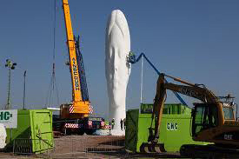
    Plensa: The Dream

    Two beavers are standing looking at the Hoover Dam and one says to the other, “I didn’t build it, but it was my design”. Cue laughter. Now picture the same gag line under a cartoon of two artists looking at an enormous public sculpture. The gag still works, but the laughter’s forced. Because while a beaver has an innate grasp of the fundamentals of dam building, your average contemporary artist doodling a landmark sculpture on the back of an envelope could fit his knowledge of structural engineering on the other side.

    This might bother a beaver, but we’re not fussed. In a world of ever narrowing specialisations, we habitually depend on the skills of others. Renaissance artists working in the public sphere were expected to master the principles of construction: Michelangelo and Raphael were architects, Leonardo was an engineer. But in this age of alpha males rather than Renaissance men, our public artists only seem able to function with specialist support from Ove Arup.

    For a decade, the global firm of structural engineers which cut its teeth on the Sydney Opera House has kindly put itself at the disposal of contemporary sculptors in distress. A regional development agency, say, has commissioned a landmark sculpture you have absolutely no idea how to construct: simply summon the Arup genie from the bottle and all your structural worries will disappear. With added Arup, you can aim higher and think bigger. The firm can turn any 3-D dream into reality, and if you split the money with them you can take all the credit. They won’t mind, it’s just a job to them. When it’s over they’ll go back to doing something useful with their time, like building bridges.

    Search the small print of the biggest public art commissions of the past decade, and the magic name of Arup will appear. If it’s a massive sculpture lifting the profile of a blighted skyline, Arup will be behind it holding it up. Conveniently, the firm seems to have an office in every northern town. When St Helens Council commissioned Jaume Plensa’s The Dream – the 20m concrete head now sprouting like a giant mushroom on the site of the former Sutton Manor Colliery – Arup’s Liverpool office made the dream come true.

    Their assistance goes beyond structural design. According to the Arup website, they also took charge of the “planning, tendering and commissioning processes”, plus the “specialist ecology, lighting engineering and 3-D imagery, all required for the planning application submission”. Don’t stare in despair at your landmark doodle; just hand Arup the envelope and they’ll work out the “complex geometries” and come up with a professional “assessment of overall stability and  ‘buildability’.” Arup is the Jim’ll Fix It of the landmark sculpture business, a one-stop-shop for local enterprise partnerships wishing to lay the ghosts of the industrial past by commissioning monstrous beacons of false hope for the future.

    It was Arup that calculated the wind-resistance of the Angel of the North’s 54m wingspan and stopped the 20m Gormley falling on its face, winning such gratitude from the artist that he has retained their services ever since. Arup’s Advanced Geometry Unit was the eminence grise behind Gormley’s Quantum Cloud at Greenwich and the brains behind the collapse mechanism built into his latest batch of iron men in the Waters of Leith, designed to make them go down like ninepins in the event of flooding (a sight I’d pay good money to see). If Thomas ‘Spillikins’ Heatherwick had had the humility to call on their superior expertise The B of the Bang might not have blown up in his face, but he was foolish enough to imagine he could go it alone. Anish Kapoor has no such illusions. It was Arup that stopped his Marsyas idea from going down like a PVC balloon in 2002. “If the calculations had been 1% out,” their engineer admitted, “it would have been sitting on the ground” – along, presumably, with the artist’s career.

    After that, Kapoor was Arup’s for life. He hasn’t put pen to back of envelope since without the firm’s deputy chairman and AGU founder Cecil Balmond in attendance to do the workings out in the margin. They share an interest, apparently, in “interrogating form”. It was Balmond who ensured that Kapoor’s Temenos, the £2.7m 120m windsock launched in Middlesbrough last year, didn’t take off, and it is Balmond who will guarantee that the Arcelor-Mittal Orbit stays up for the duration of the 2012 Olympics. Now a celebrity in his own right, Balmond left Arup last October to found his own company and devote more of his time to art. It can’t be long before the engineers remove the artists from the equation altogether. But they’ll have to do better than the July 7th Memorial, a soulless experiment in art-free design by architects Carmody Groarke and, yes, engineers Arup that surely ranks as the world’s least memorable monument, while serving as a stark reminder of why monuments need sculptors.

    The question is, do monuments need engineers? The answer is, only when they are unjustifiably big. There are good reasons for making enormous dams, but there are almost never good reasons for making enormous sculptures. In fact, the reasons are almost invariably bad: jingoistic, militaristic, imperialistic, narcissistic or just plain hubristic. Temenos was to be the first of a £15m series of five giant Kapoors destined to ‘rejuvenate’ the Durham towns, with four more planned for Stockton, Hartlepool, Darlington and Redcar & Cleveland. Together, boasted the scheme’s publicity, the ‘Tees Valley Giants’ would “form the most significant public art project anywhere in the world”. With even greater hubris, the director of Middlesbrough Institute of Modern Art Kate Brinsley proclaimed that Temenos would “call on the traditional twin skills of the region: precision engineering and heavy industry”. She neglected to say how many workers with those skills it would take off the dole queue in what has just been named the most economically vulnerable city in Britain. Now the North East’s regional development agency is being abolished and Tees Valley Unlimited, the local enterprise partnership behind the scheme, has had its budget slashed and lost its tourism arm. It looks as if four of the giants may never awaken, and cultural tour operators will have to strike Teesside off their itineraries.

    Interrogating form is a game best played on a small scale, a scale at which the sculptor can work unaided. The RA exhibition Modern British Sculpture includes a 1937 piece by Naum Gabo titled Spheric Theme: Transparent Variation, a twisted double parabola of striated celluloid that speaks of flight more eloquently than the Angel of the North and, at its full eight inches, is more imposing. Unlike Hepworth, whose Single Form (Memorial) was scaled up to a monumental 21ft outside the United Nations Building, Gabo never hit the public sculpture jackpot (although ironically, with his engineering background, he would have had no trouble making monuments stand up). And so his sculptures remain as pure experiments in form, material and light on which no weight of meaning has to rest. They don’t have to trumpet anything, rejuvenate anything, apologise for anything. Their thinking was done in the materials of which they are made, with the result that they are entirely self-supporting.

    The Jackdaw Mar-Apr 2011

  • Who’s afraid of the Kulturkampf? Art will not die for lack of public subsidy, argues Laura Gascoigne

    While currency speculators place their bets on which Eurozone economy will be next to fail, the clatter of falling dominoes has reached the contemporary art world. And it’s not just about investors being hit in their pockets. As austerity bites, discontent is spreading through society at large.

    Last September in Istanbul – our current European Capital of Culture – fashionable liggers quaffing private view drinks on the pavement outside a contemporary art gallery near Istanbul Modern museum were set upon by anti-art vigilantes, who attacked two other galleries and hospitalised five people. Locals in the up-and-coming Tophane district are apparently unhappy that their neighbourhood is becoming a cultural quarter without their consent. They know that up-and-coming, for them, means up-and-going as soon as property prices rise through the roof.

    Meanwhile in Switzerland, home of the Basel Art Fair, a poster campaign by the Swiss People’s Party (SVP) has forced Zurich city council to scrap plans for the Nagelhaus, an art pavilion designed by cardboard model-maker Thomas Demand with help from architects Caruso St John. It was meant to improve the look of a rundown square as part of a 300m regeneration package, but the SVP – who make a virtue of being Swiss – balked at spending money on anything arty and demanded a referendum. Their poster featuring a golden toilet and the slogan ‘5.9m Swiss Francs for a shit!’ carried the day. The SVP leader on the city council objected that the money “would give dreamers the possibility of self-fulfilment at the expense of taxpayers.”

    This is, of course, the far right nasty party whose last poster campaign to hit the headlines featured three white sheep kicking a black one. But it’s simplistic to blame public reaction against contemporary art on a right-wing bias against the left-wing avant-garde, especially when the Chinese Communist Party is poised to demolish Ai Weiwei’s Shanghai studio. The hard truth is that when it comes to a vote, there’s almost anything the public would rather spend its money on than art. In a recent UK poll, 60% put the arts at the top of the list for cuts.

    In the boom years, people were prepared to humour the liberal arts establishment’s delusion that an education in contemporary art would improve the nation’s quality of life. But now that school and university education budgets are threatened, this looks like an expensive indulgence, especially since the government launched its transparency agenda itemising exactly what things cost – a Machiavellian wheeze to get the citizenry clamouring for cuts before the Treasury unsheathes the knife. So far, all the riot police have had to worry about is students lobbing fire extinguishers off roofs. How long before protestors in Anarchy bandanas start uprooting sculptures and a cordon has to be thrown around the fourth plinth? The Serpentine may have chosen the wrong moment to open its second outlet in The Magazine, a munitions depot established in Hyde Park by a former government fearful of civil unrest. Rather than filling it with more extravagant art, they should perhaps restock it with munitions.

    David Cameron signalled which side of the avant-garde art barricades he was on three years ago when he let drop that ‘one-legged Lithuanian lesbians’ clanger at an arts funding lunch at Tate Britain. To be fair, he only expressed the hope that “you won’t be giving grants to too many [my italics] one-legged Lithuanian lesbians”. He didn’t rule them out altogether. Now he’s in power, the job of deciding exactly how many has been passed to Culture Secretary Jeremy (Berkeley) Hunt, who has lobbed it on to the Arts Council, under instruction to trim 50% of its own administrative fat before liposucking 15% from its 850 dependents.

    Crises have unpredictable effects on people: suddenly the whole arts lobby is speaking German. The term ‘kulturkampf’ is in widespread use and Serota has even referred to a ‘blitzkrieg’ – this despite having been allowed to keep the final £2.2m tranche of the £50m of DCMS money he has so far sunk into a giant hole behind Tate Modern. If the hole doesn’t succeed in sucking in the remaining money needed to put up an extension by 2012, it can still make an artistic contribution as an Olympic-sized Doris Salcedo crack – or Ai Weiwei could ship over the rubble from his Shanghai studio and plug it.

    While our national museums heave faint sighs of relief over less damaging cuts than initially feared, local authority museums wait in trepidation while councils decide which non-essential services will be least missed. In Italy, where most museums are locally funded, 30% cuts threaten the closure of contemporary art museums in Turin, Bologna and Naples. Naples’s La Madre (Museo d’Arte Contemporanea Domina Regina), which has come close to having its electricity cut off, is in the mother of all financial messes. A petition from 7,500 intellectuals (more than you can fit in a Fiat Topolino, but fewer than it takes to turn on the lights when the meter’s empty) failed to impress the regional assessor for culture (it might have helped if the signatories had come from Naples). “It is not possible that with a budget of 8m euros a year it only manages to generate a 100,000 euros with the odd disco and party,” she reasoned. “Ma si, signora,” reasoned the intellectuals, “é possibile.”

    Do cuts spell Armageddon for the arts? Not if they force the avant-garde back onto the streets, where they belong. From the Jeremiads raining down from on high you’d think we were returning to the Dark Ages. The direst predictions, of course, are from arts administrators, as they’re the ones who’ll be out of a job. Creative industry workers at the coalface go on being creative and industrious without the need of incentivisation by fat monthly cheques and a final salary pension. The average annual earnings of artists in this country are in four figures. Most of them make art not to educate the public or to promote tourism or regenerate rundown areas; they make it because that is what they do. Arts administrators can big themselves up by pretending the whole cultural edifice will collapse without them, but it won’t. Painters will go on daubing, poets will go on poeticking, actors will go on playacting, musicians will go on fiddling. The band will play on after the bandwagon stops.

    In the past month I’ve had three five-star cultural experiences, none of them paid for by state subsidy. Exhibition of the month was Eric Rimmington’s latest show of still lifes in a small commercial gallery, the Bohun, in Henley: 40 exquisite paintings, as many as one can profitably look at, nearly all sold (none to a public gallery). Play of the month was Kiki Kendrick’s Next! at the 40-seater Etcetera Theatre above the Oxford Arms in Camden, a brilliantly written and acted one-woman drama with an ideal running length of just over an hour. Musical experience of the month was a videoed pop-up performance of Handel’s Hallelujah chorus, sung by a flash mob of 600 singers – gathered under the banner of ‘1000 Random Acts of Culture’ – to the accompaniment of the world’s largest pipe organ, in Macy’s department store in Center City Philadelphia. Seeing shoppers who had no intention of being  ‘cultural consumers’ suddenly transported by the experience brought me close to tears, partly because it wasn’t packaged as culture but sprang apparently unaided from the ground.

    State subsidy has not been the mother of invention; let’s see what necessity can do.

    The Jackdaw Jan-Feb 2011

  • Lost in New York: painter and critic Alexander Adams discovers an unlikely empathy between Ingres and de Kooning

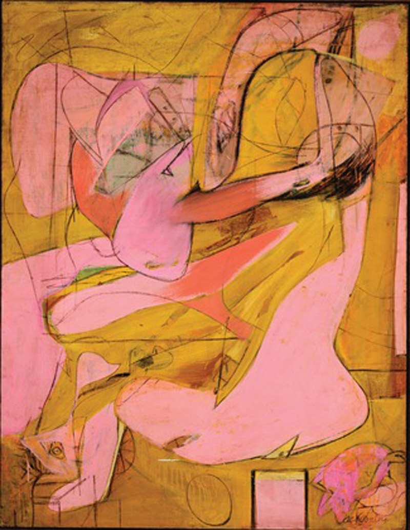
    De Kooning: Pink Angels

    New York City, home to great collections of art, is never short of key works by important artists to measure against one another. Autumn 2011, three displays have coincided to allow people to compare the skills of a modern master with those of a predecessor who influenced him. Willem de Kooning (1904-1997) revered J.A.D. Ingres (1780-1867) for both his devotion to the human figure and technical skill (in drawing especially). De Kooning vowed he would never paint a tree and his art never strayed too far from the portrait or nude, even at its most abstracted. Likewise, Ingres never manifested much interest in landscape and still-life either. Both painters were noted by peers as being consummate painters of flesh, principally female.

    MoMA claim that De Kooning: A Retrospective (until 9 January) is the “first major museum exhibition devoted to the full scope of the career of Willem de Kooning”. As the current survey includes work from 1983-7 not included in a much larger 1983 retrospective shown in Berlin and New York (the current show has 195 works, the earlier one had 280) the press release is technically accurate while being a touch grandiloquent.

    Filling the sixth floor of the new MoMA building for the first time, the retrospective provides some surprises and confirms some expectations. (Incidentally, the airy building is both impressive and a sympathetic environment for art.) Firstly, the confirmations: de Kooning could be a great draughtsman. The traditional still-life made at Rotterdam’s Academie is intensely detailed and meticulously observed yet remains vivid and not at all dry. The small pencil drawings in the style of Ingres are effective and memorable. The celebrated paintings of the late 1950s (Door to the River, Suburb in Havana, Gotham News, etc.), which display wide brush marks and acute angles on large canvases, tend towards the dry, vacant and bombastic. The pastels are not successful; their shapes are too diffuse and lack colour intensity.

    Secondly, the surprises: de Kooning went through a Matissean phase in the late 1920s following a January 1927 encounter with the French master’s work. The few surviving paintings are highly keyed still-lifes using deep blue and patterning. Another insight is that de Kooning’s early delicacy was not entirely submerged and was occasionally called on later. Clam Diggers (1963) is a creamy, lush oil on card, 51 x 37cms, showing two nude blondes. The colour of the ground forms a sandy surround and oil paint performs as flesh substitute è soft, tactile and alluring. It is a shame de Kooning did not return to this small size and chromatic simplicity more often.

    Excavation (1950) drew many viewers, who lost themselves in its swerving, enfolding curves and bejewelled glints among the creamy folds. The interlocking fragments of figures Ingresque and Hellenistic jostle and mesh, animating the picture plane but showing relatively little pictorial depth. It is endlessly seething and – to my eye – is pictorially richer than the women that followed. Five of the great Second Women Series make a memorable sequence at the centre of the display. Woman (1948) is a precursor to the most violently coloured and executed Woman I (1950-2) in MoMA’s collection. The catalogue writers fail to note the influence of Max Beckmann on the stark graphic quality of the orange-segment mouths and eyes during the 1940s. Likewise, the influence of John Marin is overlooked. John Marin was one of the early American Modernists who made semi-Cubist compositions of urban scenes in watercolour and charcoal. He was lionised until he was eclipsed by the Abstract Expressionists and was extremely influential, even representing the USA at the Venice Biennale of 1950 (alongside de Kooning and Pollock). He is now largely neglected and his jauntily angled views of New York with insipid colouring and insistent charcoal delineations are simultaneously crude and tepid. The star form on the top right of Woman (1948) is very characteristic of Marin’s formula of activating dead space around a motif è and an unusually weak device for de Kooning to resort to.

    It is hard to know what to make of the bronzes which the artist made during the 1960s and early 1970s. On one level they are three-dimensional translations of his painted and (especially) drawn figures modelled in clay and cast in bronze. They are faithful to their origins but without the ambiguity that is one of the pleasures of the drawings. They are literally “there” the way the drawings – playful and spare – are not and it is the “thereness” that fails to satisfy. They are exactly the sculptures that Francis Bacon imagined making (minus the brushed steel armature and whitewash). The most amusing bronzes are small maquettes, which are barely more than twists of clay. No. 6 (1969) has more than a touch of Rodin’s Iris, Messenger of the Gods (c. 1895). In No. 13 (1969) a rudimentary spread-eagled figure benefits from being set on a found box which acts as an alcove/door, just as the women are depicted in rowing boats in paintings of this period. Again, this echoes Bacon’s practice of juxtaposing loose, organic figures exploiting the plastic potentials of its medium against tightly described geometric surroundings.

    The paintings from the 1970s after de Kooning returned from sculpting are the most chromatically dazzling and sumptuous in use of paint in all of his oeuvre. Although a few of the best oils of the period are missing from this selection, the sequence on one wall is a glory. These are what the late 1950s should have been: serpentine trails of ultramarine, black and pink wind around bursts of loosely brushed colour. Have any more purely joyful and playful paintings been made in the late 20th century?

    The paintings from 1981–1990 (the “White” or “Ribbon” paintings) are still contested. In these canvases the painter simplified radically, reducing his palette to cadmium red, cadmium yellow and ultramarine, with black being used only for lines and white predominating. The Ribbon paintings are strongly linear, with ribbons of colour gently jinking across the picture surface, sometimes enclosed areas of evenly brushed hues. The Ribbon paintings were made by painting over charcoal tracings (drawn by studio assistants) of old drawings projected onto the primed canvas.

    Detractors consider them evidence of waning powers, less tactile and lacking engagement with the characteristics of oil paint. They point to the influence of the assistants in preparing canvases and even selecting the combinations of drawings transferred to the canvas. (Age and alcoholism blunted the artist’s mental capabilities and dementia set in during the 1980s, leading to his family being granted power of attorney over his affairs in 1989.) Curator John Elderfield puts the contrary case for the Ribbon period: that de Kooning made conscious choices and chose to engage with emptiness and serenity and deliberately used the sparseness of drawing to direct his paint handling. He was returning to an approach apparent in earlier phases.

    After the slippery delights of the 1970s paintings, these works can’t help but appear thin in every sense. They are less inventive, satisfying and “present”. They lack energy and cannot compel the way even less successful earlier pieces could. However in command of his faculties de Kooning was or was not, the last paintings are less good. Ensor largely lost his inspiration and sense of colour around his 40th year yet painted with clarity and purpose until his late 70s. It is not an issue of competence but of results. Just because, assessed on the ample evidence of this retrospective, de Kooning was a masterful painter does not mean all his paintings are at the highest level.

    One artist with ferocious consistency and constancy is Ingres. The group of drawn portraits taken from the Morgan Library’s collection on show at the library’s elegant and humanly scaled galleries demonstrate Ingres to be a consummate professional who never sacrificed psychological insight to the expectations of patrons.

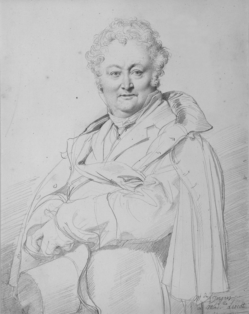
    Ingres: Guillon-Lethiere

    Ingres was a master technician and portraits of Mlle Joséphine Nicaise­Lacroix (1813) and M. Guillaume Guillon-­Lethière (1815), show his flexibility. The first is largely diagonally hatched on the face while the latter has a mixture of straight hatching and rounded hatching at the brow radiating from the sitter’s left eye. This curving hatching was a common device used by engravers of portrait frontispieces in books of the period. Ingres’s human warmth shines through in his portrait of his wife, where he places himself as an attendant, devotedly marginalised.

    The stand-out item, Odalisque and Slave (1839), is a drawing and wash, with touches of brown to soften the grey that might otherwise have been steely. It is in effect a grisaille painting partially achieved through drawing. The female anatomy is subtly altered to suit the picture’s clarity and harmonious rhythm, something Matisse, Picasso and de Kooning would continue to practice. The small strokes and grain of the paper give the picture a powdery presence.

    In parallel, the Morgan Library is also hosting a display of early 19th century French drawings borrowed from the Louvre. The Louvre has generously loaned some of the best drawings of the period: Géricault’s Leda and the Swan (1816-7), emphasises the struggle before consummation in dramatic brown wash and white gouache; Francois-Marius Granet’s moody and stygian ink wash View of Rome (c. 1803-12); Ingres’s assured pencil Self­Portrait (1835). There are some bold ink drawings by Delacroix. In a sketch for The Death of Sardanapalus, Delacroix dashes off a patchwork of fabric for the garments of the dying (or supplicating) concubine in a riot of invented pattern. It is done with such carefree energy it reminds one of Picasso at his most daring. This and the other loose pen sketches captivated Delacroix’s Romantic peers and for many now these pieces will hold more appeal than his oils, a number of which have altered as fugitive pigments have discoloured. Delacroix’s tenuous understanding of anatomy is least distracting in the sketches.

    Best known for his proficiently sentimental Execution of Lady Jane Grey (1834) in the National Gallery, Paul Delaroche is represented by a marvellously delicate portrait of Antoine Alphonse Montfort (undated) in multiple drawing media. The finely graduated face gazes out sculpturally precise, a single touch of white gouache on his ring gleams in a startlingly present manner. If Delaroche made more portrait drawings of this quality then they deserve to be better known.

    There are two pieces which have special emotional power. The first is a portrait by Pierre-Paul Prud’hon of his lover Constance Mayer, a black-and-white chalk drawing on tinted paper (c. 1804). The depiction is lifelike and lively, made with affection and attention. Mayer (a fellow artist) is attired casually. She turns to look past the viewer, head tilted, smiling. When, in 1821, Prud’hon and Mayer’s relationship reached an impasse, the latter committed suicide. Stricken, Prud’hon gave away the drawing, unable to bear the likeness, and died in 1823.

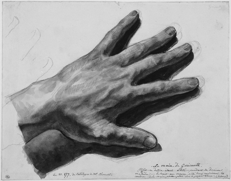
    Another masterpiece is Géricault’s watercolour of his left hand (1823/4). Ravaged by cancer and a series of riding accidents, the painter was bedridden at the time and was only weeks from death. His world had contracted to his own body. As he lamented to acolytes all the masterpieces he had planned but never followed through (Géricault was an inveterate perfectionist who only completed one complex composition in oils, The Raft of the Medusa), the artist articulated his frailty and mortality in a slender hand. It thrums with life in the rough red-chalk hatching and loose blue washes even as the man himself was rushing towards oblivion and dissolution.

    De Kooning: A Retrospective, was at MoMA, until January 9th 2012; David, Delacroix, and Revolutionary France: Drawings from the Louvre, was at Morgan Library, until December 31st 2011; Ingres was at the Morgan, Morgan Library, until November 27th 2011.

    The Jackdaw Nov-Dec 2011

  • Magritte and Post-Impressionist art: Alexander Adams is enthused by two stimulating surveys

    The effects of Liverpool’s time as City of Culture in 2008 are still becoming apparent as various building projects reach completion. Liverpool has many excellent museums, to which number the Museum of Liverpool is due to be added. My visit to Liverpool was before the museum’s opening on July 19th, so I made do with two significant shows which will run until the autumn: a survey of Magritte and a partial reconstruction of a pioneering exhibition of Post-Impressionist art held at the Bluecoat Gallery, Liverpool in 1911. (The Bluecoat Gallery itself has recently been refurbished. The excellent diverse bookshop and the well-stocked art-materials store have both left and the gallery, which occasionally hosted worthwhile shows, now runs an exhibition programme of the driest and least engaging type. What was once a hub of artistic activity has been reduced to a deracinated husk. Best to bypass it entirely and visit the newly relocated Probe Records next door instead.)

    The 1910-11 display “Manet and the Post-Impressionists” at the Grafton Gallery, London is a celebrated landmark in British Modernism. What is less well-known is that the show (minus the Manets) travelled to Liverpool before the pictures were dispersed. Art in Revolution: Liverpool 1911 (Walker Art Gallery, closes September 25th) is an investigation of the second display, which included local Liverpool artists alongside the French painters. The French artists included Denis, Derain, Matisse, Picasso, Serusier, Signac, Vlaminck and others.

    As co-curator Charlotte Keenan comments of the 1911 show, the sheer heterogeneity of styles evident in the French paintings must have contributed to the incomprehension of viewers. Press response was apparently muted, not helped by tension between the Sandon Studios Society (SSS), the guiding spirit behind the Liverpool display, and the Municipal Art Gallery (the Walker). The SSS was a Liverpool arts club along the lines of the Omega Workshop conceived in the spirit of the Bloomsbury Group. The most notable member was Augustus John.

    In the current exhibition art is placed alongside information about the industrial strife on Merseyside in the summer of 1911. Transport and dock workers came out on strike and the Army (supported by a warship) were brought in to break the strike, leading to violent and fatal conflict. The link between revolutionary art and socialism isn’t at all tenuous. The artists tended to emphasise intellectual and moral reforms, while the trades unionists agitated for political and industrial change, but there were many common areas of overlap. The point is well made but the busy graphics and film audio distract from viewing the art. Part of the exhibition examines art exhibited by the Walker Art Gallery during 1911: a display of photographs and an annual autumn salon. The paintings are not markedly more conservative than the art of the Sandon Group exhibited and attracted more visitors at the time. Prints and textiles demonstrate the influence of the 1911 show on local artists.

    So, how do the British artists hold up against the French? Well, the British look slightly tweedy compared to their French colleagues. Certainly there is nothing to match to a fiery, vigorous landscape by Matisse, borrowed from Belgrade, or a pen-and-pencil drawing by Van Gogh, A Corner of the Garden of St Paul’s Hospital at St Rémy (1889), which seethes and roils. Yet the Philip Wilson Steer landscape The Horseshoe Bend of the Severn has a lot of energy, though the colour is a little sludgy. Albert Lipczinski’s portraits are bright and vivid and James Hamilton Hay’s Falling Star has Whistlerian moodiness but one longs for some unruliness.

    The Albert Marquet (1875-1947) canvas is a view of Notre Dame Cathedral in mist and snow, painted with spirit and restraint. Was Marquet as natural a painter as Derain (also shown here)? Quite possibly. Certainly his output was more consistent, less intense and severe. Does the fact that Marquet’s might be a little easier to live with than Derain’s reduce the level of the achievement? Marquet’s art rewards repeated encounters. We should think of him as more than a spear carrier and assess his art on its own terms.

    1911: Art and Revolution in Liverpool, The Life and Times of Albert Lipczinski (Sansom & Company, 215pp, illus, £15) is David Bingham’s biography of the German-Polish artist who played a part in the Sandon Studios Society (SSS). Lipczinski (1876-1974) was a painterly realist in the mould of John. His spirited portraits are refreshingly lively. He painted portraits of some union figures. A dark, atmospheric and detailed nude of c.1906-9 offers a glimpse of an untaken path. He was deported back to Poland in 1919 and his work declined in quality it seems partly due to neglect and to difficult circumstances in Danzig. The city suffered depression, dictatorship, war, annexation and Communist oppression in less than two decades, so understandably creativity was somewhat sidelined by the business of survival. The biography is an ideal primer for exhibition visitors and an insight into the Liverpool art scene of the period.

    As mentioned in the review of Miró in the last issue, curators often claim to have new perspectives on great artists. The thesis of René Magritte: The Pleasure Principle (Tate Liverpool, until October 16th) is that Magritte was more intellectually engaged by his commercial work and his photography and home movies than had been hitherto realised. On the evidence here, it is definitely clear that the artist put more thought and creativity into his posters and advertisements than he needed to. How much of this fed back into his art is debatable. Nonetheless, what is impressive about this display is how the quality of the works and the selection of items provide a satisfying overview of Magritte not allowing any explicit curatorial direction to intrude. The hang is very well judged, sequencing small groups of work to illuminate an aspect, even arranging works in the best order. The pairing of two versions of La Saveur des larmes (The Taste of Tears, 1948) – one from Brussels, the other from Birmingham – is salutary. Although supposedly near identical, the colouring and background cloud formations do differ distinctly.

    The coffin paintings are an example of how context alters reception. Magritte painted versions of David’s Mme Recamier Reclining and Manet’s Balcony, replacing the figures with coffins. This creates an energising frisson as the viewer superimposes his memory of the depictions of the living over Magritte’s coffins. The tension between the remembered living and the present dead is the meaning of the works, yet today many viewers do not know the originals and simply take the Magrittes as japes. Supplying comparative figures in a catalogue does not create the same effect, though it is the best that can be done to remedy the lack of familiarity.

    What we have here is an excellent survey of Magritte’s ideas (transformation, substitution, juxtaposition, association, reversal, words as icons) with much supporting material. The only periods which are not represented are pre-Surrealist (before 1926) and Renoir (1943-1947) periods, neither of which is essential and the latter certainly not missed. The brief Vache period is covered by a clutch of paintings. The Ellipsis (1948) – showing an amalgamated misfit figure with rifle-barrel nose and lime-green skin – is an assured and troubling piece of buffoonery, sour and sinister. Only an artist at the top of his game could produce such deft painting. Sceptics who doubt Magritte’s credentials as a painter (as opposed to mere image fabricator) should study this painting in particular.

    The most compelling items are the early (pre-1930) paintings when the art was dark, rough and urgent. It carried the real risk of failure and smelt of anxiety. Though the later works have a degree of serenity and majesty, one can miss the fear and compulsion that drove the young Magritte. That said, it is hard not to melt a little in the face of Towards Pleasure (1962), in which a bowler-hatted man faces a nocturnal landscape. Like a Rückenfigur from a Friedrich painting, we share the figure’s contemplation of Nature. The palette is perfectly judged, consisting only of blue and grey for the clouded sky and blacks for the man, trees, curtain and misty field. The only touch of warm colour is the palest of yellows for the limpid full moon.

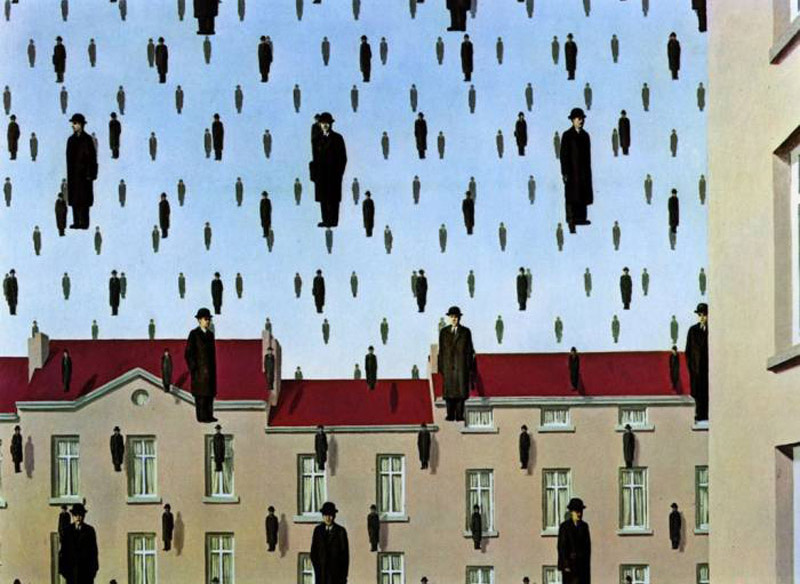
    Some of the best-known Magrittes are here: (the surprisingly big) Tomb of the Wrestlers (1960), where a red rose fills a room, Golconda (1953) with its raining men and MoMA’s The Menaced Assassin (1927). Key works are complemented by rarely seen minor works. The collection builds to a well-balanced picture of the painter’s concerns and accomplishments. For anyone who is not able to travel to Brussels to see the René Magritte museum, a visit to Liverpool is recommended.

    Alexander Adams is an artist and writer.

    The Jackdaw Sept-Oct 2011

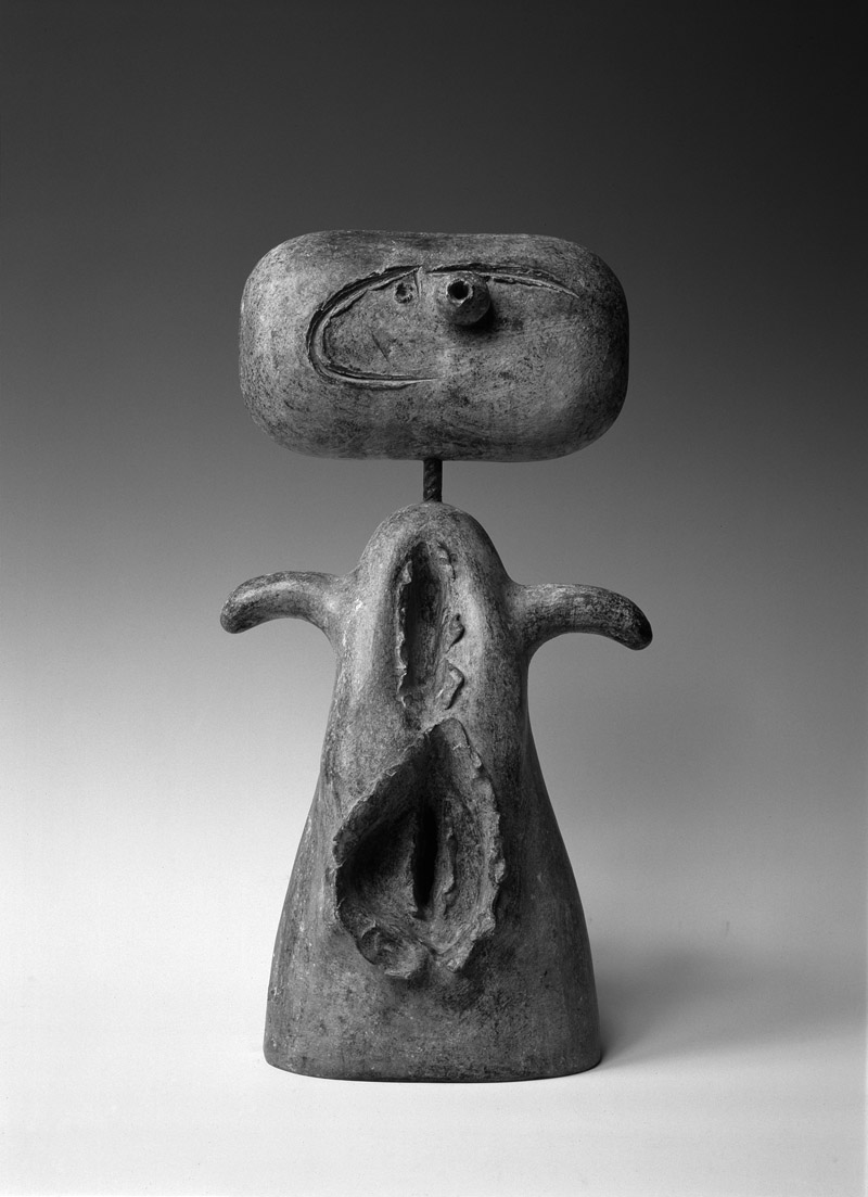
  • The Relics of St Joan: Alexander Adams goes in search of the curator’s Miro

    The Relics of St Joan: Alexander Adams goes in search of the curator’s Miro

    How often have we seen – of late – exhibitions of Modern masters with didactic subtitles? These subtitles tell us why we should visit this exhibition when we have seen so many on this particular artist before. It is the subtitle that gives us the curatorial slant. What happens is not that famous artists get “played out” but that curators and curatorial imperatives get played out. Museum directors and curators naturally want to show great artists but, unless inaccessible art is made available, there are really only two routes for monograph retrospectives: greatest hits or the hidden side of X. Recently we have seen a spate of the second approach; witness Picasso the Communist, Picasso the Surrealist, Picasso the erotic artist.

    Two exhibitions of Joan Miró (1893-1983) in London and Brussels this summer take different approaches. The London display is subtitled “The Ladder of Escape” and aims to revise our view of the artist, while the Brussels display, one on a much smaller scale, is subtitled “Peintre Poète” and presents a more conventional view of the painter. The Brussels exhibition conceives of the artist as lyrical, straining to escape the boundaries of conventional restrictions and mores, whereas the London one purports to uncover an overlooked political dimension to Miró’s art. I visited the Brussels display in person but I am assessing the London one from the catalogue (Tate, £25).

    The curators have made a point of selecting some adventurous work (burnt paintings in London, painted weavings in Brussels) which helps to spike the false impression of unalloyed gaiety and playfulness that is often associated with Miró.

    Comparatively, the Tate display has the upper hand in many respects. It is much larger; it features famous pieces; it has some strong early paintings and has gathered dispersed sets. For example, Tate has the original Constellations (1940-1) gouaches whereas Brussels makes do with the lithographic reproductions. This group is the summation of many of the painter’s discoveries and is combined  (condensed and unified) into a compendium of possibilities. Overall the Brussels display has a higher proportion of editioned work (prints, books and bronzes) than the London one.

    Miró’s output is so large that there is no significant competition between the two shows, particularly as neither display seeks to present a full retrospective. As with Picasso, Miró’s work can still surprise you with overlooked groups. A case in point is a series of paintings on boards from 1935-6. The ones on copper have the aspect of illusionistic solidity, like candy-coloured models in clay in the manner of Picasso’s Dinard bathers or Tanguy’s biomorphs. Comparison with Picasso’s Crucifixion (1930), similarly painted in sharp colours on a small panel, is inescapable and not unfavourable.

    What of the Tate premise that Miró’s art was politically engaged?  Miró made veiled anti-Franco statements sporadically (not an insignificant act while living in Spain under the regime, but others went further) and had demonstrated his commitment to the short-lived Republic that preceded the Civil War. His political stance is clear – but in his words and actions not in his art. His posters, picture titling and refusal to collaborate with the regime’s propaganda plans demonstrate this.

    Around the late 1940s something goes out of the drawing – some kind of tightness. The tension of attempting to capture something exact has departed, to be replaced with a masterful performance. However much we appreciate the skill of the artist, that cannot compensate for what has been lost – a nervousness, an uncertainty, a sense of exploration tempered by fear of failure. When Miró lost this fear something vital went from his art. The attention and care is still present in the later paintings but the resistance has gone, especially in the largest works, where unlike earlier compositions, dominant gestural marks are untethered and float free of the picture edges and other marks. (For example, see the late triptychs in London.) It gives a sense of liberation but it reduces tension and torsion.

    Striving to convey transcendence can denature pictures by eliminating the tension they require. Extra-pictorial considerations (a sense of wellbeing and satisfaction in the artist) have overridden the requirements of making art (concentration, revision, doubt, observation from life) to the detriment of the picture. They use the colours and materials of Western art and the borrowed lexicon and approach of Eastern art in an ambitious – but ultimately unsatisfying – experimental fusion. It would be interesting to see some of these canvases hung beside those by Adolphe Gottlieb.

    For the late period, Brussels has stronger individual works. It includes late drawings. These have more bite than the late paintings which have a tendency towards unearned largeness. Miró’s post-War engagement with children’s art and CoBrA is more pronounced. The higher proportion of bronzes also shows Miró to advantage.

    The late bronzes are some his finest works, not just of that period but of all his whole oeuvre. Miró used everyday objects – baskets, dolls, taps, eggs, nails, cutlery, wood, card, tools – and assembled them in small and relatively sparse compositions. Once the assemblage had been cast in wax he often worked over the wax models, incising lines or gouging holes before the model was cast in bronze. This gives the sculptures a vivifying multi-layered quality. Objects are found and assembled, graphic marks applied and the metal cast. Sometimes Miró would add a further stage by adding paint. The paint tended to lessen the characteristic qualities of the bronzes by diminishing each of the first three stages, submerging them in Miró’s rather over-forceful palette. The greenish patina has pleasing asperity and the authenticity of the generally utilitarian objects brings a toughness of material and fixity of form – a kind of resilience and resistance that largely departed from Miró’s late pictorial art – that makes the late bronzes special.

    The drawings in Brussels are especially welcome and good. The raggedness of materials and variety of surfaces (including patterned paper) provides relief from the tessellated areas of colour in the oil paintings.  After the Second World War Miró’s art is at its best roughly finished and textured (in the drawings, burnt paintings, weavings and bronzes), something that the Tate curators have either ignored or bypassed, as is evident from the selection of the triptychs instead of rougher pieces. Even the late paintings in Brussels have this refreshingly coarser quality.

    Both exhibitions have strong points and the Brussels show does not necessarily come out second best by being significantly smaller. While it is commendable that curators seek to broaden our understanding of familiar artists, it is important that curators identify what most aesthetically exciting about the art in question and allow that to determine at least some of their selections. After all, art consists of objects, does it not?

    Joan Miró: The Ladder of Escape, was at Tate Modern, until September 11th 2011, then touring to Barcelona and Washington D.C.; Joan Miró: Peintre Poète, Espace culturel ING, Brussels, closed June 19th 2011.

    Yorkshire Sculpture Park hosts the first major UK exhibition of sculpture by Joan Miró from 17/03/12 to 06/01/13. With key works set in the landscape, the exhibition fulfils the artist’s desire that “sculpture must stand in the open air, in the middle of nature”.
    http://www.ysp.co.uk/exhibitions/mir%C3%B3-sculptor

    Alexander Adams is an artist and writer based in Berlin. Three Strikes (poems and drawings) is published by Bottle of Smoke Press (www.bospress.net).

    The Jackdaw Jul-Aug 2011

    Â