Tag: Alexander Adams

  • Lost in New York: painter and critic Alexander Adams discovers an unlikely empathy between Ingres and de Kooning

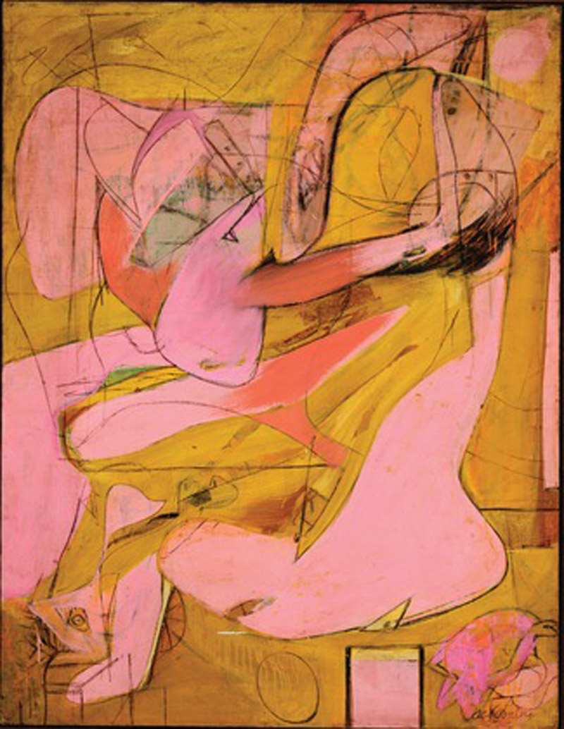
    De Kooning: Pink Angels

    New York City, home to great collections of art, is never short of key works by important artists to measure against one another. Autumn 2011, three displays have coincided to allow people to compare the skills of a modern master with those of a predecessor who influenced him. Willem de Kooning (1904-1997) revered J.A.D. Ingres (1780-1867) for both his devotion to the human figure and technical skill (in drawing especially). De Kooning vowed he would never paint a tree and his art never strayed too far from the portrait or nude, even at its most abstracted. Likewise, Ingres never manifested much interest in landscape and still-life either. Both painters were noted by peers as being consummate painters of flesh, principally female.

    MoMA claim that De Kooning: A Retrospective (until 9 January) is the “first major museum exhibition devoted to the full scope of the career of Willem de Kooning”. As the current survey includes work from 1983-7 not included in a much larger 1983 retrospective shown in Berlin and New York (the current show has 195 works, the earlier one had 280) the press release is technically accurate while being a touch grandiloquent.

    Filling the sixth floor of the new MoMA building for the first time, the retrospective provides some surprises and confirms some expectations. (Incidentally, the airy building is both impressive and a sympathetic environment for art.) Firstly, the confirmations: de Kooning could be a great draughtsman. The traditional still-life made at Rotterdam’s Academie is intensely detailed and meticulously observed yet remains vivid and not at all dry. The small pencil drawings in the style of Ingres are effective and memorable. The celebrated paintings of the late 1950s (Door to the River, Suburb in Havana, Gotham News, etc.), which display wide brush marks and acute angles on large canvases, tend towards the dry, vacant and bombastic. The pastels are not successful; their shapes are too diffuse and lack colour intensity.

    Secondly, the surprises: de Kooning went through a Matissean phase in the late 1920s following a January 1927 encounter with the French master’s work. The few surviving paintings are highly keyed still-lifes using deep blue and patterning. Another insight is that de Kooning’s early delicacy was not entirely submerged and was occasionally called on later. Clam Diggers (1963) is a creamy, lush oil on card, 51 x 37cms, showing two nude blondes. The colour of the ground forms a sandy surround and oil paint performs as flesh substitute è soft, tactile and alluring. It is a shame de Kooning did not return to this small size and chromatic simplicity more often.

    Excavation (1950) drew many viewers, who lost themselves in its swerving, enfolding curves and bejewelled glints among the creamy folds. The interlocking fragments of figures Ingresque and Hellenistic jostle and mesh, animating the picture plane but showing relatively little pictorial depth. It is endlessly seething and – to my eye – is pictorially richer than the women that followed. Five of the great Second Women Series make a memorable sequence at the centre of the display. Woman (1948) is a precursor to the most violently coloured and executed Woman I (1950-2) in MoMA’s collection. The catalogue writers fail to note the influence of Max Beckmann on the stark graphic quality of the orange-segment mouths and eyes during the 1940s. Likewise, the influence of John Marin is overlooked. John Marin was one of the early American Modernists who made semi-Cubist compositions of urban scenes in watercolour and charcoal. He was lionised until he was eclipsed by the Abstract Expressionists and was extremely influential, even representing the USA at the Venice Biennale of 1950 (alongside de Kooning and Pollock). He is now largely neglected and his jauntily angled views of New York with insipid colouring and insistent charcoal delineations are simultaneously crude and tepid. The star form on the top right of Woman (1948) is very characteristic of Marin’s formula of activating dead space around a motif è and an unusually weak device for de Kooning to resort to.

    It is hard to know what to make of the bronzes which the artist made during the 1960s and early 1970s. On one level they are three-dimensional translations of his painted and (especially) drawn figures modelled in clay and cast in bronze. They are faithful to their origins but without the ambiguity that is one of the pleasures of the drawings. They are literally “there” the way the drawings – playful and spare – are not and it is the “thereness” that fails to satisfy. They are exactly the sculptures that Francis Bacon imagined making (minus the brushed steel armature and whitewash). The most amusing bronzes are small maquettes, which are barely more than twists of clay. No. 6 (1969) has more than a touch of Rodin’s Iris, Messenger of the Gods (c. 1895). In No. 13 (1969) a rudimentary spread-eagled figure benefits from being set on a found box which acts as an alcove/door, just as the women are depicted in rowing boats in paintings of this period. Again, this echoes Bacon’s practice of juxtaposing loose, organic figures exploiting the plastic potentials of its medium against tightly described geometric surroundings.

    The paintings from the 1970s after de Kooning returned from sculpting are the most chromatically dazzling and sumptuous in use of paint in all of his oeuvre. Although a few of the best oils of the period are missing from this selection, the sequence on one wall is a glory. These are what the late 1950s should have been: serpentine trails of ultramarine, black and pink wind around bursts of loosely brushed colour. Have any more purely joyful and playful paintings been made in the late 20th century?

    The paintings from 1981–1990 (the “White” or “Ribbon” paintings) are still contested. In these canvases the painter simplified radically, reducing his palette to cadmium red, cadmium yellow and ultramarine, with black being used only for lines and white predominating. The Ribbon paintings are strongly linear, with ribbons of colour gently jinking across the picture surface, sometimes enclosed areas of evenly brushed hues. The Ribbon paintings were made by painting over charcoal tracings (drawn by studio assistants) of old drawings projected onto the primed canvas.

    Detractors consider them evidence of waning powers, less tactile and lacking engagement with the characteristics of oil paint. They point to the influence of the assistants in preparing canvases and even selecting the combinations of drawings transferred to the canvas. (Age and alcoholism blunted the artist’s mental capabilities and dementia set in during the 1980s, leading to his family being granted power of attorney over his affairs in 1989.) Curator John Elderfield puts the contrary case for the Ribbon period: that de Kooning made conscious choices and chose to engage with emptiness and serenity and deliberately used the sparseness of drawing to direct his paint handling. He was returning to an approach apparent in earlier phases.

    After the slippery delights of the 1970s paintings, these works can’t help but appear thin in every sense. They are less inventive, satisfying and “present”. They lack energy and cannot compel the way even less successful earlier pieces could. However in command of his faculties de Kooning was or was not, the last paintings are less good. Ensor largely lost his inspiration and sense of colour around his 40th year yet painted with clarity and purpose until his late 70s. It is not an issue of competence but of results. Just because, assessed on the ample evidence of this retrospective, de Kooning was a masterful painter does not mean all his paintings are at the highest level.

    One artist with ferocious consistency and constancy is Ingres. The group of drawn portraits taken from the Morgan Library’s collection on show at the library’s elegant and humanly scaled galleries demonstrate Ingres to be a consummate professional who never sacrificed psychological insight to the expectations of patrons.
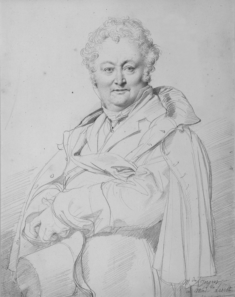
    Ingres: Guillon-Lethiere

    Ingres was a master technician and portraits of Mlle Joséphine Nicaise­Lacroix (1813) and M. Guillaume Guillon-­Lethière (1815), show his flexibility. The first is largely diagonally hatched on the face while the latter has a mixture of straight hatching and rounded hatching at the brow radiating from the sitter’s left eye. This curving hatching was a common device used by engravers of portrait frontispieces in books of the period. Ingres’s human warmth shines through in his portrait of his wife, where he places himself as an attendant, devotedly marginalised.

    The stand-out item, Odalisque and Slave (1839), is a drawing and wash, with touches of brown to soften the grey that might otherwise have been steely. It is in effect a grisaille painting partially achieved through drawing. The female anatomy is subtly altered to suit the picture’s clarity and harmonious rhythm, something Matisse, Picasso and de Kooning would continue to practice. The small strokes and grain of the paper give the picture a powdery presence.

    In parallel, the Morgan Library is also hosting a display of early 19th century French drawings borrowed from the Louvre. The Louvre has generously loaned some of the best drawings of the period: Géricault’s Leda and the Swan (1816-7), emphasises the struggle before consummation in dramatic brown wash and white gouache; Francois-Marius Granet’s moody and stygian ink wash View of Rome (c. 1803-12); Ingres’s assured pencil Self­Portrait (1835). There are some bold ink drawings by Delacroix. In a sketch for The Death of Sardanapalus, Delacroix dashes off a patchwork of fabric for the garments of the dying (or supplicating) concubine in a riot of invented pattern. It is done with such carefree energy it reminds one of Picasso at his most daring. This and the other loose pen sketches captivated Delacroix’s Romantic peers and for many now these pieces will hold more appeal than his oils, a number of which have altered as fugitive pigments have discoloured. Delacroix’s tenuous understanding of anatomy is least distracting in the sketches.

    Best known for his proficiently sentimental Execution of Lady Jane Grey (1834) in the National Gallery, Paul Delaroche is represented by a marvellously delicate portrait of Antoine Alphonse Montfort (undated) in multiple drawing media. The finely graduated face gazes out sculpturally precise, a single touch of white gouache on his ring gleams in a startlingly present manner. If Delaroche made more portrait drawings of this quality then they deserve to be better known.

    There are two pieces which have special emotional power. The first is a portrait by Pierre-Paul Prud’hon of his lover Constance Mayer, a black-and-white chalk drawing on tinted paper (c. 1804). The depiction is lifelike and lively, made with affection and attention. Mayer (a fellow artist) is attired casually. She turns to look past the viewer, head tilted, smiling. When, in 1821, Prud’hon and Mayer’s relationship reached an impasse, the latter committed suicide. Stricken, Prud’hon gave away the drawing, unable to bear the likeness, and died in 1823.
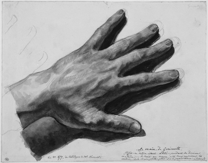
    Another masterpiece is Géricault’s watercolour of his left hand (1823/4). Ravaged by cancer and a series of riding accidents, the painter was bedridden at the time and was only weeks from death. His world had contracted to his own body. As he lamented to acolytes all the masterpieces he had planned but never followed through (Géricault was an inveterate perfectionist who only completed one complex composition in oils, The Raft of the Medusa), the artist articulated his frailty and mortality in a slender hand. It thrums with life in the rough red-chalk hatching and loose blue washes even as the man himself was rushing towards oblivion and dissolution.

    De Kooning: A Retrospective, was at MoMA, until January 9th 2012; David, Delacroix, and Revolutionary France: Drawings from the Louvre, was at Morgan Library, until December 31st 2011; Ingres was at the Morgan, Morgan Library, until November 27th 2011.

    The Jackdaw Nov-Dec 2011
  • Magritte and Post-Impressionist art: Alexander Adams is enthused by two stimulating surveys

    The effects of Liverpool’s time as City of Culture in 2008 are still becoming apparent as various building projects reach completion. Liverpool has many excellent museums, to which number the Museum of Liverpool is due to be added. My visit to Liverpool was before the museum’s opening on July 19th, so I made do with two significant shows which will run until the autumn: a survey of Magritte and a partial reconstruction of a pioneering exhibition of Post-Impressionist art held at the Bluecoat Gallery, Liverpool in 1911. (The Bluecoat Gallery itself has recently been refurbished. The excellent diverse bookshop and the well-stocked art-materials store have both left and the gallery, which occasionally hosted worthwhile shows, now runs an exhibition programme of the driest and least engaging type. What was once a hub of artistic activity has been reduced to a deracinated husk. Best to bypass it entirely and visit the newly relocated Probe Records next door instead.)

    The 1910-11 display “Manet and the Post-Impressionists” at the Grafton Gallery, London is a celebrated landmark in British Modernism. What is less well-known is that the show (minus the Manets) travelled to Liverpool before the pictures were dispersed. Art in Revolution: Liverpool 1911 (Walker Art Gallery, closes September 25th) is an investigation of the second display, which included local Liverpool artists alongside the French painters. The French artists included Denis, Derain, Matisse, Picasso, Serusier, Signac, Vlaminck and others.

    As co-curator Charlotte Keenan comments of the 1911 show, the sheer heterogeneity of styles evident in the French paintings must have contributed to the incomprehension of viewers. Press response was apparently muted, not helped by tension between the Sandon Studios Society (SSS), the guiding spirit behind the Liverpool display, and the Municipal Art Gallery (the Walker). The SSS was a Liverpool arts club along the lines of the Omega Workshop conceived in the spirit of the Bloomsbury Group. The most notable member was Augustus John.

    In the current exhibition art is placed alongside information about the industrial strife on Merseyside in the summer of 1911. Transport and dock workers came out on strike and the Army (supported by a warship) were brought in to break the strike, leading to violent and fatal conflict. The link between revolutionary art and socialism isn’t at all tenuous. The artists tended to emphasise intellectual and moral reforms, while the trades unionists agitated for political and industrial change, but there were many common areas of overlap. The point is well made but the busy graphics and film audio distract from viewing the art. Part of the exhibition examines art exhibited by the Walker Art Gallery during 1911: a display of photographs and an annual autumn salon. The paintings are not markedly more conservative than the art of the Sandon Group exhibited and attracted more visitors at the time. Prints and textiles demonstrate the influence of the 1911 show on local artists.

    So, how do the British artists hold up against the French? Well, the British look slightly tweedy compared to their French colleagues. Certainly there is nothing to match to a fiery, vigorous landscape by Matisse, borrowed from Belgrade, or a pen-and-pencil drawing by Van Gogh, A Corner of the Garden of St Paul’s Hospital at St Rémy (1889), which seethes and roils. Yet the Philip Wilson Steer landscape The Horseshoe Bend of the Severn has a lot of energy, though the colour is a little sludgy. Albert Lipczinski’s portraits are bright and vivid and James Hamilton Hay’s Falling Star has Whistlerian moodiness but one longs for some unruliness.

    The Albert Marquet (1875-1947) canvas is a view of Notre Dame Cathedral in mist and snow, painted with spirit and restraint. Was Marquet as natural a painter as Derain (also shown here)? Quite possibly. Certainly his output was more consistent, less intense and severe. Does the fact that Marquet’s might be a little easier to live with than Derain’s reduce the level of the achievement? Marquet’s art rewards repeated encounters. We should think of him as more than a spear carrier and assess his art on its own terms.

    1911: Art and Revolution in Liverpool, The Life and Times of Albert Lipczinski (Sansom & Company, 215pp, illus, £15) is David Bingham’s biography of the German-Polish artist who played a part in the Sandon Studios Society (SSS). Lipczinski (1876-1974) was a painterly realist in the mould of John. His spirited portraits are refreshingly lively. He painted portraits of some union figures. A dark, atmospheric and detailed nude of c.1906-9 offers a glimpse of an untaken path. He was deported back to Poland in 1919 and his work declined in quality it seems partly due to neglect and to difficult circumstances in Danzig. The city suffered depression, dictatorship, war, annexation and Communist oppression in less than two decades, so understandably creativity was somewhat sidelined by the business of survival. The biography is an ideal primer for exhibition visitors and an insight into the Liverpool art scene of the period.

    As mentioned in the review of Miró in the last issue, curators often claim to have new perspectives on great artists. The thesis of René Magritte: The Pleasure Principle (Tate Liverpool, until October 16th) is that Magritte was more intellectually engaged by his commercial work and his photography and home movies than had been hitherto realised. On the evidence here, it is definitely clear that the artist put more thought and creativity into his posters and advertisements than he needed to. How much of this fed back into his art is debatable. Nonetheless, what is impressive about this display is how the quality of the works and the selection of items provide a satisfying overview of Magritte not allowing any explicit curatorial direction to intrude. The hang is very well judged, sequencing small groups of work to illuminate an aspect, even arranging works in the best order. The pairing of two versions of La Saveur des larmes (The Taste of Tears, 1948) – one from Brussels, the other from Birmingham – is salutary. Although supposedly near identical, the colouring and background cloud formations do differ distinctly.

    The coffin paintings are an example of how context alters reception. Magritte painted versions of David’s Mme Recamier Reclining and Manet’s Balcony, replacing the figures with coffins. This creates an energising frisson as the viewer superimposes his memory of the depictions of the living over Magritte’s coffins. The tension between the remembered living and the present dead is the meaning of the works, yet today many viewers do not know the originals and simply take the Magrittes as japes. Supplying comparative figures in a catalogue does not create the same effect, though it is the best that can be done to remedy the lack of familiarity.

    What we have here is an excellent survey of Magritte’s ideas (transformation, substitution, juxtaposition, association, reversal, words as icons) with much supporting material. The only periods which are not represented are pre-Surrealist (before 1926) and Renoir (1943-1947) periods, neither of which is essential and the latter certainly not missed. The brief Vache period is covered by a clutch of paintings. The Ellipsis (1948) – showing an amalgamated misfit figure with rifle-barrel nose and lime-green skin – is an assured and troubling piece of buffoonery, sour and sinister. Only an artist at the top of his game could produce such deft painting. Sceptics who doubt Magritte’s credentials as a painter (as opposed to mere image fabricator) should study this painting in particular.

    The most compelling items are the early (pre-1930) paintings when the art was dark, rough and urgent. It carried the real risk of failure and smelt of anxiety. Though the later works have a degree of serenity and majesty, one can miss the fear and compulsion that drove the young Magritte. That said, it is hard not to melt a little in the face of Towards Pleasure (1962), in which a bowler-hatted man faces a nocturnal landscape. Like a Rückenfigur from a Friedrich painting, we share the figure’s contemplation of Nature. The palette is perfectly judged, consisting only of blue and grey for the clouded sky and blacks for the man, trees, curtain and misty field. The only touch of warm colour is the palest of yellows for the limpid full moon.

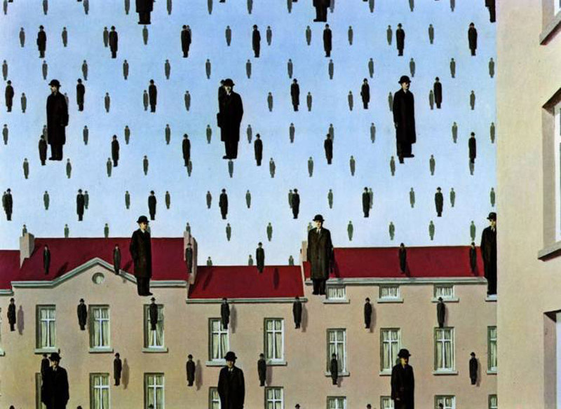
    Some of the best-known Magrittes are here: (the surprisingly big) Tomb of the Wrestlers (1960), where a red rose fills a room, Golconda (1953) with its raining men and MoMA’s The Menaced Assassin (1927). Key works are complemented by rarely seen minor works. The collection builds to a well-balanced picture of the painter’s concerns and accomplishments. For anyone who is not able to travel to Brussels to see the René Magritte museum, a visit to Liverpool is recommended.

    Alexander Adams is an artist and writer.

    The Jackdaw Sept-Oct 2011

  • The Relics of St Joan: Alexander Adams goes in search of the curator’s Miro

    The Relics of St Joan: Alexander Adams goes in search of the curator’s Miro

    How often have we seen – of late – exhibitions of Modern masters with didactic subtitles? These subtitles tell us why we should visit this exhibition when we have seen so many on this particular artist before. It is the subtitle that gives us the curatorial slant. What happens is not that famous artists get “played out” but that curators and curatorial imperatives get played out. Museum directors and curators naturally want to show great artists but, unless inaccessible art is made available, there are really only two routes for monograph retrospectives: greatest hits or the hidden side of X. Recently we have seen a spate of the second approach; witness Picasso the Communist, Picasso the Surrealist, Picasso the erotic artist.

    Two exhibitions of Joan Miró (1893-1983) in London and Brussels this summer take different approaches. The London display is subtitled “The Ladder of Escape” and aims to revise our view of the artist, while the Brussels display, one on a much smaller scale, is subtitled “Peintre Poète” and presents a more conventional view of the painter. The Brussels exhibition conceives of the artist as lyrical, straining to escape the boundaries of conventional restrictions and mores, whereas the London one purports to uncover an overlooked political dimension to Miró’s art. I visited the Brussels display in person but I am assessing the London one from the catalogue (Tate, £25).

    The curators have made a point of selecting some adventurous work (burnt paintings in London, painted weavings in Brussels) which helps to spike the false impression of unalloyed gaiety and playfulness that is often associated with Miró.

    Comparatively, the Tate display has the upper hand in many respects. It is much larger; it features famous pieces; it has some strong early paintings and has gathered dispersed sets. For example, Tate has the original Constellations (1940-1) gouaches whereas Brussels makes do with the lithographic reproductions. This group is the summation of many of the painter’s discoveries and is combined  (condensed and unified) into a compendium of possibilities. Overall the Brussels display has a higher proportion of editioned work (prints, books and bronzes) than the London one.

    Miró’s output is so large that there is no significant competition between the two shows, particularly as neither display seeks to present a full retrospective. As with Picasso, Miró’s work can still surprise you with overlooked groups. A case in point is a series of paintings on boards from 1935-6. The ones on copper have the aspect of illusionistic solidity, like candy-coloured models in clay in the manner of Picasso’s Dinard bathers or Tanguy’s biomorphs. Comparison with Picasso’s Crucifixion (1930), similarly painted in sharp colours on a small panel, is inescapable and not unfavourable.

    What of the Tate premise that Miró’s art was politically engaged?  Miró made veiled anti-Franco statements sporadically (not an insignificant act while living in Spain under the regime, but others went further) and had demonstrated his commitment to the short-lived Republic that preceded the Civil War. His political stance is clear – but in his words and actions not in his art. His posters, picture titling and refusal to collaborate with the regime’s propaganda plans demonstrate this.

    Around the late 1940s something goes out of the drawing – some kind of tightness. The tension of attempting to capture something exact has departed, to be replaced with a masterful performance. However much we appreciate the skill of the artist, that cannot compensate for what has been lost – a nervousness, an uncertainty, a sense of exploration tempered by fear of failure. When Miró lost this fear something vital went from his art. The attention and care is still present in the later paintings but the resistance has gone, especially in the largest works, where unlike earlier compositions, dominant gestural marks are untethered and float free of the picture edges and other marks. (For example, see the late triptychs in London.) It gives a sense of liberation but it reduces tension and torsion.

    Striving to convey transcendence can denature pictures by eliminating the tension they require. Extra-pictorial considerations (a sense of wellbeing and satisfaction in the artist) have overridden the requirements of making art (concentration, revision, doubt, observation from life) to the detriment of the picture. They use the colours and materials of Western art and the borrowed lexicon and approach of Eastern art in an ambitious – but ultimately unsatisfying – experimental fusion. It would be interesting to see some of these canvases hung beside those by Adolphe Gottlieb.

    For the late period, Brussels has stronger individual works. It includes late drawings. These have more bite than the late paintings which have a tendency towards unearned largeness. Miró’s post-War engagement with children’s art and CoBrA is more pronounced. The higher proportion of bronzes also shows Miró to advantage.

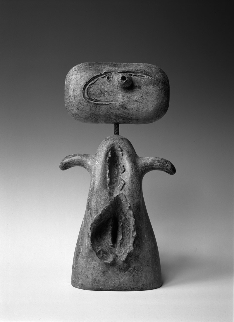
    The late bronzes are some his finest works, not just of that period but of all his whole oeuvre. Miró used everyday objects – baskets, dolls, taps, eggs, nails, cutlery, wood, card, tools – and assembled them in small and relatively sparse compositions. Once the assemblage had been cast in wax he often worked over the wax models, incising lines or gouging holes before the model was cast in bronze. This gives the sculptures a vivifying multi-layered quality. Objects are found and assembled, graphic marks applied and the metal cast. Sometimes Miró would add a further stage by adding paint. The paint tended to lessen the characteristic qualities of the bronzes by diminishing each of the first three stages, submerging them in Miró’s rather over-forceful palette. The greenish patina has pleasing asperity and the authenticity of the generally utilitarian objects brings a toughness of material and fixity of form – a kind of resilience and resistance that largely departed from Miró’s late pictorial art – that makes the late bronzes special.

    The drawings in Brussels are especially welcome and good. The raggedness of materials and variety of surfaces (including patterned paper) provides relief from the tessellated areas of colour in the oil paintings.  After the Second World War Miró’s art is at its best roughly finished and textured (in the drawings, burnt paintings, weavings and bronzes), something that the Tate curators have either ignored or bypassed, as is evident from the selection of the triptychs instead of rougher pieces. Even the late paintings in Brussels have this refreshingly coarser quality.

    Both exhibitions have strong points and the Brussels show does not necessarily come out second best by being significantly smaller. While it is commendable that curators seek to broaden our understanding of familiar artists, it is important that curators identify what most aesthetically exciting about the art in question and allow that to determine at least some of their selections. After all, art consists of objects, does it not?

    Joan Miró: The Ladder of Escape, was at Tate Modern, until September 11th 2011, then touring to Barcelona and Washington D.C.; Joan Miró: Peintre Poète, Espace culturel ING, Brussels, closed June 19th 2011.

    Yorkshire Sculpture Park hosts the first major UK exhibition of sculpture by Joan Miró from 17/03/12 to 06/01/13. With key works set in the landscape, the exhibition fulfils the artist’s desire that “sculpture must stand in the open air, in the middle of nature”.
    http://www.ysp.co.uk/exhibitions/mir%C3%B3-sculptor

    Alexander Adams is an artist and writer based in Berlin. Three Strikes (poems and drawings) is published by Bottle of Smoke Press (www.bospress.net).

    The Jackdaw Jul-Aug 2011


  • The Sutherland bequest: Alexander Adams pursues his original inquiry into the future home of an important gift to the nation

    An article about Graham Sutherland’s bequest of art to Wales (The Jackdaw, no. 90) raised a number of points which further research has – partially – answered. To recap: Sutherland donated work to a purpose-formed Graham Sutherland Trust (the “Trust”) in 1976, which displayed the art in a gallery housed in Picton Castle, Pembrokeshire. When the cost of maintaining the gallery became unsupportable the Bequest was transferred to the National Museum of Wales (“NMW”).

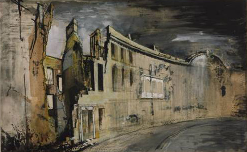
    Recently, I was able to view some of the works on paper and key documentation relating to the Trust at NMW in Cardiff. Items in the original Marlborough Gallery frames are kept in those frames; loose material is now stored in archive boxes. One box contained landscape sketches on perforated sheets from sketchbooks. These pages were mostly early (1930s), largely drawn in black ink with a fine nib and given washes of ink, watercolour or dilute oil (or a combination of those). Some of them were squared for transfer. Another box held sketches from Sutherland’s time as a war artist and showed the ruined Masonic Hall in Swansea and buildings in and around Cardiff. Some were versions of the same composition. Many were coloured pungent acid and moss greens, purple and pink. These sheets, a mere handful, demonstrate the excellent quality of some of NMW’s Sutherland collection. Unfortunately, it is not easy to ascertain which articles came via the Bequest, the Ministry of War or NMW acquisition, something that ongoing research by Rachel Flynn will establish.

    Viewing the contents of the archive (including Sutherland’s will and the 1989 agreement between the Trustees and NMW) demonstrates how convoluted the tale of the Sutherland Bequest is. We can now flesh out a basic timeline. Sutherland deeded the original Bequest (valued at £500,000) to the Trust on February 12th, 1976. The Trust comprised a number of distinguished figures, including Lord Goodman and Ronald Alley; others were representatives of local municipalities. The driving force behind the running of the Trust was Gordon Bennett MBE, a retired civil engineer and friend of the artist. The lease of part of Picton Castle began on June 9th, 1976. It opened to the public on June 18th, 1976. By 1978, repair, alteration and maintenance of the property had cost £80-90,000.

    What is obvious from studying the archive is that at the conception of the Bequest, NMW was seen as playing an active part in the custodianship and promotion of the gallery and NMW was a signatory in various agreements during the 1970s. From the beginning the project was hamstrung by critical divisions between the Trust, NMW, local council authorities and the owners of Picton Castle (the  “Landlords”). Additionally, ticket revenues for castle and gallery (both charged entry fees) were never combined and opening hours not coordinated, confusing visitors and sparking protracted negotiation between Trustees and Landlords. Sutherland died in February 1980, leaving everything to his wife. The Trust is not mentioned in his will. During September 1980 the Trust severed links with NMW.

    The chronic financial problems of the Trust deepened over the 1980s, relying as it did on a combination of donations, entry revenue and merchandise profits. The relatively remote location severely limited the contribution of the latter two components. Urgent deliberation began to find a solution. Two clear-cut options were complete dispersal of the Bequest by auction and assigning the Bequest to NMW. Trustees could delay no further: the Charity Commission stated in no uncertain terms that the Trust, a charitable body, could not be allowed to function insolvent. By 1989, save for certain sums inextricably committed to particular minor projects, the Trust was effectively bankrupt. Minutes record that at a board meeting on June 11th, 1989 Trustees authorised unconditional transfer of all art and some other properties to NMW.

    NMW signed a five-year extension to the lease of the Picton Castle gallery in 1989. The intention was to streamline the gallery, reduce property rented (some of which had become dangerously dilapidated) and manage from Cardiff while maintaining the Bequest and gallery in the original forms. This proved unworkable and the gallery closed in October 1995. Abolition of entry fees to museums has since limited NMW’s room for manoeuvre regarding a dedicated gallery in Pembrokeshire for the Bequest. Current developments (cataloguing by NMW and Ms Flynn and a planned public database of all works in the collection) combined with the current regime of exhibiting canvases on a near permanent basis at Oriel y Parc, St. David’s alongside a rotating selection of works on paper, seem a viable, though imperfect, response to the troubled legacy of the Sutherland Bequest.

    The author wishes to thank Oliver Fairclough, Keeper of Art, NMW, for his assistance in the preparation of this article.

    Alexander Adams is an artist and writer based in Berlin.

    The Jackdaw May-Jun 2011

  • Jenny saville and the theatre of self-importance: Alexander Adams examines the reputation of one of the original young British artists

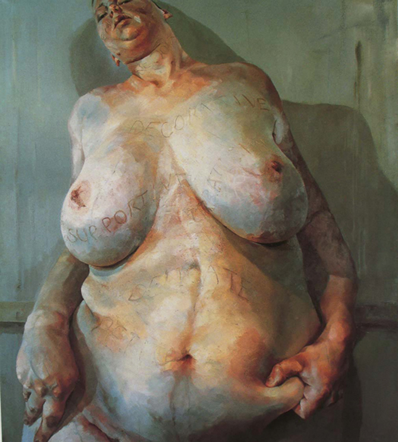
    Branded, one of Saville’s earliest pictures, painted in 1992, fetched £1,497,250, double its low estimate, when sold at Christie’s

    Most YBAs achieved prominence by recasting genuine avant-garde art in a palatable commercial form, influenced by advertising and pop culture, and served up to a credulous public largely ignorant of the original sources of the art. (Something Julian Stallabrass discusses in his book High Art Lite.) Jenny Saville was seen as one exception by virtue of the facts she studied in Glasgow, not Goldsmith’s College, and painted figures representationally in a non-ironic manner. Yet on closer study, Saville is not dissimilar to her YBA peers. Since paintings were acquired from her college studio,  Saville’s paintings have changed from billboard Lucian Freuds to hybrids of Freud, Bacon and de Kooning. Her painting rests upon adapting recent art and presenting it in a more extreme form (larger than that by the original artists), shorn of the original art’s foundations and complex origins, just as the art of other YBAs does.

    The paintings have been described as “monumental” by writers who cannot differentiate between monumental and big. Likewise, painting something from a very close viewpoint (a Saville tic) does not convey monumentality or help us comprehend the mass of a figure.  Monumentality has nothing to do with size; it has do with the impression of size, which can be conveyed through adjusting the size of a motif relative to the picture surface, elimination of detail, lowering the observer’s viewpoint of the motif, reduction of colour, simplification of form and emphasis on the mass of a motif. Picasso could achieve this concisely in modestly sized paintings and drawings  (those of the Boisgeloup period, the Dinard bathers and the Gosol figures), as can any artist who applies the principles. Painting fat figures on large surfaces tells us nothing about fatness but it reveals the painter’s insecurity, her need to bolster insubstantial depictions of bodies by expanding them to cinema-screen scale.

    Looking at Saville’s paintings is like opening the sketchbook of a teenage art student. There is the preoccupation with “body issues”, a reliance on photographs, the modish twist of gender-change surgery and emulation of the most obvious recent painters of the nude. Saville fails to realise that some great painters are bad influences and looking at artists you paint like (or aspire to paint like) can be damaging practice. (The recent drawn pastiches of Leonardo da Vinci show that Saville emulates rather than assimilates.) Saville’s imagery often relates to surgery, including blood and wounds. (Bacon spoke about the beauty of wounds thus Saville paints from surgical photographs.) Louise Bourgeois can make shocking and gripping images of bodies in small rough sculptures lacking virtuosity. Bourgeois’s metaphors can slip under the skin while Saville hammers away with ponderous literalness, emphatically insisting on the seriousness of her subject. There is neither setting nor context for figures because Saville likes painting flesh, so that is what she paints and it is all she paints.Yet flesh – like all substances – exists in context.

    Freud may have trouble with composition and proportion but he understands, and can paint, flesh. Saville cannot. Regardless of the ostensible subject, the appearance of flesh is dictated by the period of her style not any close observation and differentiation of subject. Her early paintings employ cloudy masses of conventional “flesh” tones.  Tangles of brushmarks, arranged to give an impression of impetuosity,  make up her later paintings. The seeming absence of pentimenti in the later paintings is because Saville’s formula is designed to give the impression of exploration and boldness. There is no need for revision because the subject is not a figure; the subject is Jenny Saville’s brushmarks. Saville is the Singer Sargent of the self-harming generation.

    Why do all her figures tend towards sameness? Where is the concentration on describing the essence of an individual or situation?  Where is modest and patient observation? For sure, these qualities are sometimes missing from great figure paintings but those are paintings by artists of a magnitude of achievement and accomplishment many times that of Saville, artists with substantial range. Rembrandt could paint with consummate accomplishment but that never overwhelmed his humanity, empathy and breadth of understanding.

    For example, consider Saville’s Passage (2004) a painting of a preoperative transsexual and Christian Schad’s Agosta, the Pigeon-Chested Man, and Rasha, the Black Dove (1929).While both paintings are nominally about human objects of curiosity, Saville’s painting is prurient and self-indulgent, filling in a canvas over 3 metres high, whereas Schad’s is a restrained, clear-eyed yet sympathetic, touching depiction of outcasts, on a canvas slightly higher than 1 metre. Schad has painted diligently and self-effacingly, the very model of a painter of humanity and has made a testament to the dignity of his subjects.

    Flesh is such a various and vivid landscape that it is incomprehensible that a painter supposedly dedicated to depicting it could reduce this rich spectrum to the bloody slatherings Saville serves us with. Saville has remained a painter with an adolescent’s taste for sensation and self-absorption, her progress stymied by being taken seriously when she was an undergraduate. Collectors, dealers and critics are partly culpable for Saville’s failures. For those who appreciate and revere great painters of the flesh, Saville’s bombastic and egotistical pictures, her simulacra of adventurous figuration, will not bear prolonged scrutiny.

    Alexander Adams is an artist and writer based in Berlin.

    The Jackdaw May-Jun 2011

  • Radical Classicist: Alexander Adams visits the museum dedicated to Surrealist painter Paul Delvaux (1887-1994)

    Radical Classicist: Alexander Adams visits the museum dedicated to Surrealist painter Paul Delvaux (1887-1994)

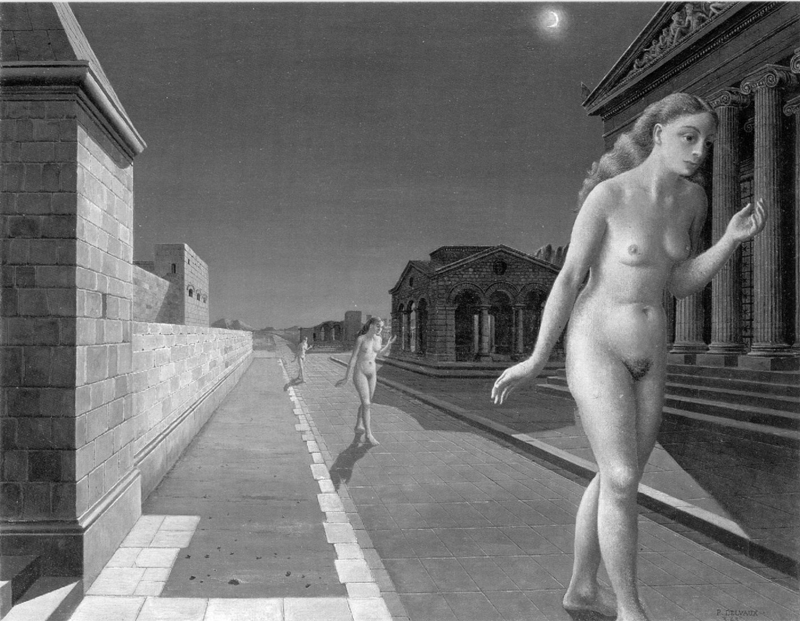
    Delvaux: Acropolis, 1966

    If you have heard of Belgian painter Paul Delvaux (1897-1994) then it is likely to have been in connection with Surrealism. He gets a couple of illustrations in thematic surveys of Surrealism, rarely more. Unless you locate a specialist publication on the artist, it is hard to get an overview of his development. Delvaux is poorly represented in British public collections.

    Born near Liège in 1897, Delvaux initially studied architecture in Brussels, though he abandoned his studies because his grades in mathematics were insufficient, transferring to the painting course.  Delvaux’s earliest pieces are landscapes composed with a naturalistic palette, later leavened by Impressionism. As is usual for Belgians of this period, the Impressionism is more a form of vivacious naturalism with vibrant lighting effects and vigorous brushwork rather than sustained application of complimentary colour theory. Throughout the late 1920s he picked up and attempted to blend a welter of (often conflicting) influences: Renoir, Cézanne, Modigliani, Ensor. After 1925 one constant emerges: the human figure, often as a nude, as the principal subject. In the late 1920s Delvaux came into the orbit of Flemish Expressionists (less bold and strident than the Germans, they evolved a dull-hued, restrained style dwelling on figures in domestic settings, clearly displaying an attachment to realism).

    Yet even as he was painting the most accomplished works of his career, something was nagging at him. He had seen the art of de Chirico and pondered Wiertz’s La Belle Rosine (see Jackdaw no. 95) and felt there was new territory to be discovered. (In 1922 he painted a view of the entrance to Musée Wiertz.) The example of Magritte proved a decisive spur. By 1935 his figures were becoming more normally proportioned, the palette broader and more conventional and the settings ever more precise and significant. He had arrived at his classic mature style.

    What is the typical Delvaux? Although there are distinct phases, we can make some generalisations: the subjects are females, often nude, with dreamlike repose in the surrounding of fantastic architecture, generally a blend of classical, neo-classical and 19th century Belgian. Frequently used settings included train stations, town squares, beaches and temples, often nocturnal and deserted and almost exclusively urban rather than pastoral. The technique is direct, the lighting pellucid, the brushwork unobtrusive.

    A typical work is Echo (1943) (currently in a Japanese museum): between ancient buildings at night time a woman walks along a road towards the picture plane; behind her are her echoes – two identical versions of her in the same pose. The ground is arid, indicating we are in Near East or Mediterranean lands. Nothing will ever change, no rain fall, no building deteriorate any further. The world we see is in a state of perfect stasis. Of all paintings (Surrealist or otherwise) these come closest to capturing dreamlike states. There is very little here that is literally impossible – no burning giraffes or floating rocks. The poetry resides in the mood evoked by arranging legible motifs.

    Delvaux’s personal collection (as one might have guessed, the largest collection of Delvaux paintings in the world) is housed in a museum in St.-Idesbald, on the coast. To get to Museum Delvaux one takes the tram from Ostend south-west to Koksijde-St.-Idesbald (direction De Panne, zone 7, €2 per journey). During summer the one-hour journey with the dunes on one side and the sea on the other must be picturesque but out of season it is rather bleak. The museum is a low brick building in a residential lane less than ten minutes’ walk from the seafront. It was established in 1982, two years before Delvaux (who lived in Brussels most of his life and spent long periods on the coast) moved permanently to the area. The opening rooms cover the early years of tenebrism and Impressionism. A room is dedicated to views in watercolour of St. -Idesbald and its environs. There is a wall of various small drawn studies and sketches, none labelled, a collection of fragments more or less.

    A masterpiece from a private collection, In Praise of Melancholy (1948), shows the painter at the height of his powers. This is one of a series of great reclining nudes that are marked by serene grandeur. Delvaux never painted figures larger or with more detail. The drapery is intensely coloured and the contrast crisp. Delvaux is an artist who used the nude but – great or not – he could not be called a great painter of the nude in the way Balthus might be described. Balthus is curious about the body – both its reality and its plastic potential when manipulated – whereas Delvaux wants to capture the essence that attracts him. Delvaux paints nudes but never nudity, figures but never flesh. Delvaux does enough to evoke the presence of a figure without going so far as to become naturalistic, something true for every element depicted. It is very rare for any sexual feeling to makes its presence felt and this only happens in a few drawings, never in the oil paintings.

    The more one sees the more one understands that Delvaux was deeply involved with pre-Modern art, more so than any other Surrealist. He used the vocabulary, and to a lesser degree the technique, of Classical art with a Modern syntax. He employed motifs lifted from found sources and collaged them into settings where the motifs never quite settle. The first (and so far only) serious study of Delvaux’s art written in English is David Scott’s Surrealizing the Nude (1992). Scott’s thesis is that the artist set out to “problematise” academic Classicism. This confuses means for motive. Delvaux did not intend to agitate; in order to achieve the pictorial effects he wanted he had to distort norms of academic practice and naturalism. Although incongruities and irregularities are woven into the fabric of the pictures they are not the subject. Indeed, although these unorthodox combinations are not elided they are not expected to be noticed other than subliminally.

    In 1941 Delvaux revived a conceit from ten years earlier and had skeletons acting as protagonists, inhabiting real domestic interiors – something his female nudes never do. He also tackled episodes of the Passion with skeletons: The Crucifixion, Deposition, Entombment and Lamentation  (though notably not the redeeming, mystical parts: the Resurrection and Ascension). These are very peculiar works – intense, bleak, detached yet not ironic and not notably pious – which paraphrase Netherlandish altarpieces. By prematurely curtailing the development of a scene at this stage – or by stripping flesh from Rogier van der Weyden’s Deposition (c. 1435) – the artist leaves the armature of religious iconography nakedly incomplete, thereby short circuiting viewer-subject empathy.

    There are paintings including skeletons and female nudes. Delvaux’s encounter with the Spitzner Museum in 1932, a travelling show which juxtaposed lifelike Venuses in somnolent states with anatomical casts, postmortem photographs and skeletons, made a deep impression and led to immediate attempts to capture that frisson in two unsuccessful paintings.

    Perhaps the most psychologically charged painting (and, to my mind, his most remarkable picture) is not here. La Visite (1939), the title of which can be translated as The Visit or more properly as The Visitation, the latter with religious overtones, is in a private collection. In a room a naked (rather than nude) woman holds her breasts as a naked young boy enters. He gazes at her breasts and she gazes at his pre-pubertal genitals. Overhead tiny angels trumpet the occurrence. It bears comparison with Balthus’s Guitar Lesson (1934) as a study of psychic tension and sexual discovery. It must have taken a degree of courage for Delvaux to paint such a picture. It is a tremendous, fraught, haunting image, all the more so for being unforced.

    A painting such as Horizons (1962) shows what a playful painter Delvaux could be, beyond being a consummate image maker. It is one of a group of strongly horizontally orientated paintings of railways. Cadmium yellow powerfully illuminates the horizon and only slowly does one notice myriad sources of light: streetlamps, lanterns, house lights, train lights, signals, a paraffin lamp, the moon.  Seats from old-fashioned train carriages have been situated in the galleries. (Tellingly most of the few British visitors to Museum Delvaux are train enthusiasts rather than art enthusiasts.)

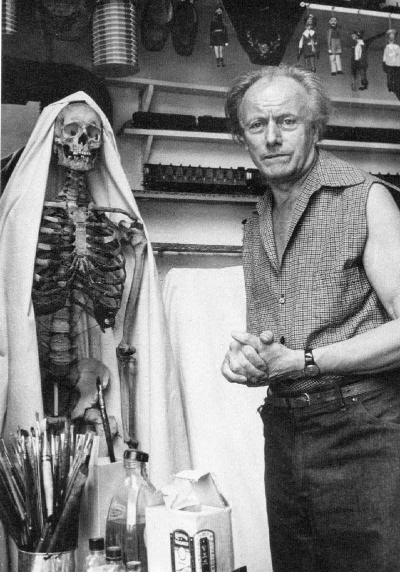
    In a number of lit niches are puppets and model trains that Delvaux made while young, as well as spiral-bound sketchpads in which compositions are roughed out in ballpoint.  On large sheets he used the laborious technique of cross-hatching in ink then applying washes of ink or watercolour.

    The painter’s eyesight deteriorated badly in his late eighties and eventually was extinguished totally. He painted his last oil in 1986 but continued making drawings until 1989, aged 92. Some of the framing of works on paper is unsympathetic and the lighting would benefit from an upgrade. Although the paintings suffer a little visually from a lack of natural light, the windowless isolation proves immersive. These aspects do not seriously detract from the charm of the museum. The great range and depth of the collection is remarkable. There are genuine masterpieces from all periods in spacious galleries with plenty of supporting material including models, source books, painting paraphernalia and personal documents. There is a recreation of Delvaux’s studio as it was at Avenue des Campanules, Boitsfort, Brussels.

    Various figures marginal to Surrealism  (Leonor Fini, Claude Cahun and Hans Bellmer, with Louise Bourgeois reclaimed as a Surrealist) have enjoyed renewed attention of late. Delvaux is no less complex than Fini and Bellmer. Delvaux’s art, rich and sophisticated, can be best appreciated detached from Surrealism. Delvaux’s blend of Classicism, Symbolism and Surrealism will never be as popular as the art of Dalí or as accessible as Magritte’s. It deserves to be taken more seriously than it has been. If we assess the status of artist in relation to his ability to compel and fascinate then Delvaux truly is a great artist.

    Museum Paul Delvaux, Avenue Paul Delvaux Laan 42, 8670 St.-Idesbald- Koksijde, Belgium, entrance €8. Check for opening hours. www.delvauxmuseum.com, e-mail: info@delvauxmuseum.com

    Alexander Adams is an artist and writer based in Berlin.

     The Jackdaw, Mar-Apr 2011


  • The Belgian Blake: Alexander Adams visits two little-known artist-museums in Brussels, the Musées Wiertz and Meunier

    The Belgian Blake: Alexander Adams visits two little-known artist-museums in Brussels, the Musées Wiertz and Meunier

    The house-museums of two Belgian masters of the 19th Century shed light on artistic and social concerns of the era. As case studies they exemplify dominant thematic trends in both halves of that century – Romanticism in the first half and Realism in the second.

    Antoine Wiertz (1806-1865) was born to an impoverished family in Dinant, Wallonia (later Belgium). After studying at Antwerp Art Academy, he won the (Belgian) Prix de Rome at a second try, in 1832.  His grand manner was Romantic and painterly, derived from Rubens. His subjects anticipate those of the Symbolists. Though Wiertz made his name with historical and religious compositions, the allegories and  (often gruesome) scenes of contemporary life are his most distinctive contributions to art.

    In 1850, partly in order to establish Belgian art as independent of French influence (led by the School of David; J-L David (1714-1825) spent his last years in Brussels) the newly formed state agreed to build a studio and dwelling for the benefit of Wiertz, the first truly “Belgian” artist. The initial agreement was that the artist would donate works to the state but it seems Wiertz early on had the idea of turning the studio into a permanent museum. The government drew the line at Wiertz’s proposal to fund the construction of a ruined temple in the studio grounds. Upon the artist’s death the combined house and studio became possessions of the state. Both building and grounds have remained unchanged since 1868, now a fragment of a lost age lodged under the glass towers of the European Parliament.

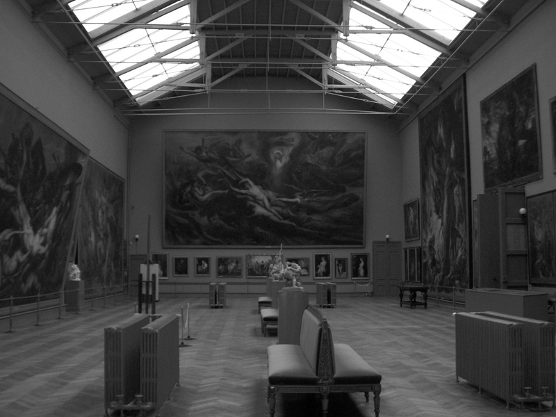
    Photographs leave one unprepared for the vast scale of the studio and its contents. The studio is 35m long, 15m wide and 16m high, accommodating gargantuan canvases almost as tall and wide as the walls. Subjects are suitably grand: the fall of the rebel angels, Christ triumphant, Homeric scenes. The paintings offer a serious challenge to conservators. Aside from the technical experimentation discussed later, their size presents difficulties. Expanses of canvas bulge down from tilted frames, unsupported from behind. Extensive restoration of Musée Wiertz (completed in 2009) involved reconstruction of the roof and repair of the walls, which have been returned to their original grey colour.

    Wiertz: La Belle Rosine (Two Young Girls)

    If you can find anything written about Wiertz, it is almost all negative. Novotny gives Wiertz three sentences in his Painting and Sculpture in Europe 1780-1880, the last being “His wild-eyed hysteria is a mere caricature of real passion.” The disdain and distaste for Wiertz is evident from the start of his career. The first version of Greeks and Trojans Fighting over the Body of Patrocles (first version 1836, Liège, second version 1844, Musée Wiertz) was skied at the Paris Salon of 1839 and mocked by critics. Wiertz became a national cause, though one wonders what misgivings Belgians must have had about their standard bearer. In terms of grandiose aspirations, hyperbolic acclaim and posthumous neglect, the story of Wiertz’s art is comparable to that of GF Watts’s.

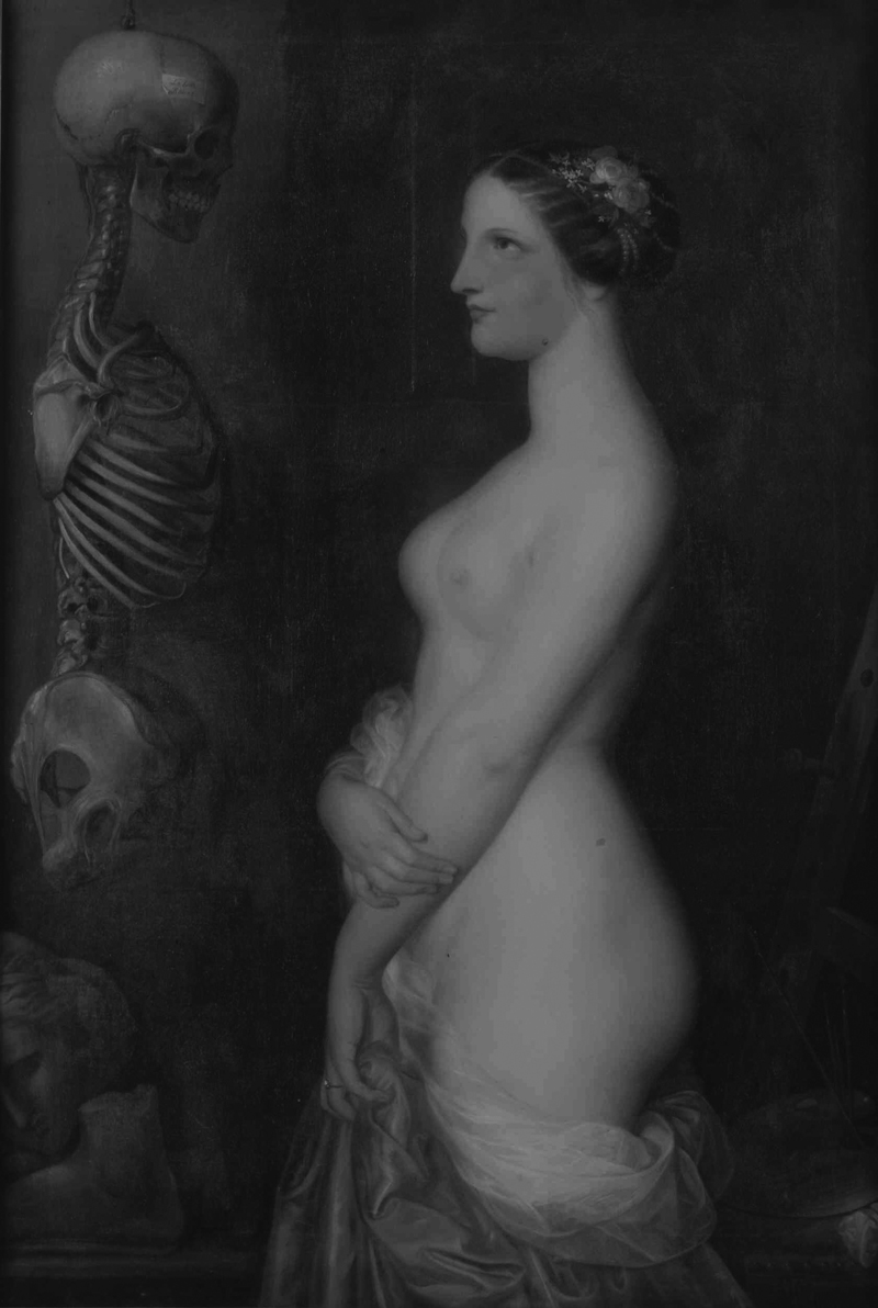
    The only good word anyone seems to have is for La Belle Rosine (1847), Wiertz’s most famous invention. This painting, influential and much reproduced, is excepted as “a good chord on a bad piano”. It shows a nude woman contemplating a skeleton. The alternative title is Two Young Women. Now very fragile, the painting is unlikely to leave Brussels again. Death and the Maiden is an oft-reprised subject but there can’t have been a more compelling version than this. The woman, garland in her hair, gazes with hypnotic calmness into the vacant eye sockets of the anatomist’s specimen. Below the suspended partial skeleton (missing its leg bones) are fragments of an ancient statue. A label on the skull carries the inscription “La Belle Rosine”. One might interpret this two ways. The painter is using a graphic intervention to insert the title of the picture or – more likely – the label identifies the skeleton as that of Rosine. (The issue of titling is a curious one. Wiertz did give certain pictures exact titles. It seems fixed, artist-given titles only began in earnest with the advent of the Paris salons in the early 18th Century. Before then works were discussed by topic. Vasari refers to “a Madonna by the hand of…”; “a Dead Christ in the lap of Our Lady, surrounded by many figures”; “a panel made for the Duke of Urbino”; and so forth. The idea that paintings should have a definite title is essentially a modern construction, in that it derives from the practice of organised temporary public exhibitions. Some scenes of a narrative or anecdotal character can depend to a degree on a title. Think of When did you last see your Father? by WF Yeames in the Walker Art Gallery.)

    Little work is at the level of La Belle Rosine, though there are other paintings worth attention. La Liseuse de Romans (The Novel Reader) (1853) has a recumbent female nude reading on a bed, unaware of the figure reaching towards a book beside her. The Devil’s Mirror (1856) adapts Goya’s Maja paintings, with one canvas showing a clothed woman at a mirror and the pendant with the woman unclothed, the Devil hidden behind her mirror. A modest trompe l’oeil still-life painted when Wiertz was a student is skilfully designed and realised. There is a sensitive painting of the artist’s dog asleep on a chair.

    Wiertz was a committed humanitarian and campaigner for social reform. The Burnt Child was originally entitled If there were Crêches and was inspired by a newspaper report of an unmarried mother who left her child by a fire to keep warm while she worked. When she returned she discovered the child burned. The Premature Burial (1854) shows a terrified man forcing open his own coffin marked “MORT DU CHOLERA”. It is both a sensational scene of horror and social criticism of the not-infrequent phenomenon of premature interment of cholera victims. Doctors could be lax about distinguishing between death and coma. Some victims were regarded as hopeless cases and deliberately consigned to the tomb while still alive.

    The evidence of carved versions of Wiertz’s models suggests he was an able sculptor. His Triumph of Light (1860-2) is said to have inspired Bartholdi’s Statue of Liberty (1876/1886), though the resemblance seems coincidental.

    To describe Wiertz as inconsistent is an understatement. His triptych of Christ in the Tomb (1839), with wing panels of female nudes, is badly misjudged. The Suicide (1854) shows a man shooting himself in the head with a pistol. A praying attendant angel has closed her eyes, as well she might. There are many other pictures that prompt a viewer to wonder “What could he have been thinking?” There can hardly have been another artist who has failed and succeeded to such extreme degrees.

    The depiction of a guillotining may have been well meant (the artist apparently attended a public execution and was appalled) but the result is incoherent and ineffective. Additionally, it is painted in Wiertz’s essence technique and has deteriorated appreciably. Noting the troublesome reflection from conventional varnished oil paintings, Wiertz devised a technique to combat sheen. He used essence, which is oil paint with the binder largely extracted (usually done by allowing the oil medium to soak into an absorbent substance, such as blotting paper), mixing it with turpentine or a mineral thinner and applying it directly to unprimed flax. This technique effectively removed gloss but over the years it has proved prone to fading. Worse still, the low proportion of binder to pigment has left the paint powdery. These fragile paintings are not possible to frame or clean, prohibitively expensive to restore and now impossible to move.

    Alongside criticisms of morbidity, hubris and sensationalism (all reasonable reproaches) is another charge, that of titillation. (A current guidebook mentions “saucy girls in a state of undress”.) This is more debatable. If one looks at the figures in question, there is less nudity than one finds in Rubens, the female anatomies are not entirely convincing and there is nothing overtly sexual in the poses, even for the period. It comes as no surprise to discover Wiertz was homosexual (or at least bisexual); an idea first publicly aired by the critic Camille Lemonnier, who lived very close to the artist.

    Drawings and small painted sketches are strongly reminiscent of Blake’s in their muscular Mannerism, though Wiertz understood anatomy better. The two artists share many characteristics (ambition, stubbornness, independence, keen social conscience and admiration for Michelangelo), though at his best Wiertz is more than Blake’s equal in inventiveness, power and skill. On consideration, the received views of “Blake the Visionary” and “Wiertz the Deluded” turn out to be not only disputable but reversible. Didn’t Wiertz put his sense of justice into his art rather than into theological disquisitions at 12 shillings apiece?

    Wiertz’s aspirations may have been grandiose but his own circumstances were straitened. He painted allegories for political and artistic reasons and kept them in his studio for the nation. To eke out a living he painted portraits. The decorative edges of some canvases came about because he could not afford frames. Upon his death his possessions were found to be few, his furniture to be borrowed and his clothes to be much mended.

    The museum’s over 200 works constitute the majority of Wiertz’s (identified) output and the delicate condition of the most important pieces entail that a meaningful retrospective outside of the museum will never be possible. This fact and the unique ambience make a visit to Musée Wiertz a fascinating experience. It is hard to look at the anonymous pastel of Wiertz on his deathbed without feeling a touch of sympathy and admiration for this proud, difficult man.

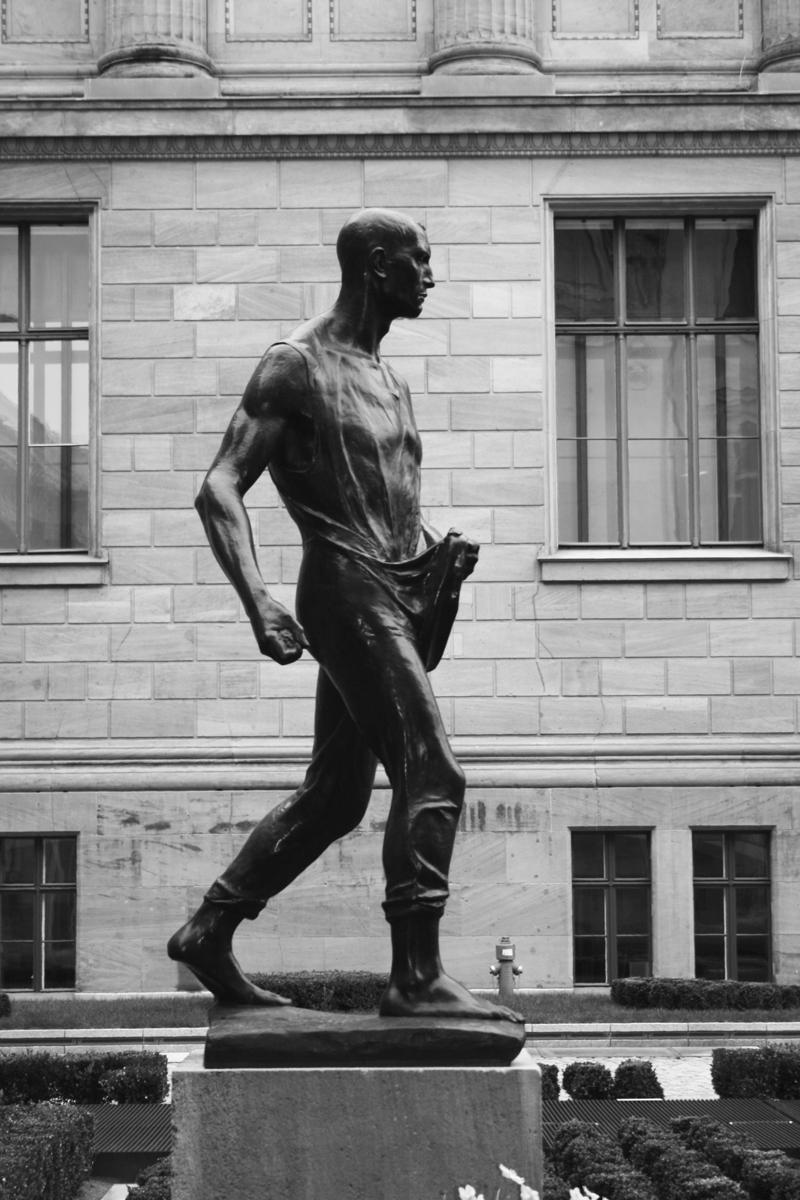
    Meunier Reaccessioned. A statue formerly in the collection of the Berlin Museums has been reacquired. The Sower (1896), (above) by Constantin Meunier was appropriated from a private collection by the GDR. The work, one among a number of bronzes by Rodin, Degas and Maillol, was returned to the ownership of the family of the original owner. At an auction of the works this year The Sower was purchased on behalf of the Alte Nationalgalerie. It is now sited in the colonnaded courtyard between the Alte Nationalgalerie and the newly opened Neues Museum

    Meunier is an artist of a different stamp. The only things Meunier and Wiertz shared were a nationality, profession and an interest in social reform. Constantin Meunier (1831-1905) took the plight of workers in Belgium’s farms and heavy industries as his principal subject relatively late in his career (around 1875). (The few early History and travel scenes on display in the museum are undistinguished.)  His principal medium was sculpture, though he was a skilled draughtsman and a competent painter. His slightly over-life-size bronze figures have the heroism of Rodin tempered by the Realism of Courbet’s Stone Breakers  (1849-1850; exhibited at the Brussels Salon of 1851). The coalminers and iron workers of the Borinage are ennobled through working for the common good. The sculptor then further dignifies them by raising them to art. By so doing the artist himself works for the benefit of his subjects and for society more generally.

    The house and studio were purpose built for the sculptor over 1899-1900. The main salon is connected via a long corridor to the sculpture studio built in the grounds of the house. The studio accommodates a number of statues and maquettes, with a few larger paintings. Only a fraction of the collection is on show. The property and collection were acquired by the state from Meunier’s heirs in 1936.

    The sculptures are all well conceived and executed with a blend of verisimilitude and idealism that became adopted as the template for Socialist Realist public monuments throughout the following century. Few of those sculptors had the talent or sensitivity necessary to attain Meunier’s consistently high standards. Full-bas reliefs, executed in bronze and smaller than life size, convey the volume and presence of figures and the interaction of them with their environment. In the mine one feels the claustrophobic closeness of the rough walls; in the field one sees the toilers against the swaying striations of tall wheat stalks. His pictures are effective but the unremitting earth hues – though honest – are obvious and deadening. (Van Gogh was an admirer of his, making 13 references to Meunier’s art in his letters.) A large triptych on the subject of coal mining has little of the energy and economy of the drawings.

    Let us hope these old-fashioned museums remain unchanged while becoming better known. Both are windows on a past well worth looking through.

    The author would like to thank Dr Brita Velghe for her assistance in researching this article.

    Alexander Adams is an artist and writer based in Berlin.

    The Jackdaw, Jan-Feb 2011