Tag: David Lee

  • Graham Sutherland: exultant strangeness at Abbott Hall and Crane Kalman

    Few save masochists would venture as far as Kendal in order to see work by Bethan Huws, not least because unless you happen to have attended one of State Art’s indoctrination sessions you won’t have heard of her. A taste considered acquirable only by the starving, Huws is among State Art’s chosen apostles. Sadly, she is unmissable in Kendal for the wrong reasons.
    For most the Lancashire town is distant and in previous decades only the likes of George Romney, who was born there, Sheila Fell, a landscape painter now forgotten but at her best worth travelling to see, and Thomas Bewick, father of English wood engravers, have attracted this paper to its fastness. All were worth the trip. Additionally, several decades ago the town’s Brewery Art Centre staged ambitious photography exhibitions, but no longer.

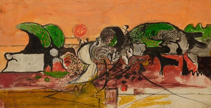
    The main event at Abbott Hall until September 15th is landscapes by Graham Sutherland, an artist once considered among the country’s finest artists but now relegated to the long list of those dismissed and, like Trotsky, as good as doctored from the record. Like his contemporary, the equally disregarded John Piper, Sutherland is considered the sort of parochial petit maître in which British art specialised during the mid-20th century.

    Until recently, of the Tate’s 56 works by Sutherland none was on display although three pieces have been dusted down for the Millbank rehang. Between 1935 and 1945 Sutherland was among the six most recognized artists working in Britain, each of whom was aware of what the other high flyers were up to. With knowledge of the latest Parisian isms, and especially Surrealism (this undoubtedly due to the well-promoted London surveys of this movement in the mid-30s), Sutherland explored form well beyond the conservatism of his instinct and training.

    This is an absorbing exhibition organized by those understanding of and sympathetic towards Sutherland’s direction. Among a small number of important works are pieces showing the inventions needed to arrive at an appearance, a feel, beyond the superficial and well distant from the topographical. Exaggerating natural forms which attracted him, his work is the equivalent to the experience of a country walk during which details and oddities are noted and accumulated. Like Piper, he found no idiosyncracy of natural shape uninteresting.

    The perfect accompaniment to the first room of the exhibition which traces Sutherland’s beginnings in detailed pastoral etchings inspired by Samuel Palmer’s bucolic prints (some are helpfully included), would be silence. Just as you need to listen to a landscape by Rubens or Constable an ear helps with these scenes too.

    Unfortunately, that possibility is ruined by noise from a Bethan Huws’s video installation. Called Singing for the Sea, and made in 1993, Bulgarian grandmothers wearing traditional costume stand wailing in a circle on a beach. Officially their singing is called ‘antiphonal’ whilst, unofficially, it is a bloody awful racket. (The piece was commissioned by Artangel and is on loan from the Tate – who doubtless, between them, also supplied the ‘masterpiece’ tag with which this pretentious guff is accompanied.) The grannies were flown to Northumberland to do their performance. Doubtless there was a very challenging and cutting-edge reason why this noise couldn’t have been recorded more cheaply on the Black Sea coast. The women moan and shout incessantly, loudly, near the tops of their voice. As an exercise in fatuity [I think you must mean ‘deeply spiritual ritual’? Ed] this takes some beating.

    The upshot is that because of these bellyaching peasants concentration on Sutherland is impossible. The few paying visitors present at the same time as The Jackdaw were all of a mind that this was an outrageous intrusion tantamount to deliberate sabotage. The price of having Huws’s ghastly piece in the gallery, inevitably described by the fools responsible for installing it as ‘unique’ and ‘haunting’, is the impaired appreciation of everything else. Can those who promote this species of material be so unaware that looking at pictures requires undistracted attention? Perhaps their experience originates solely in a period when painting was so unfashionable that they never mastered the art of looking at it properly. Some people now working in galleries don’t seem to understand that noise is a distraction which flies in the face of why a gallery should exist in the first place. There must be a venue somewhere appropriate to antiphoning Slavs but it isn’t anywhere close to a landscape painting.

    A few issues ago The Jackdaw noticed an exhibition of John Piper’s landscapes at Whitworth Art Gallery in Manchester. In the decade after 1935 Piper, as was illustrated there, and Sutherland were aware on one another’s experiments, and their drawings exhibit a related sympathy. Their landscape pictures, the one working in Snowdonia, the other in Pembrokeshire, converse and compare notes. In both, for example, drama and threat are emphasised by daylight scenes appearing to take place in darkness. Though their aims and methods couldn’t be more different, the results are close in effect.

    In passing, it is fashionable these days to compare Sutherland unfavourably with Bacon on the grounds that the latter was more original. This exhibition, featuring works well in advance of Bacon’s post-war debut, gives the lie to that exaggeration. Bacon was well aware of Sutherland’s stylistic experiments to get beyond appearances and narrative logic.

    What is impressively illustrated in these pictures is the deliberate, intelligent progress they chart towards a way of depicting landscape so it is simultaneously recognisable and mysterious and its substance both solid and dissolving. In a work such as Rock Form in a Landscape (opposite) the style parallels closely what Piper was simultaneously attempting in Nant Ffrancon. In another work here (above), a commission for his war artist duty of depicting those working in mines, Sutherland’s knowledge of Moore’s drawings (particularly in the technique of using contour lines to emphasise solid volume) is apparent in the figures. It would seem that the more exploratory artists of this moment were working fully aware of one another’s advances while not being party to any movement.

    The exhibition is a reminder of Sutherland’s status as an explorer at a time when his reputation could scarcely be lower. The show could bear having more works in it. Looking through the 55 Sutherlands owned by the Tate and which are never on show, or ever likely to be, numerous other drawings (besides the three loaned to the exhibition) would have further amplified the journey Sutherland undertook during these years.

    David Lee
  • National Rail Museum

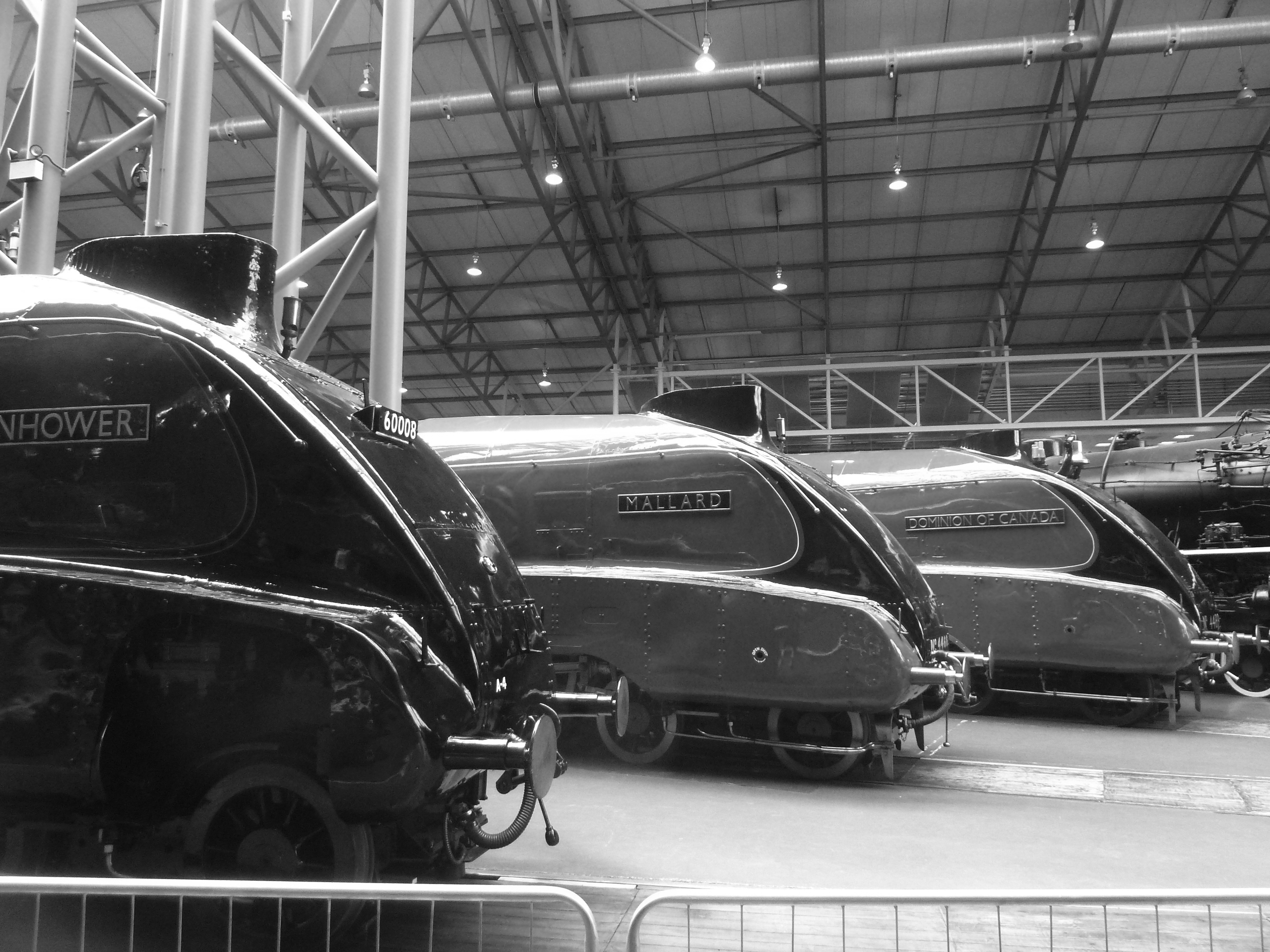
    The most elegantly streamlined of all British Rail’s steam locomotives was the Great North Eastern Region A4 class of which an engine called Mallard is the best known of the 35 built at Doncaster works. Designed in 1935 by Sir Nigel Gresley, whose earlier A3 class (of which Flying Scotsman is the preserved example) was in terms of classy looks arguably the apogee of the conventional un-streamlined locomotive, the A4s, or Streaks as trainspotters dubbed them, pulled blue riband expresses between King’s Cross and Edinburgh/Aberdeen. Few who have seen one will forget it because they represent the most dashing solution to their function. In terms of efficiency (especially if fuelled by the best Welsh coal) it was as reliable and as quick as Charles Collett’s ‘King’ class of the Great Western Railway, though far racier on the eye.

    Often over the 13 years of The Jackdaw an argument has been advanced that as a work of sculpture, of form, of beautiful workmanship, an A4 (or, indeed, a Collett ten-wheeler or a Stanier pacific) is immeasurably more stimulating than any lifeless metal behemoths by Anthony Caro or Richard Serra. Presented with a do-or-die choice between an A4 and a row of yellow tin lock-ups by Donald Judd the answer is a no-brainer.

    To celebrate the 75th anniversary of Mallard screaming down Stoke Bank between Grantham and Peterborough at over 126 mph on July 3rd, 1938, and thereby establishing a world speed record for a steam locomotive, the National Rail Museum has taken three years to arrange the delight of bringing together the six preserved Streaks, three of which are still in steam and one of which only a few weeks ago was breezing up the east coast main line pulling a long rake of coaches at close to a ton. Two of the six have been generously loaned from museums in Canada and the USA. It cost the NRM a great deal in money and ingenuity to achieve this feat of organization. One suspects the resulting exhibition has almost bankrupted them. But it was worth it. The record crowds smiling at the gleaming spectacle of their line-up parade is testimony to that.

    The Great Gathering, as it was dubbed, took place in July and was free to the public. Recently threatened with closure by its parent, the Science Museum, I fear the NRM missed a trick here. Nobody would have complained at paying a fiver or more for the privilege of seeing these engines together for what certainly will be the last time. And anyone attending would have realised immediately the crucifying expense involved in making this possible. The National Gallery is currently charging £15 to see in its basement an exhibition of pictures normally shown free of charge two floors up. In other walks of life we call this cheating but we live content with this sort of distasteful scam in the visual arts, while the NRM are obviously not up for such scheming dishonesty. As we have mentioned here before the NRM is among few museums which don’t seem to lie about their attendance figures. We have noticed over the years, for example, that the place is always well attended though it registers far fewer annual visitors than museums which give the impression of being empty almost all the time. It’s a fact that most museums lie about their attendance.

    So, there they all stood arranged on the spokes off the turntable in the engine hall, newly painted and buffed to a high shine by volunteers. The crowds of enthusiasts were delighted. Never would you see in any other museum such visitor attention to detail, such appreciation of refinement, as you get in the NRM. It’s one of those places where visitors could probably lecture the staff. The public love this place and they show it. Doubtless the sponsor, train set maker Hornby, was delighted that the six engines looked as spit-and-polished as a guardsman’s boots on parade, just like enlarged versions of their models. This perfection, however, presents a problem in the days of preserved locomotives because it renders the object tartily unreal, for in memory they were never like this. Engines were neglected and abused, especially after 1945 when most looked like vagrants. They were expected to work hard and get used to being caked filthy, which more often than not they were.

    One would have loved to have seen these six engines outside the engine house, dirty and simmering in air aromatic with the cocktail of steam, coal fire and sump oil. Here, they looked marvelous but it all seemed remotely decorative and lifeless. One would also have preferred to see them without their matching headboards bearing the sponsor’s name and the silly overblown legend, The Great Gathering. These inauthentic plates ruined the lines of the smoke box. It was as if BP had slapped their logo on the winning face in their annual portrait competition. When the Dwight D Eisenhower arrived from Green Bay in Wisconsin a few months before the event it was still in its working black livery, with rivets bursting and pressure-twisted, and with panels pitted as though recently returned from a war zone. It looked more the part then than it does now in its dashing green coat and frilly knickers.

    The sense of elegy lurked heavily behind the thick gloss paint and gaudy souvenirs. Here was an example of genius in engineering and design, manufactured and cast from the steel of Scunthorpe and Teesside, and built by the boilermakers, rivetters and tradesmen of Yorkshire and Lancashire. How many schoolchildren have heard of Gresley, Stanier, Bulleid, Ivatt, Thompson, Collett or Churchward? Or Armstrong, North British, Vulcan, English Electric, Beyer Peacock, Metropolitan Vickers? Or emotive towns like Horwich, Newton-le-Willows, Crewe, Derby, Stratford, Swindon, Barry, Brighton and Eastleigh?

    The NRM will never be allowed to shut for lack of money because it is too genuinely popular. Enjoyment and surprise are visible on every face. Retired engineering blokes explain the workings of valve gear to one another and visitors young and old discuss and compare exhibits enumerating their favourites. You never see this happen in the National Gallery where the body language of corpulent tourists tells of universal drudgery and attendance under sufferance.

    The NRM deserve more than our thanks for arranging this smashing event – they deserve our cash. They desperately need donations. If you’re reading this and not short, and were perhaps in distant days a trainspotter, please send them a tenner.

    David Lee

  • Perming eight from twelve: Lowry and the painting of modern life at Tate Britain

    Perming eight from twelve: Lowry and the painting of modern life at Tate Britain

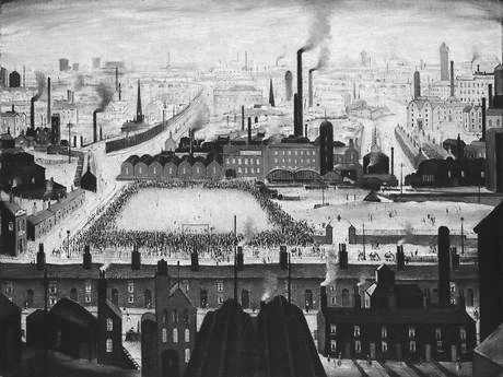
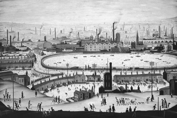
    Lowry deserves treatment as a serious artist, though more usually such an approach is denied him because of, firstly, his suspiciously wide popularity and, secondly, what is mistakenly characterised as stylistic primitivism. A strong whiff of the patronizing informed reviews of this exhibition, as though the work was a tad unsophisticated for critics used to rambling on for pages about the corners of conceptualism they prefer. The tongue-in-cheek reference in the exhibition title, Lowry and the Painting of Modern Life, didn’t help because it aligned the Mancunian to a story of modern art that doesn’t really apply to him – even the curators’ inspired casuistry couldn’t shoehorn a sui generis Lowry into any wider avant-garde narrative. Guys, Manet and Baudelaire are one thing, the experiences of a visually alert rent collector a lifetime afterwards quite another. That said, this is an excellent exhibition, intelligently, provocatively organized and with catalogue essays more elegantly written and thought through than the drivel customarily accompanying Tate advertisements for recent art. Even for those of us who met him and have often agonised over the real significance of his work, this exhibition helps us to see the Lowry phenomenon more clearly than ever we did before.

    Let’s put one fallacy to bed straightaway. If his pictures look hamfisted it was because he was happy for them to look that way. He knew exactly what he was saying with his style, was knowledgeable about events in both the art of his time and just before, and if his work appears mechanically simple then this was as deliberate as the simplifications and shortcuts informing much else in museum-approved Modern Art. His avoidance of clever-dick explanations when talking about his pictures, for example, is entirely refreshing in the context of unintelligible spoutings by the likes of the usual suspects.

    He attended art school for ten years, where he had a fine teacher whom he respected. Lowry’s personal solution to his own peculiar expressive needs arrived only slowly – as with Constable he was a late developer. And like many who discover an instantly identifiable personal idiom, he stuck to it because it worked, both for him and, more increasingly, for his rapidly developing and appreciative market. This ‘look’ said what he wanted and there is almost no stylistic development from first to last, except that as a pictorial formula it became tired and the execution slapdash. He must have been aware himself – perhaps even painfully – of this late tendency to self-parody. In the industrial scenes at least, his technique, brushwork and approach remained essentially unaltered for nearly fifty years. Painting conventional industrial landscapes, based on observation and spiced with a splash of ‘impressionism’, would not have spoken in the same way. In order to pack in the kaleidoscope of his observations he needed to invent and combine disparate elements, for his, more than most, is an imagined world inspired though it was by actual experience. The working class was for him amusing and impenetrable, a species apart to be observed with curiosity.

    Like Stanley Spencer, Lowry realized from an early age that his subject was all around him. So what inspired this new style? It is tempting to attribute the reason to the fact that his teacher, Adolph Valette (1876-1942), painted the concentration of industry and suffocating air of Manchester and Salford in a way which must have seemed startling to those for whom city scenes were suspect subjects for serious art. Clearly Lowry realised that Valette had exposed the potential of a vital new subject, at least to his eyes. He might also have been aware of Pictorialist photographs by John Dudley Johnson (1868-1955) showing the gloomy effects of a century of industrial revolution on inner Manchester and Liverpool. Both these guides demonstrated that ugliness and filth might be redeemed by beauty of form. Is it too fanciful a suggestion that, as a rent man, Lowry trudged about the city with eyes awakened by his tutors to the unique shapes inflicted on open spaces by heavy and uncontrolled industrial development?

    Lowry’s archetypal industrial ‘scene’ began to emerge around the First World War – a conflict in which he did not fight. From 1909 his family, though desperately aspiring to the middle class, lived modestly in Pendlebury, a working class suburb of north Salford overlooking the Irwell valley. As Ian Jack recently pointed out in the Guardian, this exact area was described by J B Priestley in English Journey in 1934 as having “an ugliness so complete that it is almost exhilarating … it challenges you to live there”.

    Lowry was daily aware of this mesmerising, infernal panorama as soon as he opened his front door. Additionally, his duties as a rent collector introduced him to the sights of even more disadvantaged areas than his own. Just as Charles Dickens and Frank Holl toured the East End of London in pursuit of hard-hitting subjects, so Lowry walked the east of Manchester to observe the raw desolation of the other half. Even within the working class itself, Lowry’s beat of Harpurhey, Ancoats, Miles Platting, Beswick and Newton Heath were renowned as a cut below the rest. As late as the 1950s, and my own experience, these were still scarily impoverished places. Lowry’s view of ragged, hopeless, exhausted people is more accurate than quaint. Luckily for him, social life took place outdoors. Few were the cars and, whenever possible, children especially tended to live in the street in preference to their dark, damp houses. It was impossible to walk around Manchester in the 1950s and not notice cripples, the mad and utterly destitute who were prominent on virtually every street. No             question there is a truth at the heart of Lowry’s vision.

    He tried to paint with originality what he knew, but there is no trace of political motive or social criticism in what he describes. He merely watches, fascinated. Factories, gasometers, coolers, ginnels, long viaducts, cobbles, collieries, bird-cage bridges, back-street bookies, chimneys, churches and classical chapels, and mill blocks interspersed with the incidents of daily life; brawling, death, arguing, evictions, accident, toil and chronic need… These are the elements used by the outsider to orchestrate his scenes with their syncopated verticals tiptoeing across the picture. Each is a complete world in itself. And it’s always grey, weather-free, even on Bank Holiday Monday.

    Immediately on entering the exhibition, you realize how draining and repetitive this all is, the mood unaltering, relentless. He painted the same picture with the same message in slightly different ways. And most of what comes after 1955 is the work of a retired, comfortable old gent with time on his hands. You also realise that the style doesn’t travel well. Specifics originated for one location look contrived when applied elsewhere. With few exceptions, perhaps a handful of scenes in Sunderland, his work depicting places outside Lancashire, is  unsuccessful, the effect half-hearted. They reek of tourism, of holiday art, of unfelt work which didn’t need to be made. The panoramas of South Wales, for example, are failures for being half topography and half ‘style’. Even the considerable natural gift, apparently effortless, for achieving compositional balance deserts him in these scraps and oddities. A more selective artist would have destroyed them. If you lived in Lowryland and were fortunate to escape it for a few days, when you returned it instantly struck home that nowhere else, anywhere, looked anything like this particular place.

    The exhibition shows us Lowry’s originality and his limitations. There is truth here, yes, about both the mental and physical conditions of the interwar populace, but it is hard to escape a conclusion that his descriptions, seen like this en masse, quickly arrive at decoration and formulaic pattern. Repeated mannerisms obstruct the emergence of something more profound from what was a horrifying subject.

    David Lee

  • Martin Creed: new definitions for ‘gift’

    Regular readers may recall from a recent editorial that when ‘we’ bought Yinka Shonibare’s Trafalgar Square bottle to stand outside the National Maritime Museum ten times more was paid for it than had ever been paid for a work by this artist at auction.

    That story of casual profligacy is now repeated in respect of inarticulate chancer Martin Creed, whose entire career is the creation of State Art. Without the life support machine of public patronage the likes of Creed would be stacking shelves.

    In September 2013 the Tate bought Creed’s work no. 227, the lights going on and off, for £122,000, to add to the twelve other works it already owns by him. In passing, one of these is an editioned sheet of paper with ‘fuck off’ typed on it, a masterpiece considered so significant the British Council also owns it; indeed, four of the five Creed works in the British Council’s collection are duplicated in at least one other of the Tate’s, the Government’s or the Arts Council’s holdings. The Art Fund contributed £40,000 of their charitable donors’ money to the acquisition of no. 227. The fact that the Fund had already contributed to seven other Creed ‘gifts’ to the Tate via the Artist Rooms Endowment and to another work for the Scottish National Gallery of Modern Art indicates the now symbiotic relationship existing between The Art Fund and State Art – the Fund’s head is, of course, a former director of Tate Britain. To call this network an incestuous racket is to compliment it.

    Ownership of work no. 227 is in the form of a certificate bearing a terse description of the piece, which comes officially in an edition of two plus one artist’s proof. The idea of an ‘artist’s proof’ existing for a sheet of typed paper is, of course, ridiculous, a misuse of an otherwise important distinction. Sadly, this is the sort of mercenary scam we have come to expect from fashionable contemporary art. Work no. 227 is actually in an edition of 3. One of the other two pages was bought in 2005 by the Museum of Modern Art in New York, one of seven Creeds in their collection. MoMA won’t say how much they paid for no. 227 as they don’t “share information about the acquisition of objects”.

    £122,000 is a sum significantly greater than has ever been paid for any other work by Creed. It should have cost much less. A more financially savvy Tate could have bought at auction a similar work in July for a quarter of this sum.

    In 2001 Creed won the £20,000 Turner Prize. He was nominated for a touring retrospective – he was the grand old age of 32. His Turner exhibition party piece was, famously, work no. 227, which was ‘made’, typed presumably, the year before. It caused the kind of concerted debate which instantly projects a merely notorious work to the status of modern classic. Creed became famous overnight. Before the Turner parade, the Tate could have bought no. 227 for well under £10,000.

    When tracking sales of such works the process is confused because there are at least two durations of lights, of five seconds (work no. 227) and thirty seconds (work no. 127), which are sold as different pieces. Then there are other works in which lamps go on and off and buildings in which all the lights are turned on and off at the same time. It is symptomatic of State Art that once a line of merchandise becomes established in the canon, its secure infamy can be milked for profit: perhaps the best example of this is that there are now no fewer than nine pickled sharks.

    In 2010 Creed gave an interview to The Independent in which he stated that he had given the lights going on and off (in its Turner Prize manifestation of five seconds duration), worth, he claimed, £110,000, to the Tate. This was among seven other works, also ‘gifts’, which he claimed were worth £162,000. At this time he refers to the lights being in an edition of three with the other two being in “private collections”. ‘Private collection’ is a curious way – is it not? – of describing MoMA New York.

    In fact, this was all my eye and Peggy Martin, the on-off light was not included in any ‘gift’ otherwise the Tate wouldn’t have had to pay over the odds for it in 2013. And of the seven other works in the Tate’s collection which are said to have been gifts, all are stated on the Gallery’s website as having been contributed to by the Artists’ Rooms Endowment, the Henry Moore Foundation and Tate Patrons. When this group were exhibited at Tate Liverpool in 2012 they were described in publicity material as ‘gifts’. Demonstrably this is nonsense. I have been unable to ascertain – not least because none of the parties will tell me – what proportion of this group acquisition was a genuine gift. We should all be interested to know, if only because the value of these works stated by Creed – £162,000 – is a colossal misrepresentation of their real market potential. Of the seven works ‘gifted’ four are watercolours – crude ziggurats painted in diminishing horizontal blocks of different colours – from a series which until recently fetched between £350 and £1,700 each at auction. For some reason these scraps are very popular with State Art; the British Council and the Government Art Collection also have one each. The other three works ‘gifted’ might have fetched fifty grand on a good day. £162,000 for this stuff is daylight robbery.

    On July 1st in Christie’s evening sale – i.e. a sale usually reserved for blue chip material – Creed’s no. 127 was offered. It was No. 2 in an edition of 2 (also actually 3!). This work had sold first in 1995, then in 1996 for £3,000, and in 2006 at a Kentucky auction for £22,000. The estimate this time (based no doubt on the common knowledge of what the Tate had forked out for their five-second version) was pitched at £50,000 to £70,000, doubtless in the hope that with some fancy footwork an auctioneer might edge the hammer price towards the magical six figures. Christie’s pulled out all the stops, praising its “minimal elegance and formal drama”. They went on: “By redefining the parameters of the viewer’s experience and rupturing perceptual norms, Creed forces us to engage with our surroundings in new and provocative ways.” Naturally, they didn’t bother explaining how our ‘perceptual norm’, whatever that is, had been ‘ruptured’ and what exactly ‘provocative’ might mean in the context of a light being switched on and off. Even had it sold for its high estimate, no. 127 would have been the cheapest work in the auction by four times. On the big night bidding never got beyond £32,000 and it didn’t sell. Not even the artist’s dealer, Hauser and Wirth, was prepared to underwrite the low estimate price, which is unusual in an evening sale where a conspicuous failure can fatally wound a reputation. This showed a distinct lack of faith all round in Creed’s market viability. Christie’s won’t answer questions on this fiasco and mention of it was left out of post-sale results. And as far as the auctioneer’s website is concerned no. 127 has ceased to exist. Rest assured we won’t be seeing a work by Creed feature in a flagship auction any time soon.

    At Christie’s the day after no. 127 failed, another Creed, a watercolour ziggurat from the same series as four of the seven works ‘gifted’ to the Tate said to be worth £162,000, sold for £2,500 – the lowest sum achieved in the auction. The day before at Sotheby’s a large neon work, also akin to one in the £162,000 ‘gift’ sold for £10,000, which was 25% below its low estimate.

    In the context of this embarrassing rejection, the Tate’s acquisition of no. 227 for £122,000 looks like a reckless waste not only of their own money but of The Art Fund’s and the work’s other donor, a dodgy Ukrainian oligarch. They were all taken for a ride.

    If they must buy fashionable trash like no. 227, the Tate should be instructed to do so at auction instead of buying expensively elsewhere. We should also be told what is their working definition of a ‘gift’. And I’ve mentioned many times before the wastefulness of State Art’s main collections buying the same stuff.

    David Lee

  • Out of touch

    I spent a month recently in a 12th-floor ward of the new Royal London Hospital in Whitechapel. Except for the thrilling views of the capital it provides, it is an undistinguished public building, not least because like all hospitals nowadays its corridors are lined with ‘Art’. Not even I could raise a flicker of interest as I was wheeled, sitting or prone, backwards and forwards along passages lined with studio fillers and eyesores. Indeed, more than once I felt an urge to damage the more bombastic abstract daubs which I grew to loathe: their irrelevant avoidance of a subject was an insulting imposition in the context of such lived anxiety and discomfort. Who do these hospital administrators and self-styled ‘curators’ think they’re kidding about the therapeutic value of this stuff? And in all the weeks I didn’t see a single other person stop to look at anything – in this respect it reminded me of the National Gallery. Fortunately, my ward was spared this nonsense. The only visual interest was in the picture window views of what for those of us peering out was a very distant seeming and wistful outside world.

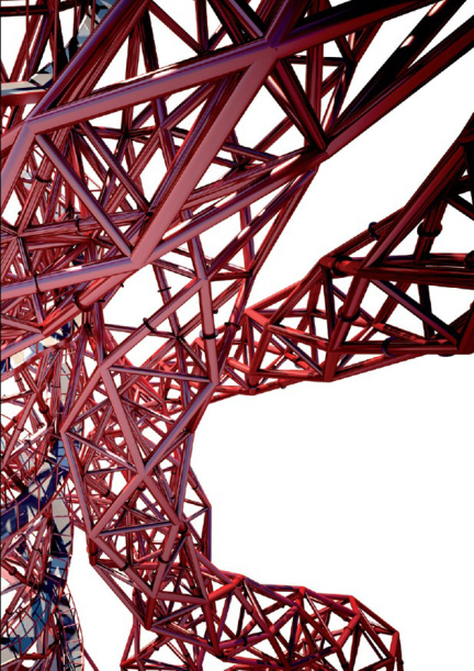
    From my bed I had the worst possible view, a panorama restricted by the hideous wing opposite. It looked north east away from our great meandering river, City monoliths, pretty Wren churches and Greenwich majesty, towards the suburban wasteland of Walthamstow and Gant’s Hill. Central to this limited aspect was our Airfix Olympic stadium with its pet cancer … Anish Kapoor’s Orbit. Disappearing anonymously among cranes and building sites, the little Indian’s inoperable whimsy looked as helpless as any other unfinished structure. Every time I opened my eyes there it was, drug-induced hallucination having the power to transform it into visionary torture. I knew exactly how Macbeth felt at the banquet – “quit my sight”. And every time I wondered what the hell it was there for.

    To discover if it owned any sense I tried drawing it, but it was formless and ungainly, without distinctive mark or symbol, rhyme or reason. Nothing commended it. Neither were the nurses any more insightful. Most hadn’t noticed its existence and of the remainder not one had a kind word, the most frequent observation being: “What’s it supposed to be?” (Incidentally, this is an intelligent question.) Given the shortages, abuse and poor conditions under which these generally marvellous carers toil, this ‘sculpture’ seemed a public folly too far.

    Orbit is a perfect example of the trash you get if you allow art to be governed by a small number of people with mutual interests, none of which concerns public desires or needs. For this is specialist gallery art foisted on a bemused populace. Orbit is and will remain meaningless to everyone who looks at it. It will never become a source of national pride or a rousing emblem because, unlike, say, the Peel Monument on the Pennine ridge above my home town, it is not assertive, commemorative or instantly recognisable, and being asymmetrical, it has no fixed image in memory, no face, no charm. It is the opposite of beautiful and it tells no story and invites no thought. Also, it fails the important Lavender Hill Mob Test: no one will buy a souvenir Orbit in the way that millions own dinky Eiffel Towers, whether of stolen gold, base metal or otherwise.

    Like all the art commissioned for the Olympics which was supposed to form part of the event’s legacy, Orbit is a characterless failure and represents a missed opportunity precisely because it was the result of a State Art establishment stitch-up. Wherever you look into its evolution, all over it are the mucky fingerprints of President-For-Life Serota and his Usual Suspects. Whenever this shower is involved you just know you’re going to get overhyped, over-rated, overpriced shit.

    An essential of public art is that you know what you are looking at and why it was put there. This demands that an artist explores beyond his own motivations and aspires to tap a collective spirit. But, of course, this is precisely the self-effacing quality of which tenth-raters in contemporary art are incapable.

    David Lee

  • Arts Council – time for action

    A submission to the House of Commons’ Select Committee for Culture concerning their short enquiry into the commissioning criteria used by the Arts Council of England.

    From the editor of The Jackdaw

    Your interest in the artistic criteria underpinning ACE’s funding decisions is a subject which has long exercised me. I wish to demonstrate here that where they are not clouded in the secrecy of woolly definitions, the artistic criteria used by ACE in the visual arts are partial and excluding of most artists in Britain whose interests the Council should be representing.

    During the 35 years I have been writing about art, the last 20 spent editing two magazines, Art Review and The Jackdaw, I have watched the Arts Council become an oppressive dictatorship of narrow taste. No other phrase adequately describes the stranglehold they exercise over the visual arts.

    The Council does not respond objectively to what is being made by artists. Far from it. Instead, it prescribes the kind of work it wishes to support. This partiality has been allowed to develop because politicians hide behind the ‘arms–length principle’ by which they distance themselves from artistic decision making. ACE has used this convenient indifference to promote its beliefs unhindered. It is long overdue that this ‘arm’ was cut off.

    So entrenched has this system now become that if you were devising a means of dispensing public money to visual arts you would look at the way we do it today as a demonstration of what to avoid. The Arts Council has encouraged an unhealthy ‘us’ and ‘them’ mentality.

    In a perfect world a body spending enormous sums of public cash would at least attempt to make a show of even-handedness. It would recognise the diversity of excellence existing in visual art styles across the whole of the fine art spectrum; that is, from those at the more traditional end to the innovators at the other. Both ends, and all those markers in between, have their place in a healthy system appealing to audiences of different expectations and with different tastes.

    For a generation after its foundation in 1946, the Arts Council did precisely this. It recognised the full range of possible styles. But not any longer. Now it is willing to support only what it calls in its literature “challenging” or “cutting edge” work.  In a booklet published five years ago, supposedly to define its objectives in visual art, it used the word “challenging” over 50 times in 80 pages but failed to say precisely what “challenging” actually means when they use it. In my view they leave it sufficiently vague so they might conveniently make it up as they go along.

    By experience we know that “challenging” to them means the kind of work loosely dubbed ‘Conceptual’. This means the type of art which, since 1984, is nominated for the Turner Prize. What we get from the Arts Council through its gallery network is the visual equivalent of being fed porridge for every meal. You only have to examine the programmes of the nine major art galleries in London funded by the Council to see the truth of this policy in operation. Only very rarely do they show anything else but conceptual work. This is the reason why so many artists whose efforts are not deemed sufficiently “challenging” feel that the Arts Council does not represent them; indeed, I know from received correspondence that many feel it has failed them utterly.

    The ACE in its visual arts policy has become an Academy representing what it claims is the avant-garde. And like all orthodoxies it is intolerant of anything else.

    A topical example of their policy in practice is the case of First Sight, a £40 million art centre opened two years ago in Colchester. It is revenue-funded by the Arts Council. Attendance at the gallery dropped dramatically in the last year because the programme of work that the Arts Council makes contingent on their continued funding is limited to what most locals do not want to see all the time – correspondence columns in local newspapers are clear on this. As far as I can recall, for the first time in the history of an ACE funded gallery, the director of First Sight has admitted that as far as the exhibition programme is concerned his hands are tied. If he varies the diet to include what some locals might wish to see the Arts Council will discontinue support. Such autocratic behaviour is threatening the very survival of the gallery. First Sight is beginning to smell like a re-run of The Public in West Bromwich, that ghastly Arts Council mistake which closed recently having swallowed close on £50 million. It seems that the Arts Council never learns.

    Not only is the ACE selection criterion dictatorial it is also unnecessarily duplicating. I draw your attention to the current exhibition of work by the Chapman Brothers at the Serpentine Gallery, which is funded by the Arts Council. These artists, who are among the more original in the conceptual fold, have shown recently in many public art galleries, from the Tate to the British Museum. The brothers are represented by a commercial dealer, White Cube, which is among the wealthiest contemporary art businesses in the world; indeed, they run two large galleries in London. Why is it necessary to show the work of these artists in a publicly funded space when they are already widely exhibited and their own dealer has larger nearby premises of its own than the Serpentine can offer? When so many other artists go unexhibited this obsession with the same few names is indefensible.

    The process by which public galleries promote and further endorse a few successful brand names is one which should be investigated at the earliest opportunity. It stinks.

    As stated above, in the distant past ACE galleries staged mixed programmes in which innovation found its place alongside historical surveys and retrospectives of artists of all descriptions and ages. This is no longer the case. ACE has inflicted upon us a virtual tyranny of youth and has ensured that the generations of British artists over 50 have been betrayed and abandoned by the Council.

    I wish you to consider the following:

    1. No publicly funded body should ever be allowed to state, as has the Arts Council, that there are “the wrong kinds of artists” and, therefore, by implication “the right kind”. This is an insult. Yes there are ‘good’ and ‘bad’ artists but there are no ‘right’ and ‘wrong’ ones.

    2. A publicly funded Arts Council should not be a blunt instrument for promoting brand name stars represented by a handful of wealthy commercial dealerships.

    3. ACE should not be allowed to blackmail or dictate selection policy to galleries they help support. Directors should be free to show whatever they deem worthy in order to attract diverse audiences to their venues. Indeed, directors should be encouraged to surprise us by showing the rich wealth of work being produced in the country, as well as in their locality. The prevailing attitude, adopted by the Council, that ‘You will have to like what we give you’ must stop.

    4. The programmes of ACE galleries should reflect the diversity of what is being produced by artists and equally encourage proposals from outsiders for historical exhibitions and retrospectives and surveys of older British artists.

    David Lee

  • Serpentine Gallery: working at home

    The last three editorials have dealt with a charity called the Serpentine Gallery. We’ve observed limousines lined up outside signifying whose interests the gallery really serves. We have identified overmanning and fat cat pay increases for two directors. And, last time, we highlighted an outside PR agency working between press and gallery in order to disarm justified criticism.

    Apologies for boring you further, but there’s more. I’m not satisfied we’ve got to the bottom of Hans Ulrich Obrist’s presence at the Serpentine. He is, after all, a second highly overpaid director in a publicly funded gallery whose peer organisations employ only one director for a quarter of the cost of Obrist and Peyton-Jones combined. I question the need for the supernumerary Obrist.

    When I asked the gallery how many days Obrist spent there in 2013 they answered, ambiguously to my mind: “He works full-time at the Serpentine gallery.” Well, yes. But hang on a minute: “He travels a great deal, usually at the weekends, and works remotely at these times.” Why does organising an exhibition programme for the Serpentine involve such “a great deal” of travel?

    You may recall from a recent editorial that Obrist enjoyed an almost 50% pay increase to between £130,000 and £140,000 a year, putting him on a par with major museum directors worldwide. For example, he earns considerably more than the director of Tate Britain who is responsible for a gallery many times larger and immeasurably more significant than the Serpentine, not least because it has responsibility for the most important collection of British art.

    The long inventory of ‘foreigners’ Obrist has done during his eight years at the gallery suggests the Serpentine plays at best second fiddle. He has recently curated exhibitions in Essen, Berlin, Zurich and Sao Paolo and published books about Chinese Art, Ai Weiwei, several volumes of interviews and the self-aggrandising The Art of Curation (Allen Lane) published this March. Hot on the heels of this lot, he will co-curate the Swiss pavilion at this year’s Venice Architecture Biennale along with the architects of Tate Modern. In the two most prominent announcements of Obrist’s new job nowhere was it stated that he is co-director of the Serpentine Gallery – as though this is just another sideline.

    This spring he is also curating Luma Arles, a huge enterprise lasting seven months; but this is nothing unusual because he appears to have done it every year since 2008. The Luma Foundation, to which Obrist seems closely attached – both are based in Zurich – also supports the Serpentine. (Luma was founded by Maja Hoffman, a pharmaceuticals heiress, who also serves as a trustee of the Tate, whose film programme, among other things, she pays for.) If Obrist can curate all these major events at the weekend how come it takes him so much time to curate so few exhibitions at the Serpentine? It defies belief that Obrist is anywhere near full time in London. He can’t be. So why is he earning twice the going rate even for a full-timer?

    Could it be that what many of us have suspected for years is true; that there isn’t actually that much involved in curating. It’s just a fancy title signifying not much more than blethering in tongues, writing atrociously and poncing about in black trying to look intelligent.

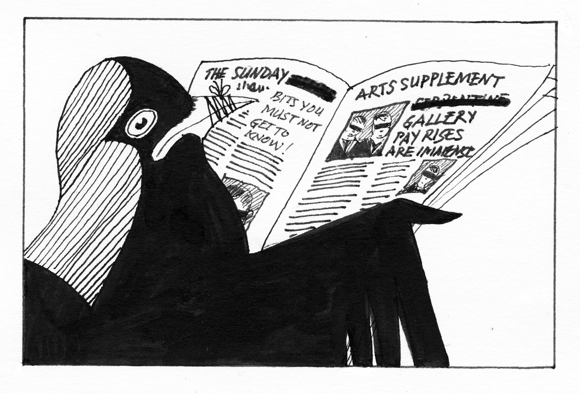
    The latest accounts for the Serpentine have been posted. They show that since last year the two directors have had their pay cut back (to £120,000 and £110,000 respectively) but nevertheless to a level which still constitutes a 33% and 37% pay increase in two years. Additionally the Serpentine now has three people earning more than the director of Tate Britain and while the Tate, with its vast and complex organisation and collections, has only three staff earning over £100,000, the Serpentine has two.

    The Serpentine Gallery has become a gravy train and if the Arts Council had any balls it would investigate immediately whether its £1.3 million a year subsidy is money well spent.

    David Lee

  • Serpentine Gallery: the black art of hushing it up

    Most readers will be unfamiliar with Bolton and Quinn Ltd, a company which is the subject here. Invisible to the public at large, they operate in a murky hinterland between major galleries and the media encouraging positive coverage of State-approved art. One definition of State Art might simply cite a list of B&Q’s clients, for all the major promoters of Contemporary Art use them as lobbyists, from the Tate to the Arts Council to the Art Fund … and the Serpentine.

    I’ve always wondered what service this company provides for the galleries who pay them, because all the bodies they represent also employ extensive in-house PR departments. If the Tate’s press office (currently comprising twelve members) is so pisspoor that they have to call on additional expertise then surely they should employ people of a higher calibre in the first place. All the organisations prominent in pleading poverty wastefully employ two press offices.

    So what extra-special purchase does contracting B&Q give to those who pay them? I can now call on personal experience to answer this. The last two editorials of The Jackdaw concerned the publicly funded Serpentine Gallery and its two directors who are overpaid by 100% compared to staff in equivalent positions elsewhere. Before Christmas a newspaper was about to trail the Jackdaw’s last editorial and expose the ‘charitable’ 67% and 47% pay increases awarded to the Serpentine’s two co-directors. A reply to these charges from the gallery was considered beyond the capacity of their own media team (all five of them, including a Head of Communications and a Head of Media Relations), whom one can only conclude must be muttonheads. Instead, they called in the household cavalry to charge the cannon. B&Q put their expensive hair-dos together and came up with a riposte so feeble it made me laugh out loud. A teenager on the minimum wage could have concocted something more convincing. So self-evidently accurate were The Jackdaw’s main charges against the Serpentine B&Q didn’t even attempt to answer them, instead resorting in desperation to mutterings about ‘bonuses’. Bonuses for public museum directors? Someone ought to be looking into that! In the end the paper pulled the story at the last minute saying there was no room for it. They still had space, however, for the vital disclosure that Tracey Emin is buying a flat in Manhattan. White Cube, Emin’s shopkeeper, is represented in media matters by … Hello!

    The story of the Serpentine pay increases was run soon afterwards in The Independent, from which many others picked it up. But not before B&Q had approached the paper. It was when I was informed of this that it finally dawned after so many years of bewilderment what precisely the function of B&Q is. They use their extensive contacts to firefight for and lobby on behalf of State Art. Quite how much they get paid for doing this is not revealed in their accounts at Companies House, which effectively tell us nothing.

    What this means is that, when circumstances demand, publicly funded organisations can pay a third party with our cash to assist in preventing us knowing the full story of what these organisations get up to. Thus are the public kept in the dark by use of their own money. If you are a closed monopoly, as State Art is, the advantage of keeping the public as ignorant as possible is an obvious benefit. On their website B&Q refer to this dubious activity as “producing opinion”.

    How might such a relationship work in practice? B&Q are in a strong position to subtly bribe journalists. They can offer trips, home and abroad, and invitations to fancy parties and soirées with all the gubbins of free catalogues, fancy bags and other sweeteners beloved of Fourth Estate liggers. More importantly, they can feed news exclusives about galleries and artists they represent to trusted journalists whose independence of opinion is surely compromised by the relationship.

    The virtual monopoly of favourable comment enjoyed by State Art in newspapers now makes perfect sense to me. David Lee

  • Fat cats in the park

    Arts administrators cleaning up in the name of charity

    In 2011, the Arts Council screamed daily that it was losing over 30% of its annual taxpayer subsidy. “Difficult decisions” and “hard choices” resulted in it cutting completely annual grants to 206 organisations, making many redundant. The Serpentine, meanwhile, was awarded the special status of “a regularly funded organization” – i.e. a reserved Pullman seat aboard the gravy train for life, and no questions asked.

    At a time when fat cats in the City were being daily excoriated for awarding themselves huge pay increases and bonuses during a period of austerity for everyone else they had themselves caused, the two co-directors of the Serpentine (Julia Peyton-Jones since 1991 and Hans-Ulrich Obrist from 2006) were awarded wage increases of 67% and 47% respectively. This inflated their pay to £150,000 and £130,000 a year respectively, a hike which brought both of them within range of what the director of the Tate receives (£161,000); indeed Peyton-Jones earns more than the Prime Minister (£142,500). A quarter of the Serpentine’s basic annual grant from the Arts Council goes on two salaries. Both earn more than the director of Tate Modern (£120,000) and the director of Tate Britain (£89,000). Together they make twice what even the director of the National Gallery earns; £140,000. Heading a small gallery, formerly a tearoom in a park, is costing 74% more a year than Serota himself receives for running an organization with 60 times the turnover, 100s of times the size, and 15 times the number of visitors. Charity definitely begins at home at the Serpentine.

    And why does the Serpentine need two directors anyway? No other minor public gallery needs more than one. On the contrary, they run their often bigger operations for the cost of half of one director at the Serpentine. Neither can Obrist claim to be anywhere near a full-time employee, given the impressive number of outside commissions he has undertaken during his tenure in the park. The Charity Commission, recently taken to task by the Audit Commission for complacency and incompetence, should urgently investigate this profligacy.

    Neither do the directors deserve anywhere near what they receive, for their performance is lamentably below average. It’s not even as though they have a difficult job. Over the last few years half of their main exhibitions have dealt with either Tate trustees or Turner Prize winners or nominees. How difficult is it to draw up a list of those kinds of candidates for exhibition? Dawdling, one could pencil in a year’s exhibitions of that kind over coffee. Their programme is unimaginative and otherwise overly concerned with foreign artists many of us have never heard of and the standard of whose work is on the face of it unexceptional. They have staged no retrospectives of deserving British artists of the kind which were regularly organised by previous regimes, and which made the place unavoidably important. In those days it could at least argue that some public service was being performed. Nowadays, it succours only dealers and rich collectors.

    The current exhibition (until February 9th) features Jake and Dinos Chapman. The brothers have shown recently at the Royal Academy, Tates Britain and Liverpool, the ICA and the British Museum. So why do they need another exhibition at the subsidised Serpentine when their own commercial dealer, White Cube, runs two big premises in central London? Apparently, it requires support from a charity to showcase works by artists already widely exhibited and who are among the wealthiest and most exhibited in contemporary art. This is not ‘Charity’ by any currently known definition of the term.

    For all its millions in public subsidy (and don’t forget it has also collected no fewer than twelve National Lottery awards) the Serpentine fails conspicuously in two respects: for a charity it costs too much to run, is overmanned and pays its top staff double the going rate; secondly, it doesn’t show enough work by British artists of the kind who are deserving but rarely exhibited.

    The Serpentine does no service to the wider community of British artists and its public subsidy should be immediately suspended.

    David Lee

  • The Serpentine as fat cat

    Why should the interests of those in limousines be subsidised by the rest of us?

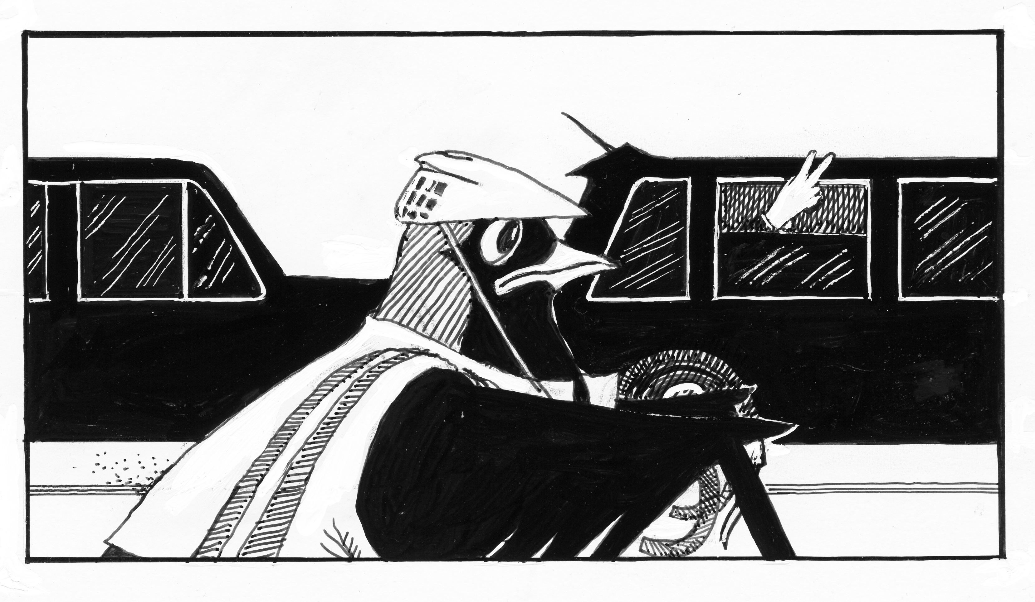
    What is the difference between a line of black limousines at a Mob funeral in Brooklyn and an identical cavalcade at the opening party of the new Serpentine Gallery annexe in Hyde Park? Well, not as much as you’d think. Although Cosa Nostra are undoubtedly the subtler of the two coteries represented, both have a common interest in protection rackets. In the case of the Serpentine this means inflating the reputation and value of the deluxe ‘branded’ art which will be shown there and will have originated, or will end up, in the collections of the limousines’ occupants.

    Unaware that a shindig was in progress I cycled past the Serpentine while the limos were chrome-to-chrome outside. At first this didn’t register as unusual: another evening, another hoolie for the vain and vulgar at the Serpentine… One has got used to it. But the image of those black limousines, just that few inches too long, that shade too opaque, that chauffeur-wipe too shiny, lingered until it formed an indelible symbol for everything that stinks about State Art. What is passed off as ‘public interest’ and ‘the public appetite for contemporary art’ (the latter is the often repeated favourite lie of President-For-Life Serota himself) is yet another means by which the wealthy protect their interests. The public has no say in what is shown in the Serpentine despite the fact we have always paid for it. And if we don’t like it we can eat cake.

    Here is a publicly funded art gallery which specializes in showing recent art of negligible visible quality, that the public couldn’t care a toss about, which is hawked by the world’s wealthiest and most powerful shopkeepers, has its value maintained by salerooms who rig prices during glamorous soirées, is traded in by billionaire collectors who purport to like it but treat it merely as a secure commodity of exchange, and is endorsed using a new language written by “international curators” no literate outsider can fathom. You couldn’t invent a more perfectly rounded system of self-interest and exclusion.

    The limos were celebrating the Serpentine’s latest expansion. A listed neo-classical building of agreeable proportions by Decimus Burton, formerly an arsenal close to the main gallery, has had a café and restaurant designed by Zaha Hadid attached to it. Enjoying limitless freedoms of manoeuvre as it does, State Art never has any problem acquiring permission for one of its chosen architects to tamper with the historically important and therefore supposedly protected. In this case what resembles the roots of a gigantic wisdom tooth have been impacted on the side of a Doric portico. It couldn’t be less sympathetic and like everything gratuitously eye-catching it is unnecessary. New gallery spaces are poky and the café charges £3.38 for a small cup of waiter-delivered coffee. How very charitable – come to think of it just like those other exemplary, public-spirited ‘charities’, the Royal Academy and The Art Fund.

    Between them the limousines paid the £14 million cost for the expansion, as well they might as many of them will be its main beneficiaries. Running costs and an exhibition programme have been underwritten with a £3 million endowment from the Lottery. This comes on top of the minimum £1.3 million a year the gallery has always received from the Arts Council. In fact, in the 19-year history of the National Lottery, the Serpentine has received no fewer than twelve awards totalling £6.8 million. Thus is the Serpentine the means by which money from the poorest, those who buy lotto tickets and scratch cards, is laundered to assist the wealthiest (non-doms many of them) in the appreciation of their investment portfolios. This revolting system is defended by the all-purpose State Art lie that the likes of the Serpentine “provide a public service”. Up to a point, but the real winners are behind all that dark glass.

    The Serpentine is run by a pair perfectly suited to their task: one is a dim socialite who does as she’s told, while the other is a Swiss “international curator” who speaks six languages and has neither penned nor spoken a clear sentence in any one of them.

    So who pays for the Serpentine? You do. Who is it for? Definitely not you. What is its purpose? Mind your own business.

    David Lee