Recent Articles

  • The Mound in Your Pocket

    David Lee

    Sept/Oct 2021

    I took a wrong turn on my bike recently near Russell Square and came upon Wallis Gilbert’s 1931 Daimler car hire garage in Herbrand Street. Set back almost hidden, and only yards from where I attended university, I had never suspected its existence. It now pleases me so much I regularly detour past it. Now used as offices it is attractively maintained in pristine white. Those arriving to work here must feel lifted and lucky as they approach. I would. Mr Wallis’s masterpiece is the Hoover building on the A40, now more or less just a facade. Passing this on school trips into London in the early ’60s was for me always an anticipated treat, a major capital landmark. Art Deco architecture is not everyone’s cup of tea but to me it is deluxe English Breakfast. I love its simple shapes and generous reticulated windows, its echoes of classical detailing from Egyptian to Greek, the courage of unusual forms not always symmetrical and the pride taken in its construction – look up Harry Weedon’s Odeon in York, it is a monumental poem in small bricks.

    I also discovered recently, while being driven out of London, that one route north passes Charles Holden’s early ’30s stations for the Piccadilly Line; Wood Green, Turnpike Lane, Southgate, Arnos Grove, Cockfosters. These original and ingenious buildings stand out as beacons in often messy urban settings. I’d not been up this way for years but now find the stations falling into blistered, crumbling disrepair, lengths of concrete moulding chipped and eroded away, especially at Cockfosters. Restored and painted they would surely become central to the street experience of open-eyed commuters and local people, and undoubtedly a quiet source of pride that there was indeed a time when modern architecture was capable of visibly improving a locality.

    Claiming poverty as a reason for neglecting good buildings is no excuse. Two recent examples of huge sums squandered by the Mayor of London come to mind. At Marble Arch, the old execution site of Tyburn tree, £6 million (the cost doubled in months due to maladministration) has been spent constructing a mound 75 feet high. The lack of judgement involved in this hideous intrusion astounds. Whoever dreamed it up should be barred from public office. The presiding committee must have sat on their fat behinds washing down blueberry muffins with caramel lattes like a circle of nodding dogs. ‘This’ll bring the shoppers back to Oxford Street all right!’ Cue more nodding: ‘Definitely!’. But how? How could a hillock skirted in plants and saplings uncomfortably vertical on steep slopes achieve this? Sadiq Khan, a man with a sixth sense for wasting money on barmy schemes, should have spent £6 million improving the capital’s air quality which is now worse than it’s ever been. The mound promises “unparalleled views”, a barefaced lie. It’s not even as tall as nearby Selfridges and the mature planes across the road at Speakers’ Corner look down on its summit so you probably can’t see much of Hyde Park either. Inevitably, this absurdity is referred to as ‘public art’ even though it has nothing to do with art and one member of the public described it as ‘The worst thing ever done in London’ – an exaggeration when considering Boris Johnson’s cancelled Garden Bridge which spent over £40 million without a spade of earth being dug. When public servants refer to money being tight you can only look at stupid piles like this and cry laughing in disbelief.

    The second waste of money, part of a £7 million scheme of ‘public art’ (again) to boost tourism, is a series of bland banners and pedestrian crossings in Piccadilly painted in gaudy abstract patterns; a joint venture between the Royal Academy and Art of London (“a new cultural initiative” set up by the Mayor). In trecento Tuscany it was demanded of artists that they could devise an exciting public pageant. More recently, in the 1930s, Paul Nash might turn his skills to designing seat material for buses. Few artists nowadays are trained to do anything communally useful or entertaining. You look at these dreary RA efforts and wonder why they bothered; it is a waste of time, energy and resources. I spent half an hour walking up and down and no one paid any attention to any of it … because it was just there and is unrecognisable as anything which reaches out. Attract tourism? Talk about self-delusion.

    Too much is spent in the visual arts on instantly forgettable temporary stunts serving only to line the pockets of the usual suspects and allow the Mayor’s office to pen self-congratulatory press releases. We waste millions on feeble diversions presented as art but without artistic content. 

    They should have painted Holden’s stations instead. David Lee 

    P.S. May I humbly refer you to my interpolation in the letters’ pages.

  • Let’s Pretend

    David Lee

    July/August 2021

    The National Gallery has prostrated itself before what Orwell called  ‘the official mind’. It must have done because the less said about Rosalind Nashashibi, their current artist-in-residence, the better … but don’t worry I’ll bore you anyway. She is exhibiting her recent efforts among the 17th century Spanish pictures to which, it is claimed, her own works are said to respond. Any connections – and they will not be obvious to anybody with normal vision – are remote and in one instance, a parody of Philip IV’s legs, positively infantile. These daubs should not have been exhibited at all, anywhere, let alone here of all places. Surely no commercial gallery would consider showing them. And I can’t believe anyone would actually buy them … but then there’s no accounting for the taste of filthy rich fools itching to be fashionable. These pictures can only be exhibited because those in authority have lost the plot and are scared to express an honest opinion about them for fear of offending State Art mores.

    This phenomenon of applauding or tolerating incompetence needs to be answered. The one thing a visitor might reasonably expect of anyone showing in the National Gallery is pictorial skill, but this is precisely the qualification conspicuous by its absence. Is there really no one at the National with the nerve to speak up? Why are some of the top curators of their generation prepared to tolerate a display of such obvious and insulting crudity? There is here no drawing, colour, touch, composition or intelligent insight. If Hodgkin’s pathetic account of Seurat’s Bathers or Peter Blake’s feeble-minded versions of the NG’s bare breasts didn’t look bad enough when exhibited among the Gallery’s collection, Nashashibi’s hopeless pictures are even more embarrassing than those.

    What makes it worse is that some poor minion drew the short straw and had to write accompanying (presumably explanatory) drivel. As with so much official commentary on Contemporary Art there is no relationship between what is seen and what is written. If you mixed up pictures and captions to play Pelmanism no way could you relate any one image to any sentence except by a fluke. What, for example, in relation to two flat formless figures, one allegedly dancing in front of the other (for which we have only the writer’s word), is this supposed to mean: “[A Drop of Scent] explores ways in which a single moment can be experienced on multiple physical and emotional levels.” Don’t be stupid. No it doesn’t. Nothing is ‘explored’. These works couldn’t ‘explore’ if they had a map, because the basics of picture making have not been learned. Indeed, they are done by someone who clearly hasn’t a clue such requirements exist.

    How can knowledgeable curators turn a blind eye to this nonsense? By going along with the State Art tendency to pretend that ineptitude is acceptable, cowardly people are doing permanent damage to the credibility of art by institutionalising incompetence. It is beyond belief that the Director of the National Gallery can have supported this, lending authority and status to daubs so undeserving. This display is typical of our present culture of fear, the terror felt by many of speaking truth. But for as long as those who should be defending painting turn a blind eye standards will continue to plummet. 

     It seems that where establishment-approved painting after about 1980 is concerned those with a grounding in art appreciation must suspend judgement and accept any scribble anyone produces on the grounds that new and mysterious criteria apply to its appreciation. But where are those who are supposed to be explaining convincingly this mystery to a wider public?

    The idea that the National Gallery must show work by recent artists in relation to its own collection, and especially when there is no connection at all, is wrong-headed. It is yet another instance of ‘Let’s All Pretend’ that different species share the same DNA and are as good as each other. You might as well hang Bob and Roberta Smith in the Arena Chapel or Lynette Wotsername among the Villa Valmorana’s Tiepolos. There’s no point, it’s just silly.

    And why bother appointing an artist-in-residence who can’t possibly benefit from intimate daily contact with the greatest masterpieces of the past?

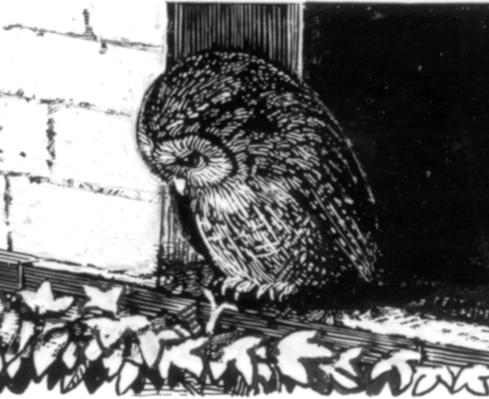
    We now regularly land robots on Mars and yet 30,000 years ago cavemen using only sticks, fingers, spit and coloured dirt could draw and paint more expressively than today’s State Artists. David Lee (See also Moping Owl overleaf and the review of the latest John Moores on p. 10.) 

  • Moping Owl: Playtime

    Moping Owl: Playtime

    Hope springs eternal, so the poet sings, or dum spiro spero, as that wise and prudent old bird, King Charles I, would put it, and he should know. But then again, true as truth may be, I have to say there are times, and these not the least of them, when it would seem to have shrunk to the merest trickle. Perhaps by the time you read this I may well have been proved mistaken – and oh how I do hope so – but please don’t go round to the bookie’s just yet, no matter how short the odds.

    But at least Spring has sprung, just about, and the tendre croppes popped up here and there, and the yonge sonne come out now and again: just the time of year indeed, as that other old bird once sang, whan longen folk to goon doon to the pub again for a swift half or two, and then perhaps to take in a gallery and catch up on a bit of Art at last – get one’s eye in again, as it were.

    And so, bifel it in that season on a day, it was in rather that hopeful frame of mind that I reached for the wagger pagger bagger (middle-English for waste-paper basket since you ask) to see what of interest might quite by chance have found its way there. For, if they’ve done little else throughout our national sequestration, our major cultural institutions have kept us more than well enough supplied with information, both on what they’re not doing and we’re not seeing. The aforesaid wpb is indeed a most useful item: no home should be without one.

    But, oh, dear:  information is all very well, and has it place, but interest doesn’t necessarily dance attendance upon it, and I’m not sure I need have bothered. If what I found is true measure of what’s in store for us, I think I’ll stay put at the Goose & Dairymaid. For in the event, far from encouragement, several melancholy figures rose instead to flit through the pervading gloom, to remind me as they passed of what our cultural commissars and apparatchiks have now brought us to, and what we have lost – the ghosts as it were of Art Past, Present and To Come.

    So what is it they mourn, these sad revenants? Can one be the Ghost of Skill and Craft, now sacrificed on the altar of Technology, the curatorial obsession with which has been long apparent but now grievously aggravated by the exigencies, excuses and opportunities afforded by the late confinement? And is another perhaps that of Particularity and Excellence, now abandoned in light of those fashionable imperatives, Diversity and Social Engineering, with their no less obsessive preoccupation with purity of thought and moral posturing? Gosh, here too come the shades of Judgement and Discrimination, forsaken in the name of Equivalence and Fairness; and that, too, of Scholarship, elbowed out long since by the fell demons of Accessibility, Relevance and Re-Interpretation. And saddest perhaps of all, at last come hand in hand those ghostly figures long forgotten, the Old Curator, the Artist and the Ordinary Visitor, each steeped in love for what Art actually is and whose only wish is to respond to it through their own eyes and minds.

    If all that might sound a bit harsh, well, as I hinted at earlier, I’m not in the best of moods. But where to begin? Well, as good a place as any is the National Gallery, that temple to the rare and beautiful which, in all these respects, indeed often all at once, seems to have been especially busy.

    I’m sure we can all agree both that the small study exhibitions of recent years, devoted often to a single painting, have been good things, and that that masterpiece of the Northern Renaissance, Jan Gossaert’s Adoration of the Kings of about 1510, one of the glories of the collection, is an entirely worthy subject for such treatment. Straight-forward scholarly presentation, however, would seem no longer to be enough.

    More than an exhibition, Sensing the Unseen: Step into Gossaert’s ‘Adoration’, is an “immersive experience where (if experience has a local habitation – answer on one side of the paper only) visitors could (though perhaps for not much longer) journey through an interactive high-resolution image of a picture with sound, poetry and light in socially-distanced pods.” It sounds just the sort of thing that would have given those shepherds abiding in the fields all those years ago quite a turn, pretty well socially-distanced as they were anyway, I suppose, and no pod in sight. But fear not, for the good tidings I bring you are that the Director Gabriel, or one of his Seraphs perhaps, has had the whole thing re-imagined not just online but in a ‘mobile edition’.

    So don’t say you haven’t been warned. “Six poems in the voice of King Balthasar, a character (and how we love ‘a character’) in the Adoration will interpret six scenes from the painting while, wonderful to behold, interactive sound brings them to life… Users will journey through the scenes, starting with the broken pavement and ending with the celestial angels, using touch to zoom (no, it’s not that funny) into visual details they may have missed… They can also share their favourite details on Instagram (behave yourselves)… Data analysis will be used to help understand more about how visitors interact with paintings on their phones” I’m not often lost for words, as you know, but I shall struggle on.

    “The fair Miss Emma McFairyland, Innovation Programme Lead, whatever that is, says: ‘Our aim … is to create enjoyable, meaningful experiences which engage new and diverse audiences with the collection in different ways’:” and you can’t say fairer than that and I’m sure they will. “The mobile experience brings together sound, images, poetry and interaction, doubtless boggling both mind and knees, to explore (of course) the themes of rupture, transformation and renewal through (and here things get a bit metaphysical) the perspective of King Balthasar (and here you might reasonably raise an eyebrow, or even two), a witness to Christ’s birth.” But we pass on.

    Collaborators in this worthy enterprise “include Nick Ryan and Theresa Lola, former Young People’s Laureate, who wrote and voiced, if that’s the word we’re searching for, the poems. Ryan is globally renowned (of course he is) for creating experiences that push the boundaries (and here we get metaphysical again) of listening besides engaging new audiences with audio.” So there. “Technical analysis has revealed the skill which the artist put into the picture.” Where would we be without technical analysis? “There is a considerable amount of underdrawing and Gossaert has made a great many changes at all stages.” Well, fancy that. Who would have thought it. Such skill. Well I never.

    I think it’s time to follow the wise example of King Balthasar and his Chums and depart into our own country another way.

  • Laura Gascoigne: Narrow Lanes to Nowhere

    Rihanna is in trouble again. This time she has offended ‘the Hindu community’ by wearing a pendant featuring the elephant god Ganesha, a fashion choice denounced on Instagram as ‘mad disrespectful’. The Barbadian singer should have known better. She has previous in the fashion department, having already upset the Chinese community by dressing up in ancient Chinese costume for a music video and the Mexican community by donning ‘chola’ dress for Halloween. 

    You know that a point of etiquette has gone mainstream when it reaches the pages of Good Housekeeping. Eighteen months ago the magazine ran a column asking: ‘What Is Cultural Appropriation Exactly, and How Do I Avoid it?’ advising readers: ‘Here’s how to avoid a cultural faux pas’. Exactitude being hard to achieve in an imprecise science, after a loose definition of the term – ‘when a person from one culture adopts the fashion, iconography, trends, or styles from another culture’, especially ‘when the culture being appropriated is that of a historically oppressed group’ – the author confined herself to advising readers on avoiding American Indian, Rastafarian and geisha costumes at Halloween parties, and attached a list of celebrity examples not to follow. Along with repeat offender Rihanna, they included white American model Karlie Kloss for striding down the Victoria’s Secret runway in 2012 in a Navajo war bonnet and little else – a faux pas for which she later tweeted profound apologies.

    You can see why this was offensive to the Navajo Nation. Native Americans have good reason to feel aggrieved at white Americans making light of their culture: when the people who stole your land start raiding your wardrobe, they’re taking the piss. Plus, on top of adding insult to injury, misappropriating fashionistas cause offence by misunderstanding and misusing native traditions.

    There’s nothing new in this. Dominant cultures have always aped the dress styles of supposedly inferior ones, from the turbans sported by Regency fops and the tarbushes teamed with smoking jackets by Victorian gents to the tweeds and flat caps adopted by British aristocrats from the local peasantry. But where fashion merely borrows, fine art steals. In the case of so-called ‘primitive’ art, Modernism stands guilty of misuse on a massive scale. What do you do with a problem like Picasso, never mind the self-identifying ‘savage’ Gauguin? Even the mild-mannered Henry Moore couldn’t keep his roving hands off Toltec-Mayan reclining figures. What does a colliery manager’s son from West Yorkshire understand of 9th century Mexican culture? Nowt. If he’d come up before the elders of the Mayan Nation, he’d have found himself on the naughty step with Karlie Kloss.

    In the eyes of cultural appropriation hawks, the fact that modernist artists regarded the makers of the objects they ripped off as their equals or superiors does not exonerate them from the charge of ‘mad disrespect’ of their meanings and purposes. Still, you may as well try to hold back the tide as stop art and fashion playing around with other visual cultures. Moves to have indigenous cultural traditions established as forms of intellectual property owned collectively by tribal nations face a legal minefield; for now, the court of social media has to do.

    In the case of art, the new strictures cover both style and subject. When the 2017 Whitney Biennial included a painting by white American artist Dana Schutz showing black Mississippi teenager Emmett Till in the open casket in which his mother laid him in 1955 to expose the brutality of his lynching, British mixed-race artist Hannah Black wrote an open letter to the curators demanding the work’s removal and destruction. “It is not acceptable for a white person to transmute Black suffering into profit,” she argued. “The subject matter is not Schutz’s… Non-Black people must accept that they will never embody and cannot understand this gesture.”

    Black was wrong. Mothers everywhere would understand the gesture, though – to adopt her own exclusionary argument – perhaps she’s not a mother so can’t speak for them. From what I saw of Schutz’s work in last year’s Radical Figures show at the Whitechapel, its destruction would be no great loss, but it would set a precedent. If artists are to be forbidden from expressing empathy with victims of injustices committed by their own people, Turner’s Slavers Throwing Overboard the Dead and Dying, Typhoon Coming On is for the chop.

    Within three months of the Whitney debacle another storm had blown up over the erection of Sam Durant’s Scaffold in the sculpture garden of the Walker Art Centre, Minneapolis. The American mixed-race artist’s work, which referred to seven gallows used in historical hangings by the US government, had toured Europe without incident, but its allusion to the hanging of Native Americans in the US-Dakota War of 1862 brought down the wrath of the local Dakota community on the artist’s head, unleashing a torrent of online abuse. Worse, the cause of defending the sculpture was taken up by local redneck ‘patriots’ – all ‘very fine people’, no doubt – who drove around the park hurling abuse at the Native American protestors demanding Scaffold’s destruction. The whole sorry saga ended with the work’s dismantling and burial by tribal elders at an undisclosed location; burning was considered too good for it. Neither side emerged smelling of roses. After calls for her sacking, the Walker’s Cuban-American executive director Olga Viso resigned.

    No wonder museum directors are running scared. Pre-emptive action was bound to follow, with exhibits withdrawn in anticipation of outrage. The first casualty has been the Philip Guston show, meant to open at Tate Modern this spring but postponed after fears that Guston’s cartoon Ku Klux Klan figures would stir up BLM sensitivities. While no one has suggested that Guston, the son of Jewish refugees from pogroms in Odessa, was a Klan supporter, Kaywin Feldman, director of the National Gallery of Art, Washington – one of four venues due to host the show  – employed the ‘A’ word, saying that the artist had ‘appropriated images of black trauma’. It later emerged that she was less worried about upsetting gallery visitors than exposing the fact that 83% of its warding staff are from ethnic minorities while 98% of its curatorial staff are white. Without even showing the non-white guards the putatively offending images, the museum pulled the show. We’ve reached a point where a white artist can’t self-critically address the abuse of blacks by whites if it is thought by a white museum administration that it might upset the sensibilities of black viewers it is too nervous/patronising to consult. 

    Still, all is not lost. In the post-colonial melting pot we live in, the stay-in-your-lane cultural traffic police face the basic problem that their absolutist vision – designed for a world of pedigree pure-breeds – is impossible to realise in practice. Short of DNA-testing all artists to map their ethnicities, would-be enforcers of this uber-discriminatory nonsense have no way of telling which cultural lane an artist belongs in. Artists who straddle several can’t be confined to one.

    Art, like fashion, belongs in the realm of fantasy, a realm beyond the rule of road markings. Appropriation, assimilation, acculturation ­– whatever you choose to call it, the process is unstoppable. Besides, without a bit of swerving and weaving there would be no artistic development. We’d all be stuck in narrow lanes to nowhere.

  • Joy Labinjo: Led To The Market

    Across the last 30 years the narrative of official Contemporary Art has unfurled like a Chinese scroll. We can follow how, from around 1990, those commercial techniques pioneered to manufacture reputations by Charles Saatchi were adopted as a template by other speculators eager to cash in. This was the start of a racket which turned the art market into an investment game of chance played by billionaires and super-dealers. Public galleries went along with it hoping for free scraps and helped along by telephone numbers of taxpayer cash. More recently these same strategies have been weaponised by State Art to engineer a preferred social character to the official art landscape. For them the process is a cinch. Whereas Saatchi only had one gallery to work with, State Art oversees a score of them as well as having access to the limitless potential blackmail offered by exclusive control of public subsidy.

    And so the story continues… Clicking through Christie’s results for their recent ‘20th Century Sale’, an auction in which Banksy’s (21st century) NHS drawing (see p. 29) fetched a higher price than Picasso, Modigliani or Bacon, one lot leapt from the screen. This was a lively picture of Pop Art thrust called No Wahala (No Problem in Nigeria’s Hausa tongue), by a 26-year-old British artist from Dagenham, Joy Labinjo, who is also being sold as an ‘African artist’. My interest was aroused because this painting fetched £150,000, five times its estimate. I’d never heard of her, not least, I suspect, because she’s still a student, yet here was a work clearly being exchanged as an investment bond in an auction of the usual blue chip names. The work was painted two years ago, having been exhibited in a solo show at Baltic Arts Centre; that is, local to where Labinjo took her first degree in Newcastle. A sell-out dealer display at an art fair followed with works priced at ten grand each. Within months the Government Art Collection, always wide awoke, jumped aboard with a £70,000 purchase. Barely dry, No Wahala has thus already been through three owners. Labinjo’s prices, meanwhile, have been bounced upwards by 15 times in only 18 months to a level way beyond the means of public galleries. 

    Labinjo is part of a State Art policy to race especially young black women painters into prominence. This demonstrates to the world that for all our past institutional and systemic racist failings we are now, at last, ‘diverse’.

    No Wahala (5’ x 6’), done in a mixture of household gloss, acrylic and oil,   concerns, we are told, ‘racial identity’. This phrase is the go-to validation now routinely attached to all works by young black artists. Used here it is clearly untrue. Labinjo’s are pictures based on snapshots from her family albums which are fed into a computer and collaged on screen. They are no more about ‘racial identity’ than paintings of white people would be. Other promotional nonsense written about this work by a Christie’s hack made me laugh out loud.

    Execution is in patches of colour like stained glass or painting-by-numbers. Figures are crude, faces twisted, clothes limp, limbs disjointed and background colours Dulux bright. Because the means to achieving precise expression of a figure’s feelings are unmastered, one can’t read properly the mood or sentiment of the subjects featured. Nevertheless, and naive as it is, the picture has presence and honesty. I sense an unselfish and genuine desire to communicate. There is no suggestion here of the fashionable sloganising so wearisome in work by other artists from a similar background.

    Labinjo is one of several black British women painters, of which she is the most interesting, to be subjected to this market grooming process for political, social and profitable rather than for purely artistic reasons. Incidentally, a picture by the most famous of the group, Lynette Yiadom-Boakye, who is currently showing at the Tate and whose work to my eye is meritless, sold a landscape in the same sale as No Wahala for an astounding £513,000.

    Is it fair to so exploit a promising student artist? One can’t blame the young for going along with a system which lines their pockets – good luck to them. But is subjecting art and reputation to artifical inflation really considerate of an artist’s long-term development and welfare? It is a process, don’t forget, which regularly fails. Consider the vapid, repetitive merchandise produced by Saatchi’s more famous discoveries, for whom as prices rocketed and publicity snowballed so the work got thinner and thinner. The fear is that Labinjo will, like them, be turned by market gamblers into a one-trick pony. 

    Meanwhile, painting that will last the test of time is being made elsewhere, out of the limelight. Not that State Art will ever let you know. David Lee

  • The Philistine – July 2021

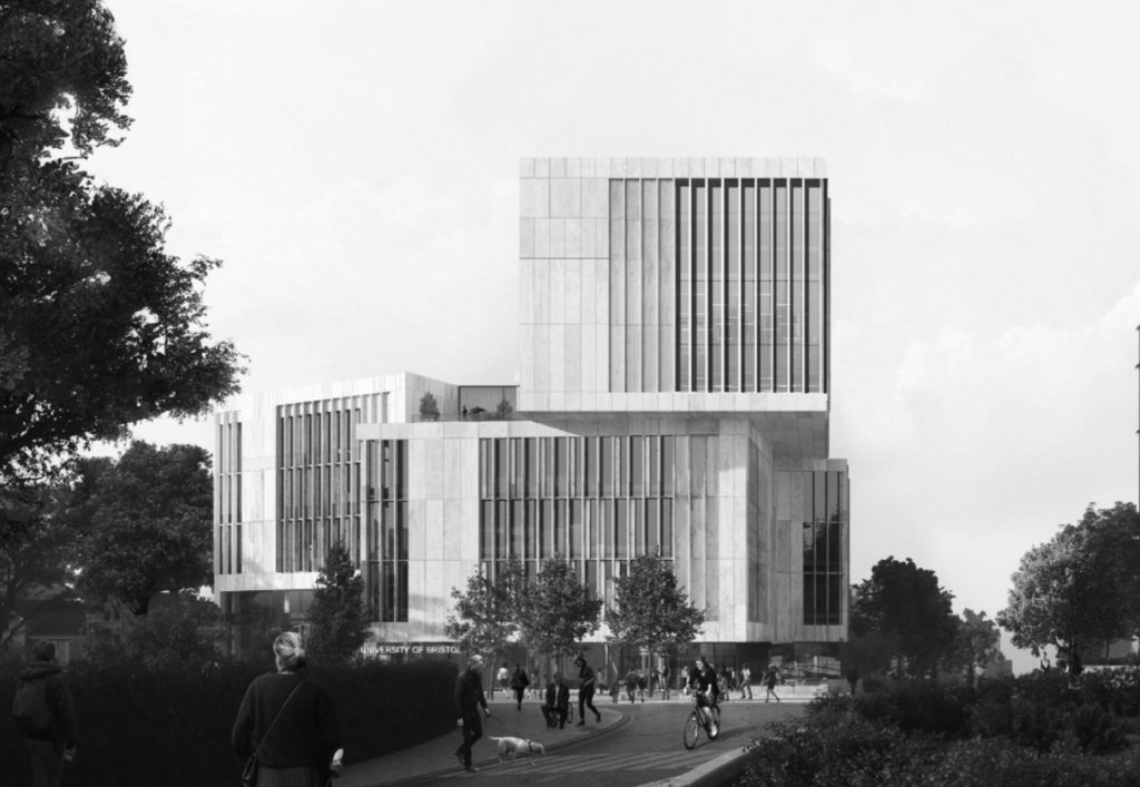
    Bristol University is building a new library. The very idea is enough to send shivers down the spine: any British institution that decides to build something new is almost certain to add to the accumulated ugliness of the world.

    And so it is in this case. The design that the University has accepted combines banality with monstrosity: a combination that, I suppose, requires talent of a kind to achieve. The building already looks a good candidate for demolition, probably within thirty years, and it hasn’t even been built yet. One can only hope that Bristol’s pullers-down of statues will get to work on it straight away: though of course they prefer to demolish only those things which have some aesthetic value. 

    One of the partners of the architectural partnership that designed the building was reported as having said: “This inspirational new landmark for Bristol will provide world-class facilities in an inclusive and welcoming environment.” It is worth lingering a moment on this horrible sentence.

    In the first place, it is not for the designer of a building to say that it inspires anybody or anything, any more than for me to say that this is a good article. That is for others to decide. In fact, the new library will indeed be inspirational: but only of contempt and despair at the aesthetic incompetence, insensibility and egotism of the architects and their client alike who have inflicted such a thing on a city.

    That it will be a landmark is, alas, true, for it is so large that it will be visible from all over the city. But being a landmark is not a good in itself, any more than is originality a good in itself. In the absence of aesthetic quality, it is, rather, a fault, and a grave one. I note that even the architect, who is by no means modest, makes no claim of beauty for the proposed building.

    Then comes that terrible word that sounds as a tocsin: ‘world-class’. What does world-class mean? It means second-rate, mediocre, boastful, and aspiring to something that is certain not to be reached. Who would say of Chartres, ‘It is a world-class cathedral?’ or of the Taj Mahal, ‘It is a world-class mausoleum’? Even to think in these terms is to have a mind that makes greeting-card poetry seem profound by comparison.

    Then comes the teddy-bear word ‘inclusive’ that is supposed bring comfort to the reader and induce a warm glow of approbation of its utterer. Who can be against inclusion? Dr Verwoerd? But who or what is to be included? Biblioclasts? Illiterates? Terrorists? Fascists? Paedophiles? Drunks? Drug dealers? Prostitutes? Pimps? Graffitists? Vandals? Swindlers? Thieves? Murderers? The word ‘inclusive’ is a lie, when it is not shorthand for deeply-ingrained but shallow ideology.  

    Here is what another partner is reported to have said: “While we set out to create a contemporary design that echoes the sense of civic dignity imbued with timeless sculptural qualities, the new library is deeply contextual and deliberately responsive to the historical environment of Bristol.” This is the kind of language with which anyone who reads architectural writers in our magazines and newspapers is only too familiar. Trying to fix a meaning to it is like trying to grasp the more slippery kind of seaweed. Someone should write a glossary, for example:    

    Contemporary –  Fit for demolition within twenty years

    Contextual  –  Standing out from its surroundings like a

                          fungating cancer

         Responsive to historical environment – Destructive once and for

                                                                   all of its surroundings.

    There is one thing to be said for architects such as those of the new Bristol University library: they reconcile one to one’s advancing age.